Long March: Restart

Long March: Restart

I recently found a super interesting game that’s pretty much been formally recognized as art. Long March: Restart was created in 2008 by Feng Mengbo as the final work in his painting series Game Over: Long March, and it was acquired by MoMA in 2009. The game questions media portrayal of events from the Long March of the Chinese Communist Party in 1934 by intertwining images of Chinese propaganda with iconic symbols of western culture like Coke cans and with fantastical monster enemies, all in the pixel art side-scroller fashion. In the installation, the viewer/player is surrounded by huge screen projections and is thrown directly into the action. I’m actually glad I got to read Claudio’s post right before making mine because I completely agree that video games immerse the user/viewer in a much more interactive way than other art forms might – games invoke a unique kind of investment in the outcome and message of the work.

Beyond the Poster – Innovation in Design

Beyond the Poster – Innovation in Design

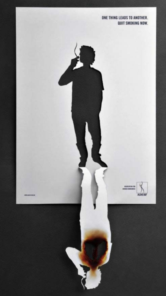
There are a plethora of incredibly well-designed posters, but the ones I personally find most intriguing and eye-catching are those that go a step beyond design. Posters that are interactive or utilize the space around it in a unique way are both creative geniuses but also, they often convey a more impactful message. The first poster is an anti-smoking PSA, which effectively uses the cut-out silouhette of a human that now doubles as two people: one healthy, and one unhealthy. The second poster is an interactive station where people could charge their phone that also encourages them to donate blood. The metaphor of the charging cable as blood running through someone’s veins is significant and powerfully reveals the important of blood drives. They are both posters which extend beyond the typical ‘rectangle’ boundaries of a typical poster.

Receiptify

Receiptify

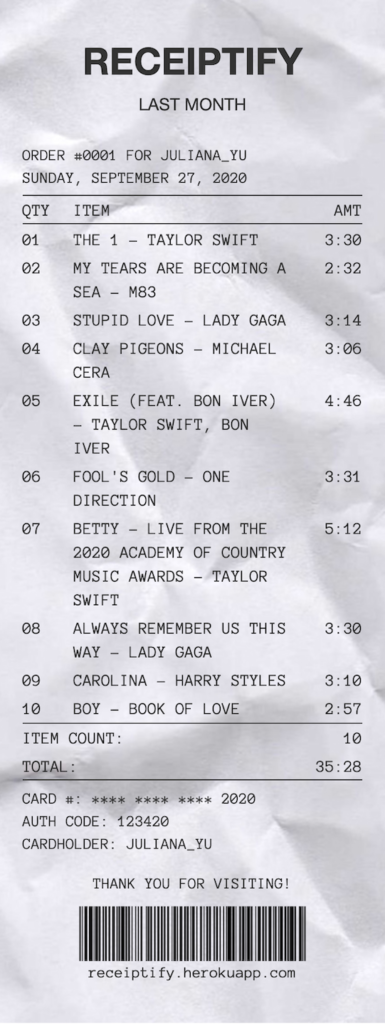
This is almost a follow up on Ayaka’s last post about an Instagram artist designing receipts for music albums. My best friend (my biggest flex I think) coded an awesome website that connects to your Spotify account to record your top played songs onto a personalized digital receipt. She was inspired by the same Instagram artist and built on this idea to create something that would allow for easy sharing across social media. This project really reminds me of the growing, transforming relationship between art/design and technology. Especially now, they are becoming even more intertwined and a part of our everyday lives.

If you ever want to check the site out here it is. Please excuse the excessive amount of Folklore on mine…

Online Presentations

Earlier this week, Apple released it’s newest iOS update. While I am not a big “technology person” by any means seeing as though I still have a cute little iPhone 6, this update really caught my attention. The way in which the user can expand and collapse these little modules (or logos, if you will) is something that caught my attention. This new update gives users the chance to choose their own designs of their home-screens even more than before, a big step for Apple which has always marketed its products as simple and sleek. With this mission in mind, Apples new update is still sleek and simple, a big reason for that being the design of each of the modules.

Kildren: Where Doodles Meet Realism

Kildren: Where Doodles Meet Realism

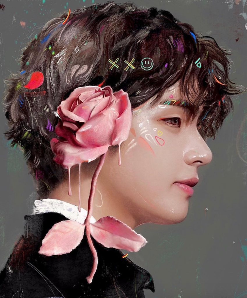
I am always trying to gain inspiration from contemporary and younger artists. Each artist has such a unique style that is constantly encouraging me to break the boundaries of what I perceive as art. An artist I have been loving recently goes by the name Kildren (@kildren on Instagram) who specializes in combing photorealistic portraits with bold colors, strokes, textures, and doodles. Each piece is so creative in unique, showcasing both his technical skills but also his ability to take a simple portrait up ten notches by incorporating more modern designs and bright colors. He works in both the digital space and using paint on canvases, yet manages to achieve a similar effect regardless of the medium. All of his pieces are so captivating and gorgeous to look at.

The Parthenon

The Parthenon

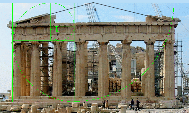
In my architecture class, we have been exploring the ancient Greek temple dedicated to Athena in the age of Pericles known as the Parthenon. While much of the interior was destroyed, its remains best exemplifies the various components of Greek architecture and temple construction. The Parthenon is a Doric temple, which artfully incorporates thicker columns and a more massive appearance (sometimes called masculine) than its Ionic (feminine) counterpart. The Parthenon still includes selected Ionic features, however, producing a building which many of the world’s top architects and designers have called “perfect”. Although a number of aesthetic elements were calculated to make the building appear as visually perfect as possible, it has also been said that “nothing is as it appears”. For example, although the lines and distances in the Parthenon appear to be straight and equal, horizontal elements were deliberately curved and vertical columns “fattened” in the middle to compensate for the imperfections of the human eye. These geometric adaptions and thickening of lines made it look as though the columns were strained under the weight of the roof, therefore making the temple less static and more dynamic. All in all, I chose to write about the Parthenon because its unique architectural composition highlights the beautiful interplay between lines and structures with elements of perspective, illusion, and distortion.

Certamente Tableware, Konstantin Grcic

Certamente Tableware, Konstantin Grcic

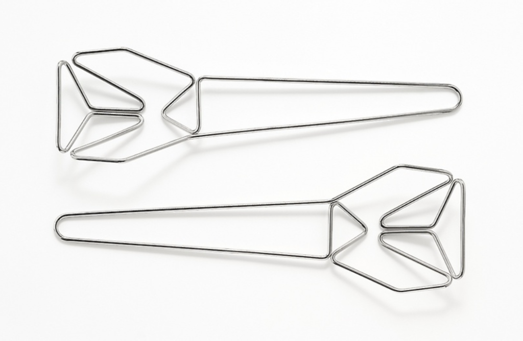
Grcic’s salad server set is an investigation into lines and planes. Being made with only one continuous piece of thin metal wire, this salad server features a minimalist tone with decorative elements created from the curves and pointed edges the line is bent in. The functionality of the salad server is still kept intact while the tool itself uses less material than say a traditional serving spoon. This salad server is part of an entire set of tableware called Passami il sale, meaning “pass the salt”. The set was created with the skills from local craftsmen from the north of Brescia in northern Italy. With such a simple yet complex design, Grcic has created tableware made to be appreciated but also to be used effectively.

Sharpening Our Design

I’ve been trying to learn more about what design is exactly (I know, a little sad considering I’m in a design class). No disrespect to Bang or Dondis but over the past few days I’ve gotten a better understanding of design and the fact that it is kind of all around us. I was searching for applications of design and stumbled upon what I think is a simple yet amazing site: sharpen.design. It automates a two-part prompt to serve as practice for professionals and students alike. The prompts are fairly simple — “Animate an icon for a pizza shop in Peru” and “Design a new logo for a hot sauce brand in NYC” are some of my personal favorites. There is also a STEM tab that focuses on designing prototypes of inventions as well as illustrating/painting. In the future or just in our free time, I think the site could be a really fun tool to get in some practice conceptualizing and creating art, and even getting more experience with Illustrator and Blender. I’ve personally been in a bit of a creative funk, and this has been a perfect cure to my block. I’m also curious, what do you all do when you have any kind of creative block?

Album Receipts

Album Receipts

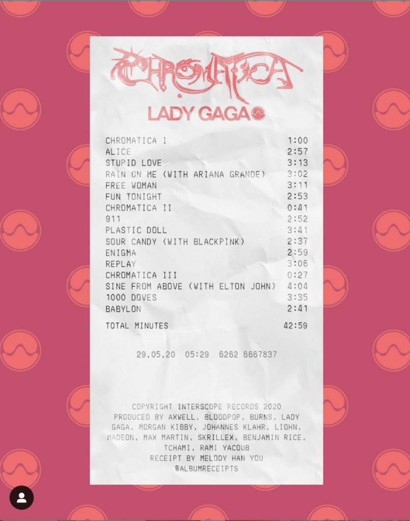
An Instagram art designer I follow creates these receipt artworks that have music albums on them. There is something so post-modern about these designs that I love. There is an irony in taking something redundant, ubiquitous, and kitschy like a crumpled up store receipt and combining that with the work of iconic artists. All I can wonder is how this artist creates these designs and mimics the texture and fonts of receipts so perfectly. If only store receipts were this fun… (especially CVS receipts, am I right?)

This week in design

This week was a big one for my design brain! Last week, my high school’s newspaper advisor passed away. As a former editor and someone who was very close with him, the news was incredibly sad but it also gave the old staff an opportunity to commemorate him. The current editor, another former editor, and I reached out to dozens of people our advisor, Mr. Lowe, had worked with over his 31 years at the paper. We ended up curating a 16 page newspaper full of memories and art dedicated to Mr. Lowe and as the only person with access to the necessary computer program, I designed and laid out the entire thing. It was an incredible experience to design the paper as a way to honor the incredible man Mr. Lowe was but it was also a really great way for me to channel some of the design elements we’ve been working on and discussing in class. The one I think of first is the element of color and relation between objects. On one page, which I do not know how to share here but I’ll link the paper here (the pages with this design are pages 4 and 5). I used the image in black and white and typed the first parts of the headline (Rodney K.) in black with the final word (Lowe) in a bright blood orange so that it popped off the page in relation to everything else. The way in which the words interacted brought the entire image together and helped ground the pages by using the story itself at the bottom of the overall image.