A Fake Reality: Sally Huang interviewed by Molly Xiao
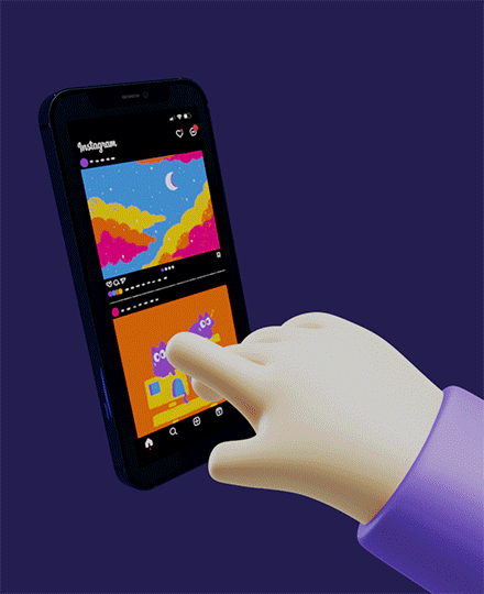
In the heated debates over Generation Z’s incessant usage of technology and the prevalence of phone and social media addiction, Sally’s animated poster visualizes the repetitive habit many are all too familiar with. Incorporating colorful, animated cartoons on the phone, and a blockish, pixelated realm around it, she amplifies the disassociation between the virtual space and reality – Molly Xiao
Molly Xiao: I know there’s been a lot of debate around the dangers of social media and technology over the last few years, for example in the recent case against Tiktok. What issues were your main inspiration for making this poster and raising awareness around this issue?
Sally Huang: Hi Molly! Great question. I consider myself a “phone zombie”, someone who, when on their phone, shuts the entire world out and is solely focused on the contents of their phone. There are so many instances in my life, especially recently, where I just lay on my bed scrolling endlessly on TikTok or Instagram with very minimal enjoyment. I just get sucked into this never-ending cycle of scrolling. It almost feels like my fingers just subconsciously scroll. Before I know it, 1 to 2 hours have passed. This is a huge and problematic issue, not just for me but for a lot of people today, both young and old. I wanted to raise awareness on this issue, of how technology has taken hold of our lives. Our society lives for social media rather than live for themselves. Although technology has provided us with so much, it is truly scary thinking about how our humanity will end up.
MX: Definitely can relate to that – it’s not exactly a glamorous realization to face so I was really intrigued by the dreamy, animated visuals on the phone. They look really similar to Julian Glander’s style. Why did you choose this kind of bubbly interface for the phone?
SH: I went for a vivid and colorful interface on the phone to emphasize how addictive social media can be. Super bright colors are always the ones that instantly catch our attention and so using this color palette highlights that instant, attention-catching aspect of tech and social media. Julian Gladder is definitely an artist that I admire, however, I wouldn’t say that I drew inspiration from his work. The choice of colors, the cutesy doodle-like drawings and the bubbly elements I would say are key elements of my style.
MX: I love the drawings, they remind me of childhood or when Instagram first started out with the simple moments in life like the birthdays and pictures of sunsets we thought were so quirky and artsy! Were the “posts” drawn from personal experiences or just off the dome of what you think of when you think of a social media feed?
SH: To be quite honest, the main reason for choosing to draw these posts is because I thought they would look really nice with my color palette! I would say that I didn’t give much thought to what posts I wanted on my feed, but now that I am thinking about it, I remember thinking back to what people tend to post on social media and I know a lot of people tend to post scenery, pets, and family life! I guess I wanted to show how life is captured inside a phone rather than enjoyed in the moment.
MX:Yes I feel like the color palette of all the posts on the phone complement each other really well. How did you choose purple for the background/space outside of the phone and for the text?
SH: I wanted the background to be dark in contrast to the phone screen that is bright and colorful. This is to not only emphasize focus on the phone but also to point out how grave the situation/issue is since dark colors are usually paired with negative connotations. I wanted to use a dark blue or a dark gray or even a dark red but i felt a dark purple suited the purple arm the best!
MX: The connotation makes a lot of sense. The purple honestly reminded me a lot of my own phone since my screensaver is purple so the whole thing felt really personal haha. How did you make the hand and animate the scrolling movement?
SH: For the hand, I knew I wanted it to be round and cartoony. I am someone who likes the “dreamy” look you mentioned before, and try to avoid harsh sharp lines especially with 3D art. The hand was actually from an image I found online apart of a phone advertisement template! I cut out the hand and pasted it into blender to make my animation! To animate the scrolling movement, I set certain points of my animation frames to specific positions and rotations and the remaining frames are “filled” in to create a seamless motion from one position to the next! I also ensured that this animation was a perfect loop because I personally love when animations or gifs have that perfect loop in it. The loop was made by ensuring the last hand position matches the first and the screen on the phone is seemed to be scrolled to the initial first two posts!
MX:That’s so cool that the hand was part of a phone advertisement template! Very on theme. I noticed the loop was also really seamless. Have you done these kinds of animation loops before?
SH: No I have not! this was such a new and learning experience! My mentor, Avery Lawrence, helped me a lot with this project and I am so grateful for him. He really helped in making this animation come to life, helping me make this seamless animation. He has taught me so much and I can’t wait to apply this to my future works!
MX:Great stuff, gotta love Avery. If you had to turn this poster into a series what would you want to make the theme, message, or animation for the next one?
SH: If I were to turn this poster into a series, I’d make multiple posters with the same message “do you own tech or does tech own you?” but with various forms of technologies, like laptops, Ipads, TVs, gaming technology, and more. All of these would include hand motions such as one-finger typing for laptops, the same scrolling motion for tablets, thin clicking motion on remotes for TVs, and different types of hand motions for different types of gaming technology.
MX: That’s a nice balance of differences and consistencies that I think are really important for making a cohesive series. I think the gaming one would be super cool to see too. Would you use a console or PC?
SH: Definitely both. Addiction to technology comes in many many forms and if this was a series, I would like to emphasize its many forms.
MX: Very true. My last question is what your favorite part of this piece was? Either one that you spent a lot of time on or just that you think looks the coolest.
SH: Quite honestly can I say everything? My favorite part of this poster is how it turned out. To be honest, this protest poster was the third idea I had. First I wanted to do a poster on racism but the idea I had got the poster was way too complicated for a 5-second animated poster. Then I wanted to create a protest poster about how children from immigrant families should live their own dreams and not the dreams of their parents. I wanted to execute this on a phone where a parent was texting the child, pressuring them to partake in a certain career path. After realizing that was also too composted for 5 seconds, I ended up with the technology addiction poster. I already had the phone and set up so why not. I know Technology addiction is probably not one of our most crucial issues today but it is still an important issue that can lead to detrimental consequences. Kids today, young people today, we live for our phones. It sets our thought process, about how our life should look like, how WE should look like. it needs to be addressed. My favorite part about my poster is being able to bring a small problem to greater attention.
MX: Your poster did do a great job capturing a simple moment that speaks a lot about an important issue that’s very real in a lot of peoples’ everyday lives. I was a big fan of your initial idea with the eggs too, and would love to see that come alive someday in a future project! Thanks so much for chatting with me about your work today and I look forward to seeing what other great things you continue to put out 🙂
SH: Thank you Molly! It was so fun talking to you! I learned things about my project I didn’t even realize!
Say No To Odd Things: Molly Xiao interviewed by Sally Huang
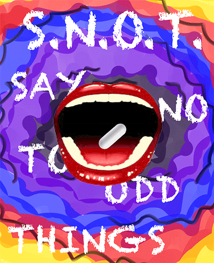
In a time period where drug usage and drug abuse is a prevalent and critical issue, Molly Xiao creates an animated protest poster not to just bring a spotlight to the issue at hand, but also to criticize the many drug resistant tactic campaigns that think tramuatization is the key tactic to establish a drug-free environment and future. Through the use of vivid colors, exaggerated elements of drug use ssuch as yellowed teeth and blood splatters, and specifically chosen typography, Xiao satirizes to get her message across. – Sally Huang
Sally Huang: Hello Molly! Thank you for taking the time to talk to me today. I was viewing the Protest Poster Project Exhibit curated by Avery Lawrence and your piece really caught my eye. First and foremost I wanted to ask about your slogan/message SNOT. How did you come up with such a saying?
Molly Xiao: Hey Sally! When I made this poster I wanted it to be almost a play on the DARE anti-drug campaigns I would see when I was a kid. I knew I wanted it to be a four-letter acronym like DARE and starting off with “say no to” the rest of the acronym just kind of came to me spontaneously!
SH: Can you give a bit of insight into the DARE anti-drug campaigns? They sound very familiar but I can’t seem to remember them. What were some key features of this campaign and how did you utilize these features into your own poster?”
MX: Yeah for sure! DARE stands for drugs abuse resistance education, and they would basically come to our elementary and middle school, do pep rallies and talk about why drugs were bad, and then pass out some quite honestly sick merch. I think I still have a DARE t-shirt back at home. I replicated the iconic font of DARE’s logo that’s almost like a mix between horror-themed font and comic sans in the font for this poster, and how the acronym is in big bold letters at the top. Also the periods in between each letter of the acronym are trademark – every time I see an acronym formatted like that it always reminds me of the DARE font and logo.
SH: I don’t think I ever went through an experience like that! It is awesome the type of initiative the DARE campaign is taking in teaching about drug abuse resistance. It is quite evident that you take huge inspiration from DARE, however, how would you say you are different? What makes your poster stand out as another drug abuse resistance campaign/initiative?
MX: I think in some senses, the poster aims to replicate but also poke fun at the scary
fear-mongering aspects of campaigns like these targeted at young children. Of course, the acronym SNOT itself is much more comical than a word DARE. The immediate pop-up of blood as the pill disappears into the horizon is also a satirical interpretation of how a lot of scary stories and statistics are thrown around by these campaigns to essentially “scare” kids into not using drugs, and it’s very black-and-white rather than comprehensively educational. Of course it’s very rare for someone to start bleeding from the mouth from taking drugs, so it’s more of a dramatic flare for the message of the poster. Overall I’d say the bold, over-the-top appearance of this poster gives it a more comical appearance that makes it different from other grimmer visuals typically used in these campaigns.
SH: I can definitely see that. I for sure chuckled when seeing SNOT on your poster followed by the catchy slogan. Would you say your protest poster is a protest against drug usage? Or is it a protest targeting campaigns like DARE and the way they form their young audience?
MX: I’m glad you got a laugh out of it haha. I’d say it’s more of the latter – a protest against the tactics campaigns like DARE use that are super intense, and fear-mongering to the point where it’s almost funny. And the thing is it doesn’t even really work, kids may still grow up around bad influences or a lack of support and that’s what these campaigns should be addressing more of; educating and offering support if they do fall into bad habits. I don’t intend for the poster to send the message that drugs aren’t scary and you can have a silly little adventure on them, but that there are more effective ways to protest drug use/abuse.
SH: I totally understand that. Thank you for letting me know about the inspiration behind your work and clarifying ur poster’s main objective. It truly is a strong message. Now I want to dive a little bit deeper into your work and the different elements you chose that make your poster so attractive to the eye. First I want to talk about the mouth, was this a piece you drew or made yourself? Is there a reason you choose for the lip to be a bright red?
MX: I actually just got the mouth off of good old google images! Made the background transparent and copied it into the piece. My design professor, Avery Lawrence, helped me split the image in two so the top and bottom of the mouth could be stretched and move in tandem. The bright red lip just came with the image, and it’s an interesting contrast with the yellow teeth of a probably regular drug-user that Avery also suggested I add. But it could be interpreted in various ways – as someone that still has hope for being healthy and colorful or from the blood rushing to the mouth to get out after taking the drug.
SH: Very interesting! I love that you took an image and added more to it to make it better incorporated for the overall message. Is there a particular reason why the mouth doesn’t fully close? Was it intentional? Or just a subconscious choice?
MX: Honestly probably more along the subconscious choice and also the logistical constraints of the five-second time frame for the animation (rip). I wanted the mouth to move at a reasonable rate for the viewer to process everything that was going on – the pill getting swallowed and the blood appearing, so I think the pace at which I chose for it to close just didn’t allow for it to close all the way.
SH:I see. Was this your first-ever animation? Is it like any of the other work you made before? How was your process?
MX: Yeah this was my first animation! I haven’t really worked with art much in general, as I would say I’m much more talented at consuming than making art unfortunately haha, so this wasn’t like anything I’ve made before but I’m really happy with how it turned out. The process was honestly pretty daunting at first since I’ve never done anything like it before but after breaking down the steps to pull everything together with Avery’s help I felt more comfortable in taking it on. I’d actually say the background took me the longest because I wasn’t sure what colors, figures, and brush to use to make the trippy spiral visual. Took a lot a trial and error experimenting with different things until I finally liked how it looked.
SH: You did a fantastic job for someone who doesn’t really work with art! I really like the trippy spiral visual you just mentioned. Why dd you choose those particular colors and was it hard to sync up the background with the movement of the mouth?
MX: Thank you!! I really appreciate that. I enjoy stepping out of my comfort zone and trying new things every once in a while. I chose the colors based on spiral patterns I had seen previously and based on what I envisioned for it. I always see yellow in these tie dye type spirals, so I ended up choosing similar colors of red and orange to go with it. I also wanted the outside to be brighter in color because oftentimes when someone takes drugs they have a glorified view or expectation of them that is often sheltered from the grim reality of their effects. Then I wanted it to get darker, with the center being black so that as it zoomed in the darkness would engulf the mouth more to resemble danger or even death after taking the pill. It wasn’t really difficult to sync since I just used Photoshop’s automatic zoom and rotate feature for the background layer.
SH: Honestly, I am so grateful for these new programs and apps! Imagine hand drawing every single frame like artists had to back then! Lastly, I wanted to talk about your text, “SNOT Say No to Odd Things”, once more. Why did you choose for the text to be behind the mouth and not around it or even in a spiral format to match the background? Also, was the choice of a chalk-like crayon-like text to emphasize the young audience that tactics campaigns target?
MX: Oh my gosh same. It’s so cool how much you can create so easily now with digital art and design softwares. The layers features really saves lives I can’t imagine drawing something permanently and having to start over to change one thing. As for the text, I chose to keep it stationary to add some stability to the piece. With the background, mouth, and pill/blood moving I think the text moving would have been too much movement for the piece and left out the “poster” feel. I wanted it to linearly behind the mouth for the same reason, just to add some more depth and dimension to the piece. And yes!! The font is exactly that feel for a younger audience. Kind of what I was talking about before, it’s also similar to the appearance of the DARE logo’s font.
SH: I see!! I really like how you thought each component out separately but also as a whole. It worked/turned out so well. Honestly, great choice of font. I love the mimicry of your poster, it’s just really poking fun at DARE and similar tactic campaigns and I am loving it!! Haha. I love how your poster is obviously mocking campaigns yet still contains elements and components that are unique. Where can you see your posters? How would you wish for them o be distributed?
MX: Exactly balance is key! I would love to see these posters in high schools for a sort of social experiment kinda thing, or maybe at a skate park because it embodies a comically edgier side. These would definitely not fly for an actual organization or campaign, so I see them being distributed by myself and some friends by hand on a Saturday afternoon just for kicks.
SH: What is your favorite part of the poster? For me, it has to be the blood. It is so random that it is so hilarious. Also, lastly, if you had more time with this project, what are some things you would do differently?
MX: I know right the way it just appears looks kinda choppy but honestly it adds to the juvenile feel of the whole thing. I would say my favorite part is the background, maybe because it just took me the most time and finally getting something I was happy with was so relieving, but I think it visually it ended up capturing exactly what I wanted and envisioned. I think maybe if I had more time, I might have tried to see if I could make the spiraling motion of the background more seamless in a loop somehow instead of obviously returning back at the starting point