Iris Lee interviewed by Alyssa Chandler
Alyssa Chandler I really love the composition and look of your poster! Your image of Timothée Chalamet is so recognizable and really drew me into your poster and made me want to learn more about the meaning and message. I’m a Ladybird fan and thought it was really interesting how you included a line from the movie and was wondering if you could talk more about its significance and why you chose Ladybird as your inspiration?
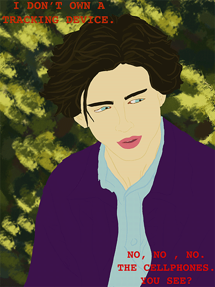
Iris Lee I love Ladybird as well, it’s always been one of my favorite movies. His character in the movie was always really interesting to me because he’s supposed to be pretentious and the stuff he says is meant to be bullshit yet I know people like him in real life. It lends itself to this idea that he shouldn’t be taken seriously yet some of the stuff he says is kind of true. His seriousness about cellphones being tracking devices is supposed to be humorous yet at the same time, it’s true. Phones are tracking devices and we do put them on ourselves. Also, when we were looking at different protest art pieces a lot of them had really captivating visuals. Since Ladybird is such a big part of pop culture I thought that it would attract the attention of viewers solely out of familiarity.
AC I also love the transition in the end to the close up of his eye. I was wondering how this imagery connects to the meaning of the line “I don’t own a tracking device. No, no, no. the cellphones. You see?”
IL In the movie, the scene where these lines come has Timothee Chalamet explaining to Ladybird that cellphones are tracking devices that we went and put on ourselves. The close up to his eye was meant to be just a transition to the final frame with the red eye and also as a bridge between this idea that we’re constantly being surveilled and the idea that we’re aware of this and complain yet continue to use our phones and other devices from which we are tracked in the first place. The topic of my poster wasn’t meant to be super serious or anything, I think I just wanted to make commentary on the hypocrisy of it all while also leaving it up to interpretation depending on which way you lean in the device tracking debate.
AC I also would love to know what is the significance of the red eye at the end? To me it seems like a commentary on surveillance and technology but I’m interested to learn more about how Timothée Chalamet plays into the poster’s message.
IL The final frame is the iconic cover of George Orwell’s book 1984. I remember reading a random post on twitter that was talking about how Orwellian it is that our devices listen to everything say and do. This immediately made me think of that scene in Ladybird. What Timothée’s character in the scene is talking about is true and it is creepy and Orwellian in many ways, but at the same time are all these people maybe just taking things too seriously? Most people do normal things on the internet and in their lives so it shouldn’t really matter that their devices are watching and tracking them. People also find great use from these tracking capabilities of technology like location tracking for families and to make using map apps easier. I guess my poster is supposed to be a commentary on surveillance and technology but really just a reflection of my thoughts on the topic and not really taking a stance regarding whether it’s bad or good. When discussing my idea with Avery in the beginning of the process he said that it seems kind of like anti-protest protest art. I agree with that, I think it’s supposed to generate conversation by showing these two sides of the debate and leave things open to interpretation with room for people’s own opinions and thoughts. I was also captivated by this idea of bringing together two recognizable and popular pieces and connecting them creating this relationship between two works that wouldn’t often be made.
AC That’s really interesting and I definitely think learning about the specific intent behind your piece really changes my understanding of it. I know you used procreate to create the image and was wondering what your process was like while making this poster? Did you go into the project with the intention of making an “anti-protest protest poster” or wanting to connect Ladybird and 1984 or did these messages arise throughout the process?
IL My final poster actually doesn’t stray very far at all from one of the first studies I did for this project. I think I just thought this was an interesting subject that I could tie in some interesting pop culture pieces to make something fun to look at and to create. It was the first time I’d used procreate to make an animation and it was actually pretty unproblematic except that I was limited to 72 layers (and each frame is made up of between 3-5 layers). If I had more layers I definitely would have closed up more on the eye so that the red eye image was larger.
AC How did this poster’s existence as a digital poster that only exists online connect to your message? Was this intentional and influential when creating your poster’s meaning?
IL I think it was absolutely necessary for it to be a digital poster as the moving components are crucial to get the idea across. It was incredibly influential when creating my poster’s meaning because I realized how many doors of opportunity it opened for me in comparison to when you’re creating a still piece that can exist offline.
AC What is the significance of your poster’s background? To me it almost looks like camo print or blurred nature which contrasts to your poster’s message of technology and surveillance.
IL To be honest, it was just an interpretation of the background of the frame of the Timothee Chalamet scene in Ladybird. It doesn’t have any real significance other than that I wanted to make the first frame as recognizable as possible. I also used courier as the font for my text to kind of plant this idea of a film script to further make that connection that it’s a scene from a movie and lines from a movie.
AC I think that’s really cool and I really appreciate your honesty – I think it’s interesting how different viewers can draw their own interpretation from your poster! My last question is did you have a target audience in mind while making this poster? Do you have one now?
IL That’s such an interesting question that I didn’t really think deeply about. I think when I first came up with the idea it was in response to the tweet I saw so it was kind of like a conversation between me and the tweeter. They offered their take and I offered some of my thoughts about it. My poster was never supposed to be one that’s really pressing a certain message or trying to influence an audience so maybe I would say the audience is just anyone that would want to engage in the conversation? It was supposed to be attracting viewers by using the familiarity and popularity of Timothee Chalamet, Ladybird, and 1984. The overall digestibility of the poster itself was meant to be more comfortable and casual so I guess my final answer would be that there isn’t a target audience.
Alyssa Chandler interviewed by Iris Lee
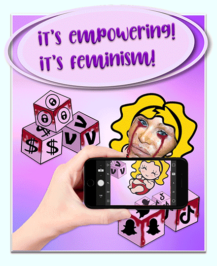
Iris Lee Your piece is so captivating to look at. My eyes immediately go to the woman’s face in particular as it’s so jarringly separate from the consistent cartoony, magazine style of everything else. To me it looks like Donatella Versace but correct me if I’m wrong. What made you decide to include this woman’s face specifically?
Alyssa Chandler Thank you so much! I definitely wanted the woman’s face to contrast with the cartoon style of the rest of the poster so I’m glad that was one of the first things you noticed! I believe the photo is of Jocelyn Wildenstein but I definitely see where you got Donatella Versace from. I chose Wildenstein’s image after researching extreme plastic surgery cases when I came across a Paper magazine interview she did titled “Jocelyn Wildenstein Doesn’t Care What You Think of Her.” I thought this article (and specifically the title) embodied my poster’s message – the branding of issues as “feminist” or “empowering” even though these topics are often a response to and perpetuation of the patriarchy.
IL I think this really brings to light all of the controversy around plastic surgery. A common argument I hear is that people just need to be transparent about the work they’ve done. However, I don’t think that just being transparent about it removes them from this culture of promoting unrealistic beauty standards. People think that just being transparent excuses them from perpetuating these beauty standards and they feign ignorance. The same goes for social media platforms that feign ignorance and innocence even though they are clearly exploiting the insecurities of young girls under the guise of feminism and empowerment. I just love how your poster brings up a topic that so many women relate to, are angered by, and are passionate about. It seems like it’s a topic you’re passionate about as well. Did you have any other subjects you were thinking about exploring in the early stages or were you set on this topic since the get-go?
AC Thank you so much! I totally agree with your points and definitely think that celebrities, especially influencers whose appearances are at the forefront of their brand, should be transparent about any plastic surgery they have gotten but that this transparency does not remove the root of the problem. Before fully leaning into this piece I had another potential topic – the dissociation and detachment from reality that social media causes but ended up choosing this topic. However, I think both topics have a lot of crossover and both highlight societal issues that primarily target and profit from young girls.
IL The overall feel of the poster is very nostalgic, J-14 magazine-esque. Is there a particular reason you chose this art style in relation to your topic?
AC I love that you said that! I actually totally did not intend for the poster to look J-14 magazine-esque but I love that reading and definitely see how it can be understood that way! I think that totally underscores the impressionability of young girls and I can even remember reading those magazines when I was younger and how they shaped my perception of femininity and myself. I initially intended for the poster to be emulative of early 2000s baby doll and toy packaging to underscore how intertwined this problem is with capitalism but teen magazines of the 2000s and 2010s also totally fit the bill of my topic! The idea of selling or buying something is definitely a main theme I wanted to push in my poster and I wanted the girl’s body and face to be both the seller, buyer, and object and the viewer themselves to be forced into an active role of participation where they are the browser. With the initial idea of the poster serving as a standing for a baby doll box, I almost wanted the viewer to imagine themselves as if they were in a ToysRUs browsing a toy aisle finding this absurd babydoll. I included some baby building blocks on either side of the girl that have social media and capitalist symbols because I wanted the message to be “Empowering Baby Doll comes with her own faux empowering building blocks” or something along those lines.
IL And what was the process like for you? You have all of these ideas and intricate meanings; did you have it all planned out before or did new ideas emerge as you created your poster?
AC I definitely created meaning throughout the process and I didn’t actually end up adding the blood, syringe, or photo of Donatella Versace until the very end. I played around with different themes and imagery throughout the process because I really wanted my intuition and subconscious to be drawn to certain images and for the final image to be a result of unplanned instincts.
IL To me it’s pretty clear that your poster is critiquing society’s normalization of the oversexualization of young girls on social media. Are there any specific, individual parts of your poster you wanted to further break down for your audience and your mindset regarding decisions you made to further portray this subject?
AC Yes! I definitely wanted my poster to critize society’s normalization of the oversexualiton of
young girls on social media and specifically how society labels these things as “empowering” and “feminist” while profitting from these pressures. I additionally really wanted to stress how performative every aspect of this discourse is – from those working in the plastic surgery field saying it’s empowering women to celebrities who get plastic surgery and say it’s empowered them to those defending celebrities for getting plastic surgery because it’s empowered them because, while that may be true for individuals, it fails to touch on the root of the problem which is that plastic surgery is a tool for people to better fit into societal beauty standards that are inherently misogynistic, racist, and harmful. I wanted to highlight this performative nature and how much of this discourse occurs on social media and much of the motivation of people to get plastic surgery is to look better on social media – which is why I included the hand holding an iphone camera. Additionally, this message that plastic surgery and hypersexualizing oneself is empowering is very attractive and branded well via social media and advertising which is why I wanted the viewfinder in the iphone camera to be very aesthetically pleasing and nice to look at while the “reality” behind the camera is defigured and hard to look at. Lastly, I wanted the color scheme and fonts to definitely draw from conventional gender roles – hence the pink, purple, and bubble words.
Overall, I believe that companies and the media sensationalize and market topics such as plastic surgery, pornography, and kinks under the guise of female empowerment which can often lead to pressuring young girls into believing they must participate in these industries in order to be “empowered.” I personally have nothing wrong with individual women participating in plastic surgery and sex work but I think the world needs to be more critical of how we frame and talk about these topics, especially when it comes to social media apps such as TikTok and Instagram which many minors have access to. If society fails to have these conversations, we will never be able to get to the root of the problem and begin to unpack and unlearn the misogyny that is deeply ingrained in every aspect of our world.
IL As this is a form of protest art, I feel that it really generates conversation and necessary debate. How are you planning to spread the message and get it to the circles of people that need to start unpacking these issues?
AC I love that you brought up protest art! I really would love to use this poster to generate conversation on social media and think it would be really interesting to post it as an instagram infographic.