Influenced by the World Around: Brendan Madden interviewed by Jocelyn Chin
Brendan’s animated poster Sunset full of trash was inspired by his childhood growing up on the West Coast and seeing the rise of pollution around the world. Brendan explains how he was inspired by the coasts and beaches he grew up on and wanted to speak out about the overconsumption and pollution that has been happening in the world which often contaminates the beautiful landscapes he loves. Using Blender, Brendan creates a beautiful and relatable poster that inspires the viewer to reflect on their own contribution to pollution. – Jocelyn Chin

Jocelyn Chin I loved your poster that you made. I think its so relatable and very impactful. So the first question is, what is your inspiration behind your poster?
Brendan Madden When I was making my poster and was thinking about the different political commentaries that I could be making, I thought about the environment. I like going outside and doing things outdoors and it has always been like really important to me. And so I thought of the different places I spend time in. Some of those places are the ocean or the lake, by my house in Washington, or the ocean in California, and seeing that sometimes there’s garbage all over the place. That’s just not a nice place to be at. At very surface level, it doesn’t look nice, and it’s not like pleasant to spend time there. But then, if you think about it more, there are animals that are getting hurt. There’s plants that are getting destroyed, whatever ecosystems that are getting like destroyed by all the garbage, and then on a massive scale it’s filling up the entire ocean. So there are different levels to the problem with pollution. And I thought that this poster was one way that I could like show that happening.
JC Yeah that makes a lot of sense. I agree that there is so many nuances to the problem of pollution, especially within the oceans. So when making the poster, did you use inspiration from your home or places that you grew up in? For example, from the beach at home or reflections and landscapes that you had seen.
BM It’s really cool when it’s like clear day, and the sun is bright orange or yellow. I tried to replicate that in the poster. But then, sometimes, yeah, I do see, the garbage all over the beach. You don’t see tires floating in the water here, but around the world there is, because the water is covered in garbage. So I kind of tried to show something that’s realistic, but at the same time like representative of more pollution if that makes sense, like pollution in the ocean as a whole.
JC Yeah, that makes total sense. And then talking about like those parts of the pollution. What was your biggest challenge for you? When we were making the design, I know we’ve like talked about putting in physics into the pollution, so could you talk about that?
BM I think the hardest part was definitely the physics of the pollution. The ocean itself is a little plane, but then it has, like a like an ocean modifier applied to it. So the plane, like the geometry itself, is not actually like moving like the ocean is. It’s just like the plane being deformed to look like it’s moving. And what that means is that there’s no geometry that I could link the different pieces of garbage to, so I couldn’t make them move up and down in one place like they were floating in the water, and it wasn’t like a real fluid. It’s not like a fluid simulation or something that blender can do, so they’re not actually floating there. I had to click each one and move it up and down with the animation while it was going to make the most realistic floating I could. But, as you can see there they kind of jump up and down a little bit, or the movement is sometimes a little jagged, because it was pretty hard with the mouse to follow where they should go.
JC Yeah, that also makes a lot of sense. But I feel like despite that, if you didn’t tell me that, I wouldn’t have known. It still looks pretty realistic for being keyframed.
BM I agree that I think it did turn out well. I’m pretty happy with it.
JC I definitely agree. Also, when thinking about your inspiration of your poster, did you think of an intended audience in mind of who you wanted to share this with? Where do you see this going if you were to publish it somewhere?
BM I don’t know. I don’t know that I was focused on college students, or people who are polluting or anything. I don’t think it has a specific audience in mind, but I think it can be applied to like a few different situations. For example, corporations that are dumping garbage in the ocean or countries. I guess that they just dump all their garbage on the ocean instead of in landfills like could be one audience. But then it could also be like a message to the consumer. Even if you think you’re recycling things and doing it as well as you can, maybe a better solution is just to not consume as many disposable things because of just the sheer volume of stuff that ends up in the ocean. So yeah, I think I think it is applicable to a lot of different settings.
JC Right. That makes sense. I can totally see this applied to many settings with different audiences in mind since it is so broad. I guess my last question is, if you had to go back and redo something on your poster, if you had like unlimited time, and you could spend forever on it, what would you change? Or would you not change anything at all?
BM I think I would change the font. I think the font of the text is a little boring. I didn’t really spend enough time playing around a different font to make it look either cooler or more applicable to like a sunset scene, something like that. And then also, I would like to figure out how to make the trash actually float in the water. But I think that would be a larger task that would take more time. So I think that if I really had a ton of time, I could figure out how to do all the fluid simulation, but that just wasn’t doable given the time that we had.
JC Right, that makes a lot of sense. Thanks so much for your time! I loved learning more about your poster!
Jocelyn Chin interviewed by Brendan Madden
Jocelyn Chin’s Why Do We Work is an animated poster featuring gears rotating clockwise and counterclockwise, moving as they would with their teeth interlocked in a physically accurate render. The gears are large, each containing a model of a different person running with the gear like they are on a treadmill, while the background of the poster loops while shifting from “daytime” to “nighttime” and back. The poster’s commentary is on corporate and capitalist culture in America: people are expected to work day and night with no end to their “grind”, all while acting as only small parts of a larger machine. – Brendan Madden
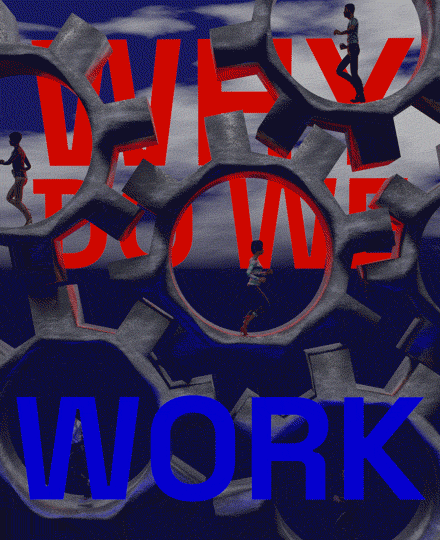
Brendan Madden In terms of the politics behind the poster, the message kind of appears to be people working in a larger machine, and it seems to refer to capitalism or the daily grind that everyone is subjected to in work. I was wondering what your thoughts were on that.
Jocelyn Chin Yeah, I think that’s exactly where I was going. It started out thinking about the hustle culture at Penn, just how everyone is really pre-professional, and it always seems like everyone’s working, and they don’t really take care of themselves or get themselves a break. But then that was also furthered by thoughts of postgrad where you’re thinking about how it’s going to be so mundane or routine to just continue working all the time. And these big corporations, especially at Penn, where everyone gets these crazy jobs. So that kind of inspired my poster to kind of be a commentary on like thinking about what our motivation is, and why we work.
BM Yeah, like being a small part of a huge machine. Do you think if you were a different year, like if you weren’t a senior, and also you mentioned Penn specifically, do you think if you were somewhere else, or if you were a different year that you wouldn’t have been thinking about this when you made this poster? Is this more important to you now?
JC Yeah, I definitely think it was Penn and the environment of being in the northeast with all these big cities. And then also, just being a senior, thinking about my life affected the poster as well. I feel like in like the Midwest, for example, the work culture is definitely different. There people are more relaxed and it’s not so Hustle Culture. And I think also, there is a huge reflection on Hustle Culture during Covid. So that was something that like made me kind of think about it more.
BM Yeah, that makes sense, I think, being from the West Coast, I see that people generally don’t work as hard as they do in New York. There, people are always working 60, 70 hours a week, while everybody on the West Coast, especially in tech or software, or whatever is working like 40 hours a week and thinks it’s too much. So it’s just different cultures, I guess.
JC Yeah, I think that’s really interesting that, like geographically, it’s different, because growing up in the northeast, it was always the same. I think I was like, “oh, this is just how it is”, but it really isn’t.
BM I guess, in terms of the art itself, the poster itself, you mentioned that the people are models that you downloaded somewhere, were there different ones that you could choose from, and then also where they already animated? Did you have the option to pick running ones?
JC Yeah, so there’s a website that makes them all. I think you can choose like the type of character like what they look like from like a preset option. Then you can also pick like hundreds of different animations, so what I chose was the treadmill effect, so that I could get it looking like they are running in place, and then I cut it down so that they didn’t speed up, because that’s what the animation had originally.
Then when choosing the different characters, I wanted to make them all be relatable, like young adult age, but also thinking about how to represent diverse sets of people. So, I tried to choose as diverse of a set of people as I could, given the limitations of the characters.
BM Cool. Is it a loop that they’re doing? Is it like they’re only taking 3 or 4 steps? And then you just loop that a bunch of times?
JC Yeah, I think the loop of the person is much shorter. Actually, it’s only like 41 frames, and then I just extended it out, so that loop repeated like 4 times within the bigger loop of the poster.
BM And then for the gears. I’m trying to think about how you actually did that. Did you place them somewhere, and then just make them all spin at the same speed, so that they ended up lined up?
JC Yeah, they’re actually not interacting with one another. It’s just it just looks like they are, which is also kind of difficult, because I didn’t realize how weird it would be for gears to all line up with one another. So that’s why there are some weird gaps. But yeah, they all are spinning at the same rotation speed just opposite directions.
BM It looks cool, it looks pretty realistic, like the gears moving as they should be. Last question – how did you pick the color of the gears and make the material?
JC I looked up a tutorial online, but what I wanted to do is make it look like more corrosive, kind of like the humans are tired, and the whole machine is tired. So, I used different nodes on Blender and you basically put materials on nodes and you’re able to add sub layers underneath. There was a tutorial to make it look metallic and then have all different levels of that material.