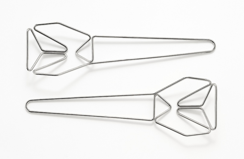
Certamente Tableware, Konstantin Grcic
Grcic’s salad server set is an investigation into lines and planes. Being made with only one continuous piece of thin metal wire, this salad server features a minimalist tone with decorative elements created from the curves and pointed edges the line is bent in. The functionality of the salad server is still kept intact while the tool itself uses less material than say a traditional serving spoon. This salad server is part of an entire set of tableware called Passami il sale, meaning “pass the salt”. The set was created with the skills from local craftsmen from the north of Brescia in northern Italy. With such a simple yet complex design, Grcic has created tableware made to be appreciated but also to be used effectively.