Grey Held

Grey Held

This only loosely qualifies as a poster, but, earlier in quarantine, I was going on a lot of walks through my neighborhood and noticed this sign for the first time. I had never looked closely at it before because from a distance it just looks like a bus stop sign, but it’s actually a poem by Grey Held. It’s a really lovely poem on its own, but the presentation on the “bus stop sign” completely changes it. The way it uses the “bus stop” text as part of the piece and how it’s hidden in plain sight gives it such an allure for me. Like, I wonder how many other people have noticed it, and I wonder how many people have walked by it and not read it (like I did for… 15 years?). It’s stuck in my head and now every time I go walking through my town I take an extra second to look at every sign or poster where there might be another poem waiting for me to finally find it. I’m pretty sure this is the only one, but I still look, just in case there are other little hidden snippets of art.

Smiley Face :)

Smiley Face :)

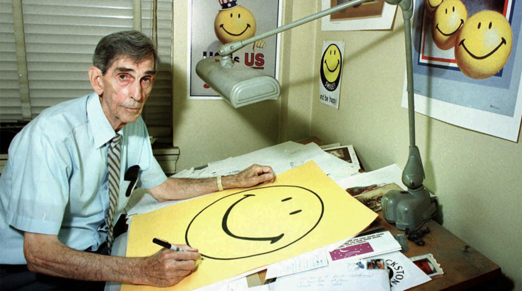
As I was trying to figure out what icon or object to choose for my project 2, i thought of tracing back the history of emoji as that is something we use often. Then, I wondered how the smiley face was invented so, of course, I went to our best friend google and searched. Turns out, in 1963, a graphic designer Harvey Ball was commissioned by State Mutual Life Assurance Company to create an image to boost staff morale. Interestingly, he only took 10 minutes to come up with a deconstructed smiling face on a yellow paper, in which he only chose it as it was sunshiny and bright.

The only way to chop an onion

I guess this is going to turn into a cooking blog. I have consumed a lot of cooking media over the years and one thing that I have come to realise is that professional chefs are so often terrible teachers of home cooks. Whether it’s Gordon Ramsay, Jamie Oliver, or Marco Pierre White to name a few, in their books, TV shows, and youtube videos they instruct you as if you were a young chef coming to work in one of their kitchens, or maybe just that you have ambitions of cooking professionally period. And I think it’s fair to say that most of their audience will be home cooks who just want to get a few tips on how to roast a chicken from Jamie Oliver because they assume he’s probably roasted his fair share of chickens in his time. But what you often get is how chickens must be roasted in his kitchen in an incredibly clinical, precise, specific fashion in order to satisfy their quality control. So many key considerations to home chefs like availability of ingredients, time, or equipment; the experience of the individual cooking; and even the amount of cleaning up you will be left with don’t even cross the minds of these chefs because their cooking motives and goals are completely different to that of most home cooks. And it seems to apply to most chefs that I am aware of, particularly of a certain generation, who started in the intense, demanding atmosphere of a professional kitchen before transitioning more and more into media. And some people might not think this is a big deal, and in the grand scheme of things there are obviously much bigger issues in the world than chefs making cooking less approachable and accessible, but I think it is – ironically – something that pushes a significant number of people away from home cooking. If you don’t have the exact ingredient, pan, oven etc that the recipe calls for and no alternative is provided, it can be an incredibly frustrating experience. The idea of improvising seems daunting when you don’t have much experience and the consequence is potentially money out of your pocket, time wasted, and a longer wait for your meal (and the reality is it is actually really difficult to make something actually inedible but that worry is very prevalent, and the likelihood is often exaggerated by the way that these instructions are often presented). It’s a massive shame most of these chefs don’t seem to use their massive voice and reach as positively as they could, by presenting cooking in a more approachable way, but it’s not surprising given every hobby, industry, niche seems to have its own gatekeepers. Fortunately, there are more and more people – whether they’re professional chefs who went to culinary school or avid home cooks – who are producing really approachable, accessible written content and video content tailored towards home cooks. So now it is just about supporting those individuals so that their reach surpasses that of the chefs who insist you have to be able to perfectly chop and onion into 5mm cubes in 20 seconds and make perfect hollandaise. I bet if more people were told that they can chop their onions however they like, because 99% of people genuinely will not be able to tell the difference when they’re eating it, then maybe more people would cook.

Receiptify

Receiptify

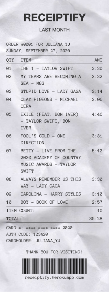
This is almost a follow up on Ayaka’s last post about an Instagram artist designing receipts for music albums. My best friend (my biggest flex I think) coded an awesome website that connects to your Spotify account to record your top played songs onto a personalized digital receipt. She was inspired by the same Instagram artist and built on this idea to create something that would allow for easy sharing across social media. This project really reminds me of the growing, transforming relationship between art/design and technology. Especially now, they are becoming even more intertwined and a part of our everyday lives.

If you ever want to check the site out here it is. Please excuse the excessive amount of Folklore on mine…

Online Presentations

Earlier this week, Apple released it’s newest iOS update. While I am not a big “technology person” by any means seeing as though I still have a cute little iPhone 6, this update really caught my attention. The way in which the user can expand and collapse these little modules (or logos, if you will) is something that caught my attention. This new update gives users the chance to choose their own designs of their home-screens even more than before, a big step for Apple which has always marketed its products as simple and sleek. With this mission in mind, Apples new update is still sleek and simple, a big reason for that being the design of each of the modules.

Github Renames “Master” to “Main”

Recent years have seen us rethink and refactor many design decisions that carry racist connotations. Git is a software version control system used by over 40 million developers worldwide, all of whom have been typing “git checkout master”, a command to access the “master” branch of a repository, for years. In the wake of the Black Lives Matter movement, however, the tech industry has made many changes to remove racially insensitive terms, such as “master” and “slave” processes, and “whitelisting” and “blacklisting”.

While these changes are obviously not a gamechanger, I think that every bit of effort to create a more inclusive tech culture makes a difference – particularly when it’s already not easy for Black programmers to enter the industry. Although it will take a while to get used to typing “git checkout main”.

Kildren: Where Doodles Meet Realism

Kildren: Where Doodles Meet Realism

I am always trying to gain inspiration from contemporary and younger artists. Each artist has such a unique style that is constantly encouraging me to break the boundaries of what I perceive as art. An artist I have been loving recently goes by the name Kildren (@kildren on Instagram) who specializes in combing photorealistic portraits with bold colors, strokes, textures, and doodles. Each piece is so creative in unique, showcasing both his technical skills but also his ability to take a simple portrait up ten notches by incorporating more modern designs and bright colors. He works in both the digital space and using paint on canvases, yet manages to achieve a similar effect regardless of the medium. All of his pieces are so captivating and gorgeous to look at.

The Parthenon

The Parthenon

In my architecture class, we have been exploring the ancient Greek temple dedicated to Athena in the age of Pericles known as the Parthenon. While much of the interior was destroyed, its remains best exemplifies the various components of Greek architecture and temple construction. The Parthenon is a Doric temple, which artfully incorporates thicker columns and a more massive appearance (sometimes called masculine) than its Ionic (feminine) counterpart. The Parthenon still includes selected Ionic features, however, producing a building which many of the world’s top architects and designers have called “perfect”. Although a number of aesthetic elements were calculated to make the building appear as visually perfect as possible, it has also been said that “nothing is as it appears”. For example, although the lines and distances in the Parthenon appear to be straight and equal, horizontal elements were deliberately curved and vertical columns “fattened” in the middle to compensate for the imperfections of the human eye. These geometric adaptions and thickening of lines made it look as though the columns were strained under the weight of the roof, therefore making the temple less static and more dynamic. All in all, I chose to write about the Parthenon because its unique architectural composition highlights the beautiful interplay between lines and structures with elements of perspective, illusion, and distortion.

Brutalism: The Return of the Creative Web

Brutalism: The Return of the Creative Web

On the early days of the web, websites were a free canvas in which designers expressed their ideas in their very own way. There were no rules, no UX design, no minimalism, and no Dribbble. In the 2010-20 period, companies like Airbnb, Apple, Instagram, among others, became the main inspiration of many web creatives and the web started to look (and feel) like a huge ocean of same-ness, full of minimalist white cards, san-serif fonts and eye-catching professional photography. These decisions were driven by the rules of efficiency: interfaces needed work as a super optimized lead-generation & conversion medium. 

Now we are seeing a anti-commoditization of the web mainly driven by the public perception of these companies not creating true, transparent progress in our societies. People are more acquainted of the conscious, nefarious manipulations these platforms do to their users and, consciously or not, web creators are starting to express their discrepancies by breaking the established rules of the web. Consumers follow this trend too: indie new products such as poolside.fm, are.na, or muze.nyc are super popular among early adopters. Designers are creating, again, original content on the web, breaking the invisible  boundaries of what was once believed “good minimal design” and disobeying what the market-efficient rules of design dictated.


Apotheon

Apotheon

Apotheon is a 2D action game whose art style and narrative is based on Ancient Greek mythology. I was thinking about this game after our conversation about appropriating art, and I think this game does a good job of celebrating and appreciating this style rooted in Greek culture instead of just borrowing parts for the aesthetic and failing to really represent the culture it’s based on (but correct me if I’m wrong, I’m no Greek mythology expert). I also just think games with unique art styles are super cool because games are such dynamic mediums. It’s like trying to frame movie shots without having control of the camera. The different ways developers try and guide the player’s point of view and form scenes that can be engaged with functionally in many ways but are still visually pleasing regardless of the player’s choices are really fascinating to me.