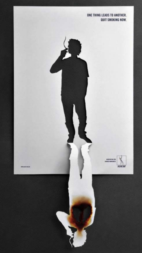
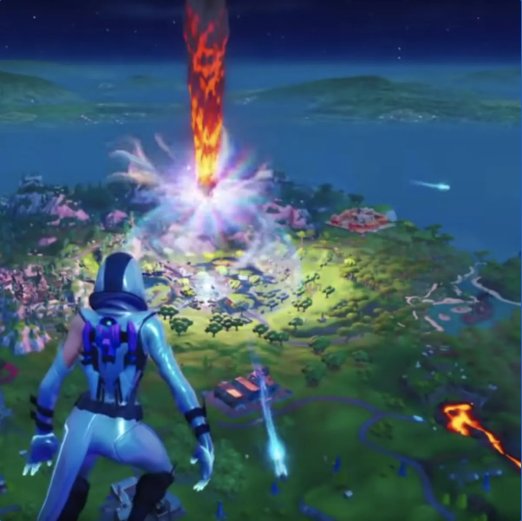
Fortnite

Fortnite

The video game Fortnite starts when a group of people drops onto a large island. For the next 20 minutes, they must search buildings for useful weapons and equipment, before fighting to the death. As the game progresses, the playable area shrinks, forcing the competitors closer together and the last person standing wins the Battle Royale. This game incorporates a multiplicity of art and design elements, most notably seen in the scenery, the detail-oriented equipment, and the sound effects. These design elements are a huge part of what locks users into this addicting game, in particular the use of sound. Fortnite utilizes careful sound design by implementing it where other design aspects are simplified. For example, when a player enters a building, the interior structures aren’t too complex in order to amplify the sound of footsteps pattering near the area. Furthermore, Epic Games is constantly updating the game’s mapping design, particularly in its environmental layout and costume design. Players are able to customize their apparel to reflect a personality, but this can only be done by leveling up or unlocking certain features. The more advanced a player is, the more versatility they have in designing their outfits. This serves to keep players continually interested and alerted of new quirks in the game, ensuring that no player gets too comfortable and all players are constantly being challenged. More broadly, this process reflects a common pattern within the medium of design, which the constant need to evolve and innovate in order to keep viewers on their toes.

Hoa and Cuphead

We’ve talked a lot about how artists use games as a medium for their works, but I’ve also been interested in how games borrow from existing art. For example, Hoa is an absolutely beautiful indie game that is based on studio Ghibli movies. The art style is an absolutely perfect recreation of the movies and the animations/gameplay seamlessly incorporate the style. I highly recommend you google and watch a game trailer – you can’t totally understand how well-executed it is until you see it. Another really incredible looking game that recreates existing art styles is Cuphead, which looks exactly like an old hand-animated Disney cartoon. Making these games looks super labor-intensive, but with increasingly powerful image processing and generating technology, I wonder if more games like these will be possible in the future. 

Philly’s First General Strike

Philly’s First General Strike

Since we are working digitally to create a modern form of poster, I wanted to look at the history of posters, specifically in political/social contexts. I initially thought to start with Martin Luther’s posting of his 95 Theses and the invention of the printing press but I’ll spare you the 5 centuries worth of history… I wanted to look at the first protests and strikes in America and found that the first general strike, in which most of a region’s labor force participates, actually happened in Philadelphia. In 1835, coal workers went on strike to demand a 10 hour workday. Given Philly’s history as a political hub and industrial center, it’s interesting to see how it’s remained a major player in American politics and the home of countless revolutionary protests. The picture above is from a 1902 child labor strike also in Philly. The slogans on their posters are simple and cleanly designed, which only draws attention to the blunt cruelty of their situation. The use of slogans and short catchphrases continues today, I think because the impact of the slogan lies in the fact that it is so digestible — succinct in capturing an entire movement.

The view outside my window…

The view outside my window…

The sign protest of all sign protests HAS to be those on street signs: a government posted item that you are nearly forced to look at if you are going to move safely makes the perfect place to post your PSA. In this specific instance — which I found by simply looking out my window a few weeks ago — the message of the protest is rather unclear. The idea that one can post these protests on a sign and have them stay there and make this sort of lasting impact is, to me, the interesting part. The idea that there can be such a long-lasting message that just stays there and also leaves you thinking is what makes it so powerful. In this one particularly, the color fits right in with the classic STOP sign red and the placement of the words — directly below and still fitting within the octagonal shape — also lead to the power of the protest, as it feels as if it is a part of the sign (or poster) itself.

Philadelphia Murals

Philadelphia Murals

When thinking of posters and banners I thought immediately of all of Philadelphia’s murals. Philadelphia is filled with murals all throughout the city on various buildings, walls, and even houses. These murals range from simple flat designs to vivid illustrations and social commentary. My favorite mural in particular is on 44th and Lancaster on the side of the Sunshine Market. It features a massive geometric, kaleidoscope, sun design with warm colors.

After some research I learned that an organization called Mural Arts of Philadelphia helps maintain and facilitate the creation of new murals. They engage in 50-100 public art projects each year and work in communities all around the city. These murals are often used to relay messages regarding social justice and cultural heritage. The murals of Philly make this city beautiful and special, serving as a great tool of communication for important issues and commentary.

Yang Zirong

Yang Zirong

I had a hard time thinking of a poster, so I asked my parents over dinner to name a poster that left a deep impression on them when they were growing up. Their first answer was Mao Zedong’s portrait. I asked which words usually accompanied it, since word and image are always intertwined in posters, and they answered, “Long live Mao Zedong”. But they warned me not to write about him, because “you never know”, in “30 years”, someone might uncover my passing intellectual interest in a famous communist and mistake me for a communist. Whatever. We all talk too much about Mao anyway.

So the second most familiar poster to my parents throughout their childhood is that of Yang Zirong, a slick People’s Liberation Army (PLA) soldier who goes undercover amongst a gang of armed bandits in the Tiger Mountain in Northeast China during the Chinese Civil War. His adventures, based off a real soldier’s life, were popularized by the novel Tracks in the Snowy Forest and its Beijing opera adaptation. Like any other person whose face would be on posters during my parents’ generation, Yang Zirong was a model communist.

But that’s not what he’s remembered for–according to my mom, Yang Zirong was cool. “Like 007”, she said. Looking at the poster now, she feels admiration. His striking eyebrows, fierce glare, and flushed face, rendered in painstaking detail, set an intense mood. The back lighting, which you can see from the highlighted outline of his hat, make the image more theatrical. Yang Zirong is strongly associated with model opera: his story told in Taking Tiger Mountain by Strategy (both the name of the play and the large red text underneath his image) was one of only eight plays featuring model revolutionaries that could be shown during the Cultural Revolution. His pose in the poster is dynamic. With a gun in hand, he’s clearly an action hero – he even has a cape!

It might be just that my mom’s a bit of a fangirl though, since my dad isn’t nearly as excited about him–he finds his story to be a bit fake. But he agrees that Yang Zirong’s image was ubiquitous; people put him up in their homes, in stores, in classrooms. In my mom’s opinion, Yang Zirong’s personal heroism outweighs its propaganda. He’s definitely more like a wuxia hero – he fights a gang of bandits, generic and uncontroversial villains, rather than the Kuomintang or the Japanese, which makes him much less political.

But to me, the work just oozes Chinese communist vibes – just red Chinese characters underneath a PLA uniform alone is enough to make the association unbreakable. I honestly have a hard time seeing this as anything other than propaganda. This makes an interesting case study of how you have to grow up during a certain period with a certain culture to feel that emotional connection.

Modern times posters

According to Wikipedia, a poster “… is a temporary promotion of an idea, product or event put up in a public space for mass consumption.” But what is “public space”? Now more than ever, public space has migrated from physical places, bars, clubs, universities, etc, to the digital space. This migration has been occurring for years now, but perhaps it is more evident now that we do not have an alternative while COVID forces us to isolate and communicate using the internet. 

With the prevalence of digital media, traditional posters have lost their significance and they are no longer the dominant media for advertising and propaganda. Leveraging on modern media, other types of visual expressions such as GIFs, “stories, or memes are now used to convey the messages traditional posters used to. But are these posters too? I believe they are. They present to us ideas in the digital public space and convey messages using visual elements and text. There are not so many differences between Toulouse Lautrec’s posters and some of the visual work one can find on the internet today. The tools and process for distributing the message may be different but, in essence, they serve the same purpose.

In modern times, the definition and uses of posters are broader than ever and traditional forms coexist with modern, more experimental ones. One very interesting use of traditional political posters in modern times was Obama’s HOPE by Shepard Fairey in 2006. It was widely adopted and distributed and conveyed a clear political message to the people, bringing back the classical use of this media and making it mainstream. It worked as a flashback to the most classic use of this form of communication and people adopted it massively.   

Plastic Sushi

Plastic Sushi

As humans, we somehow like to think that we are immune to the ramifications of our own misdoings. This poster is meant to raise awareness on the topic of ocean pollution. It achieves this message by presenting a sushi roll, wrapped in plastic, rather than seaweed. The rolls are filled with trash rather than fresh fish.

This explicit graphic poster might seem like an exaggeration, but the statistic underneath functions to contextualize and legitimize the meaning behind it: “Fish off the West Coast ingest more than 12,000 tons of plastic a year.” Even though we can’t see it when consuming freshly sliced sashimi, we are consuming our own waste without any reprise.

This poster prompts us to think, if humans don’t care about what they put out into the world or what they put into their own bodies, then what do we care about?

Beyond the Poster – Innovation in Design

Beyond the Poster – Innovation in Design

There are a plethora of incredibly well-designed posters, but the ones I personally find most intriguing and eye-catching are those that go a step beyond design. Posters that are interactive or utilize the space around it in a unique way are both creative geniuses but also, they often convey a more impactful message. The first poster is an anti-smoking PSA, which effectively uses the cut-out silouhette of a human that now doubles as two people: one healthy, and one unhealthy. The second poster is an interactive station where people could charge their phone that also encourages them to donate blood. The metaphor of the charging cable as blood running through someone’s veins is significant and powerfully reveals the important of blood drives. They are both posters which extend beyond the typical ‘rectangle’ boundaries of a typical poster.

Pro-Life Posters

Pro-Life Posters

A common tactic used by Pro-Life supporters is using extremely graphic protest posters. Through the use of these images, the supporters hope to get a disgusted reaction out of people walking by in order to convince them of how abortion is “murder”.

However, these photos have tended to originate from extremely improperly performed abortions where fetuses were disposed of incorrectly. Many of these photos can even be attributed to one source, professor Monica Migliorino Miller from Madonna University who sells these photos of fetuses she found in dumpsters.

While these photos do display a horrifying form of abortion, part of the reason why many want to enforce the legalization of abortion is to prevent situations like these. If abortion becomes criminalized, many women will seek unethical and illegal sources to perform the operation, meaning these occurrences are even more likely to occur.

Although these images are quite visually disturbing, I argue they can actually serve the opposite purpose intended by its users, showing how the criminalization of abortion can be highly risky and dangerous for women in need of help.