Bella Jiang interviewed by Grace Jiang
Grace Jiang Your piece really makes a strong first impression, and it’s clear that there’s a deeper meaning to your artistic choices. What was the inspiration behind your piece, both stylistically and idea-wise?
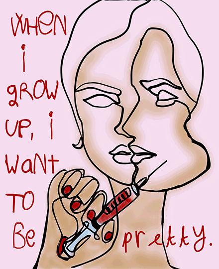
Bella Jiang I would say I’ve been thinking a lot about the way our social standards for beauty in women have evolved over the years, and in particular how they’ve seemed to have snowballed really quickly in the wake of the Internet/social media/augmented reality technology, most recently. I became aware of how deep this pressure goes when I began to notice young girls, even those still in elementary school, using filters that would alter their faces beyond recognition in the semblance of beautifying them. The kind of beauty these filters would strive toward were distinctly white and Eurocentric in their features – some of the most popular ones (“Freckles” comes to mind) lighten skin, contort noses into customarily Western forms, and change eye color (often to green or blue) – and this made me think of how children growing up with social media are very likely bombarded by these images to an extent that probably feels normal at this point. Doing a bit of reading, I also learned that plastic surgeons have increasingly found that women are coming to them with images of Snapchat filtered faces, images doctored by Facetune and Photoshop. Plastic surgery itself isn’t an issue, I don’t think – it’s the pressure to look a certain way mostly, and how this can bring young women down/lead them to emulate extreme and often specifically Eurocentric standards, that I think is potentially damaging.
GJ That makes a lot of sense! The pressure to fit into Eurocentric beauty standards is definitely a problem I’ve also noticed in our society. One thing I noted is that your piece includes 2 perspectives of a face; does this symbolize anything in particular? Or are there any smaller aspects of your piece that have double meanings that you want your audience to pick up on?
BJ I did the face roughly in the style of those minimalistic, single-line drawings where you don’t lift your pencil from the page, and in particular I wanted these faces to represent perspectives of the same person’s face. One would be progressively ‘beautified’, piling on layers of modifications, and the other would accumulate the marks of the cosmetic procedures that a woman would have to subject herself to on the way there. Maybe another quirk of the piece would be the styling of the words scrawled out in red, I definitely spent a while narrowing down and then fine-tuning the customizing of typefaces for each letter, and ended up drawing from multiple typefaces to achieve a more irregular/organic look that would be typical to a young child’s handwriting.
GJ Wow, it’s clear you put a lot of thought into your stylistic choices when creating this piece. I think your piece in general has as lot happening, which is a great thing and gives it more character, but if you had to pick just one message to leave with your audience, what would it be?
BJ I think in making this piece, I mostly wanted to convey how today’s beauty standards have the potential to become rather toxic for women and young girls. Extreme beauty standards have certainly become less overt in the U.S. over the last few decades, but I think through more pernicious channels like AR filters, they’re still being embedded subconsciously into young women in a way that could be very damaging to their mental health.
GJ That’s a very profound message. Thanks for sharing, Bella!
Grace Jiang interviewed by Bella Jiang
Bella Jiang For me, this piece brings to mind duality in identity, the rather opposing faces that one often has to juggle as a Chinese American. What would you say you were most interested in exploring, during this piece’s conception and/or through the making of this piece? Do you feel like your identity necessarily colors the art you make?
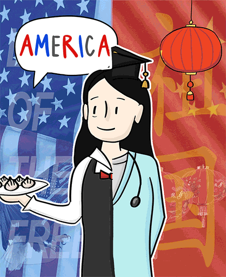
Grace Jiang I was really interested in expressing the experience of my parents as first-generation immigrants who moved to the United States from China in the 1990’s in this piece. From what they’ve told me, they had a pretty difficult time adjusting to all the cultural, language, and socioeconomic changes when they first moved. For one, they went from being college graduates to restaurant workers in order to make ends meet. They also struggled with language barriers – even though they both knew elementary English, it was still difficult to communicate fluently with many of their customers. I think their experiences as first generation immigrations have definitely in turned shaped the forming of my identity, which in turn shapes the art I create.
BJ I feel like this piece really feels alive with movement. It’s dynamic, the flags rippling in the background and the text floating in and out – in particular the constantly spinning lantern stands out to me as a choice that feels so satisfying to the eye. I’m curious as to how you animated that, and more generally in how your artmaking process looks – could you run me through the big decisions you were making with this piece’s form?
GJ Of course! In my mind, I wanted to really highlight the different experiences my parents had in both America and China, which is why this piece is so distinctly split into two halves. For the lantern specifically, I animated it through drawing each frame separately and then moshing it all together. My art-working process was a lot of grunt work of creating each of the 120 frames by hand, one-by-one, to make sure the timing of all the moving pieces was what I had in mind.
BJ Then there’s this image with choppy edges of three figures in black and white, which at once feels deeply nostalgic, like they were clipped rather haphazardly out of an old family photo. What would you say you had in mind in including this?
GJ That’s actually a picture of my mother and her parents, taken before she moved to the states. I wanted to include a “homely” element that really showed what my mother had to leave behind in order to move to America.
BJ You pay really close attention to these very fine details, and this is especially apparent in subtle touches like the shadows on the more sticker-like forms such as the thought bubbles, as well as in the little tired twitch of her eye on the ‘American’ side of the piece. I found the illustration style for the girl at the foreground so striking – she’s drawn in these graceful, black strokes that feel pleasantly simple and familiar, like those you’d find in a childhood comic book, and surrounded at all ends by a thin white outline, which for me brought to mind a an elaborate sticker, something paper-thin. These things really come together to give the impression of collage, almost, and the contrasting textures of these elements is so interesting. I’m wondering what led you to these individual decisions – how did you come to these materials/textures, and the logic of how they’re arranged among/behind one another?
GJ Yes! The artistic style I chose is meant to be more in a more “nostalgic”, simplistic style without losing it’s depth. I chose this specific arrangement of these different elements, such as the lantern and cut out photograph to represent home back in China, to contrast with the the floating speech bubbles of what my parents have actually heard here in the States. I wanted to really emphasize that although my parents and I are really grateful for all chances and opportunities we’ve had here in America, immigration is not as simple as it’s cut out to be and it has really involved a lot of personal sacrifice for my parents.
BJ At the end of the day, what would you say you’re most interested in, or perhaps most obsessed with, as an artist?
GJ I think to me, art goes beyond just the aesthetic appeal to tell different narratives. Some of them might be more serious and deeply personal, like this piece, while others might be more light-hearted and funny. Whatever the reason, I think that the intention and underlying meaning behind an artistic piece is what gives it such meaning.