Ani Nguyen Le interviewed by Ben Solliday
Ben Solliday: Ani, could you please summarize your poster?
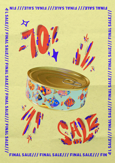
Ani Nguyen Le: With my poster, I wanted to create a parody of typical (mainly) American consumer culture billboards. My piece highlights the vibrant colors and different words or phrases associated with these types of advertisements. My goal was to produce a playful and vibrant animation while making the viewer reflect on how consumer culture works.
BS: How did you achieve the complex animations? The can is so realistic, and the words across the border look amazing!
AN: Thank you, Ben, I appreciate it. I used Blender for the can (shoutout to Avery, our amazing professor, for the help!), After Effects for the words, and Photoshop hand-drawn animation for the decoration around the can. I really like to combine all types of animations or mediums in my works!
BS: I noticed that the can is empty inside, what does that symbolize?
AN: It is meant to symbolize how most of the products we consume on a daily basis or buy because of sales are actually useless or don’t really add any value to our lives. To visualize this emptiness, I used the transparent layer’s pattern in Adobe Suite.
BS: How did you decide upon this color scheme? I’ve noticed that a lot of your work has these very vibrant colors, is this something you’re drawn to?
AN: Yes, absolutely! I love experimenting with different colors in my work, and this project wasn’t an exception either. I used complementary color pairs for my fish on the can and then later chose colors for the words and decoration to mesh with the can’s color scheme. Honestly, it’s just a lot of trial and error.
BS: Who are your stylistic inspirations and influences?
AN: I have two favorite animators currently. Yukai Du, who uses amazing colors and patterns in her work, and Marine Bufard, who is also an animator, and I immediately fell in love with her smaller moving image spots and the texture she uses in them.
Ben Solliday interviewed by Ani Nguyen Le
Ani Nguyen Le: Ben, could you begin by summarizing your poster?
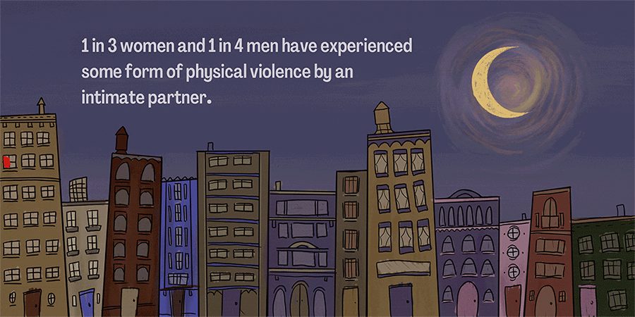
Ben Solliday: I wanted my poster to be a poignant and powerful image displaying how widespread domestic abuse is in America. By setting the background as a whimsical illustration of a city skyline, I was able to encompass a feeling of childlike innocence. This playful illustration was then interrupted with an animation of red streaking across the windows. The red symbolizes households with domestic abuse. By having the red block out the window view, I was able to communicate my message and the statistic displayed.
AN: This artwork blew my mind! What was your inspiration behind it? Or did you come up with the whole concept by yourself?
BS: I find myself drawn to my childhood a lot for stylistic inspiration. I love Tim Burton movies, children’s book illustrations, Laika movies, Jim Henson puppets. I always try to infuse that child-like imaginative feeling to all of my fine arts work, and I decided to do that with this piece. I thought having a simplistic and innocent background would be a great base, because it allows for the message to feel even more dramatic. I initially planned on creating a dollhouse and having the facade open, but I thought it was too obvious. By just having the red streak across the window, I was able to communicate domestic abuse, without actually having to show it.
AN: Lots of your other art pieces revolve around houses — is there a particular reason why you use this symbol?
BS: When I was younger my dad and I built a dollhouse. Ever since then, I’ve had a strong interest in miniature models and the idea that we can create miniature environments. I love the idea of conceptualizing a physical world, that can’t be inhabited. In my work, I find myself creating rooms and dollhouse-like imagery, simply because I find it interesting and somewhat comforting.
AN: I can totally see this poster being part of a bigger campaign. Would you consider developing this into something more in the future?
BS: Yes definitely. In high school, I had the opportunity to provide art lessons to women who resided in a shelter from domestic abusers. Hearing their stories and seeing the work they created was extremely pivotal in my decision to study art and design. Social inequities and issues always are continually pushed aside, but art and design act as propellers for their messages. Efective advertising and marketing is so important when spreading awareness. I would love to refine and develop my message and work even further.
AN: Last question. I’m so curious about what your artistic process looks like — please tell us about the timeline and process for this project!
BS: I mainly used Procreate for this project. In all honesty, I changed my concept very late into the process, thus leading me to rush some of the illustrations and animations. I hope to refine my work by spending more time paying attention to the small details.