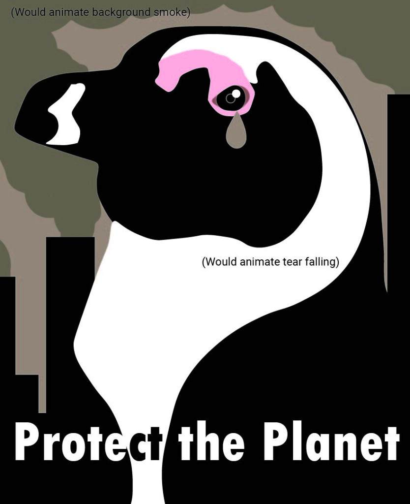
We Will Lose Our Coral: Anabelle Pham interviewed by Imani Miller
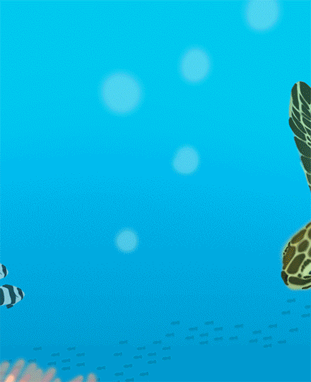
Anabelle Pham’s protest poster, titled “Will We Lose Our Coral” interrogates the effects that climate change and industrialization have on nature, specifically maritime environments and coral reefs. Through beautifully conceptualized hand drawn animation, Pham’s work attempts to raise awareness about the harrowing effects of human activities on animals, a topic that the author is passionate about. -Imani Miller
Imani Miller: So first of all, I just want to say that your poster is so beautiful. Besides the text, was it completely hand drawn using the Wacom tablet?
Anabelle Pham: Thank you, and yep, I made a lot of the different “pieces” in separate Photoshop files, then imported them as video layers so I could move them easier. The only things I did draw frame by frame were the smoke, bubbles, and water.
IM: Wow, that seems like it would take a lot of time. I was looking at your previous pieces you’ve made in our class, and they’re so cool and artistically proficient. Have you taken art classes before?
AP: This is actually technically the first art class I’ve taken since middle school. I just enjoy doing art as a hobby, but as an engineering student, I don’t often get to do art focused projects, so I’m glad I got that opportunity.
It did take some time getting used to animating in Photoshop. I’ve never really animated before so I’m glad it turned out well!
IM: Your first time? Wow, that’s amazing. Why did you first start doing art as a hobby, and what are some of your inspirations?
AP: I’ve been drawing since I was very young, like 3-5. I began drawing animals first because I thought unicorns and dragons were cool so I’d draw fantasy-type stuff like that. Then I tried doing realistic-type charcoal drawing at the beginning of middle school since my grandpa liked that type of art, but I got a set of copic markers from my uncle and got interested in coloring with those instead. I’ve never really had any “messages” or goals with my art besides just making things I like, so I don’t have any “specific” inspirations other than seeing “cool” things and wanting to make it for myself, like paintings and sculptures I can decorate my room with.
IM: Yeah, that makes sense. I noticed that you liked animals in class; in our small art workouts I’ve seen you do a lot of things with cats, which I also love. Speaking of animals, is your love of animals what inspired you to make your poster? Do you have any other motivations for focusing on climate change and its effects?
AP: Oh wow you’re really observant! And yes I do really love animals, I have 3 cats at home, ahah. When I was first thinking about what I’d do with the poster, I knew I wanted to incorporate the image of wildlife and its beauty. If I could, I’d have wanted to make the gif a little longer to spend more time “selling” the beauty of the coral reef ecosystem before it gets drained of its color. I’ve learned a lot about the climate crisis from my ENVS 1571 class and something that struck me as especially sad is the almost inevitable loss of coral reefs. If temperatures rise 1.5 degrees Celsius above industrial era levels, coral reefs will die off.
IM: Oh wow, I didn’t know that. Is this piece solely meant to raise awareness of this issue, or do you intend for this piece to be a sort of call to action as well?
AP: Because the gif is only 5 seconds long and it has a lot of movement, I couldn’t fit a lot of text into the poster so it’s meant to be more of an awareness piece bc the “calls to action” are a lot more nuanced than a singular eco-friendly habit like “don’t litter, recycle” or “take the bus/walk”.
IM: Right, that makes sense. If you had a longer time frame, would you have wanted to include a call to action?
AP: Hmm, I guess it depends. If I had more time, I’d give more “breathing” room for each “scene” and make the loop a bit more seamless. I think a full call to action would still be a bit too complex unless it was an entire video so I’d probably use the poster to direct the viewer to an external source for information regarding the climate crisis and what effective actions an individual can take that is within their means.
IM: Right. I think 5 seconds was quick, but you managed to do a lot with it.
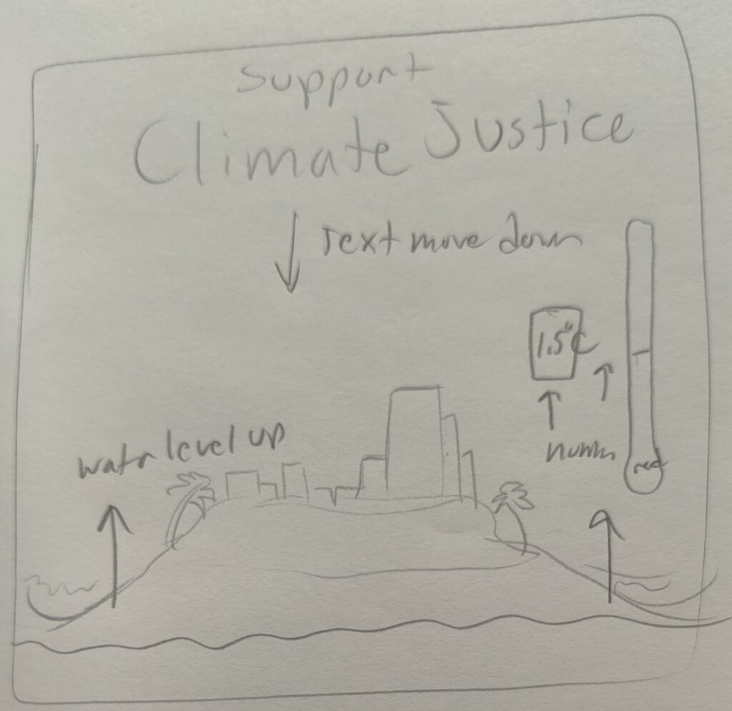
I also took a look at your early drafts. How did you go about finalizing your idea and getting from the drafts to the final version?
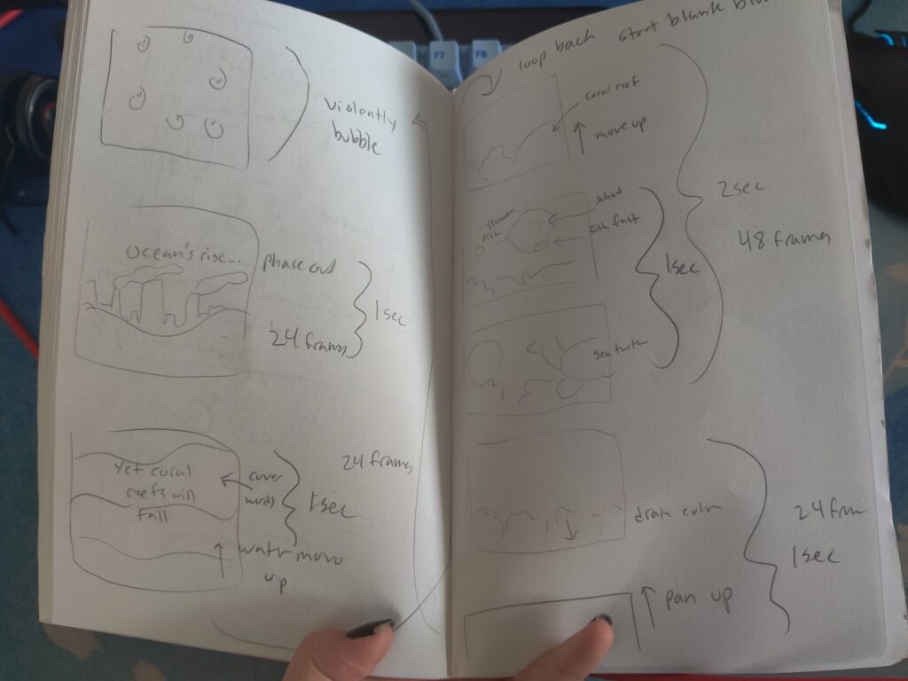
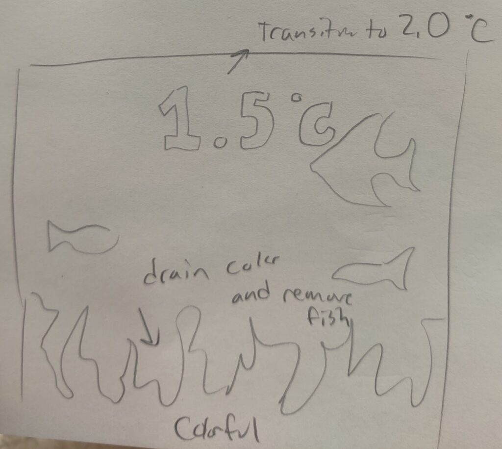
AP: Hmm, I uploaded some sketches I had from my notebook, but once I decided on the coral reef idea (I thought it would have the most easily digested message), I actually did a mini “storyboard” that I’ve seen used in animation before. I didn’t upload it since I made it after we started, but it really helped me plan out everything and how I’d tackle the animation in the time we had.
IM: That’s super cool. One of my favorite parts about animation is seeing the process and the rough drafts, and the different ways to show movement and progression as a series of a few still images.
Do you have any last thoughts about your process or the poster itself?
AP: I would say that I did originally try shading a lot more of the animation, but it’s so much harder to get the animation to look smooth with shading and light, ahah.
Thanks for the interview, you’re questions and comments helped me think more about the process than I did at the time of making it
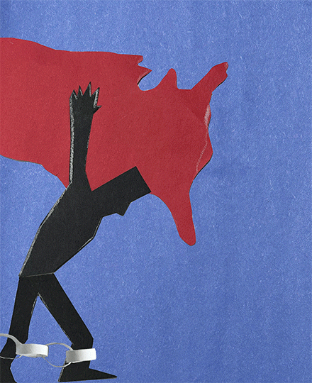
Black Atlas: Imani Miller interviewed by Anabelle Pham
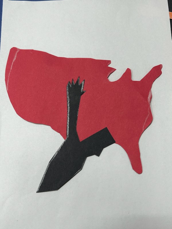
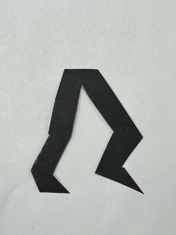
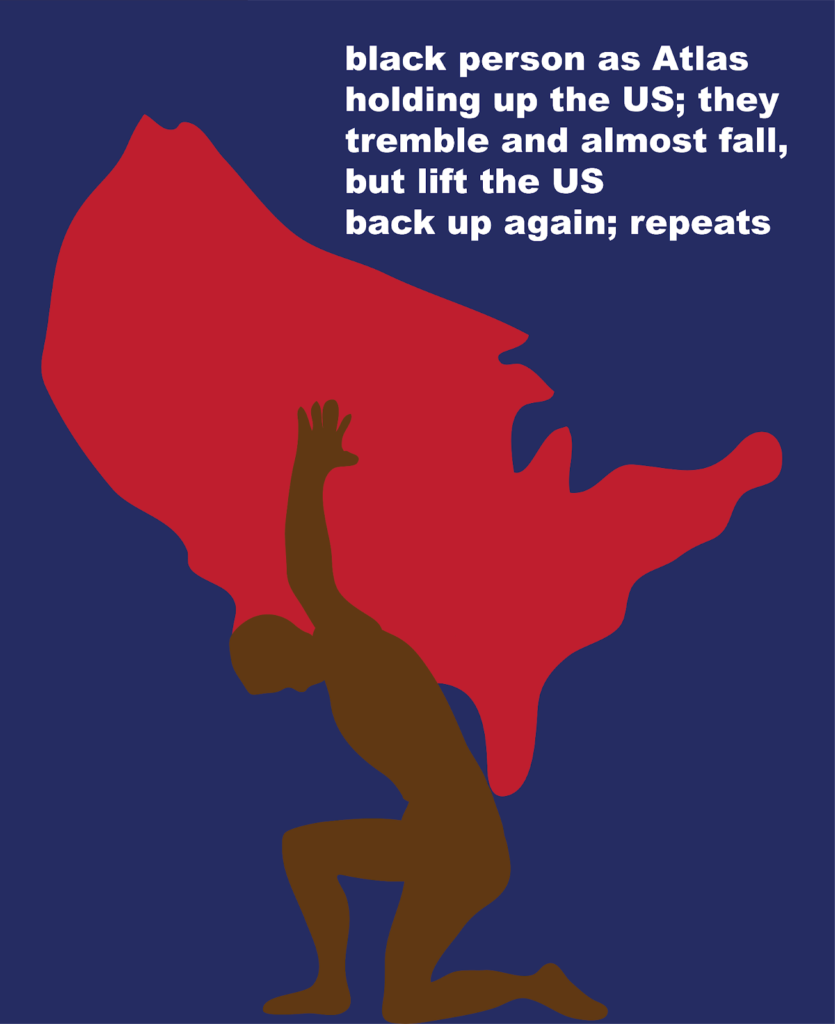
Protest poster made by Imani Miller. Meant to make “people recognize the struggle that Black people endure in the US, and that it’s often a silent struggle that has its roots in history from centuries ago” (Miller). This poster was made through stop motion animation using cut construction paper. The simple and choppy look is meant to invoke a child-like look to subvert the heavy topic being portrayed. – Anabelle Pham
Anabelle Pham: I’m really impressed by your dedication to the stop motion cut-out style, is there any reason you picked this animation method?
Imani Miller: Thank you! I chose this method for a lot of reasons, mainly that I’m not good at hand drawn animation and blender isn’t really my favorite program (plus I felt that 3D animation didn’t really fit the style I was going for), and because I really wanted a choppy, almost unfinished look for my poster. Cut construction paper is usually associated with child-like things, and I wanted to subvert that idea by attaching it to a heavy topic.
AP: Oh wow! That makes a lot of sense, it does remind me of elementary school and I can imagine this being a cut out construction paper history project. I also love the choice of material and color, the silver really pops out against the simple matte colors.
Speaking of history, I’m not good with dates so is there a specific reason you chose 1619?
IM: So 1619 is the year that around 20 enslaved Africans landed in Virginia. I don’t think it’s the exact beginning of chattel slavery in the US, but it’s the year that everyone cites as the beginning, probably because of this project by the New York Times called the 1619 Project that looks at the legacy of slavery in the US.
AP: That year I think is symbolized well within the poster, I can see how that’s something that still weighs heavily on the African community. Does that also tie into the way the gif loops where the person seemingly walks and shoulders endlessly?
IM: Yes exactly, I also wanted it to be a bit unclear if it was one person walking endlessly or if there’s a line of people walking, which is why another figure starts walking in before the numbers have completely left the screen. The one “Atlas” figure can either represent the entirety of the Black community in the US, or it can be a group of people who are all shouldering the same burden.
AP: Since this is a protest poster, is there any sort of “call to action” or awareness goal you had in mind?
IM: Not really, I think the legacy of slavery is built into the fabric of the United States, and so it will and would be extremely difficult to try and change the racial consequences of this. However, my hope with this poster would be that people recognize the struggle that Black people endure in the US, and that it’s often a silent struggle that has its roots in history from centuries ago.
AP: I think this poster is definitely a way to make a voice for those unheard and art that showcases these struggles will always be needed.
Is there anything else you want to tell me about your thoughts and feelings about the process or the poster itself?
IM: I think the process of making it was the most interesting. I was bouncing back and forth between a bunch of ideas, a lot of them involving things that were kind of difficult to achieve, but I think that sometimes the most simple idea can be the most impactful.
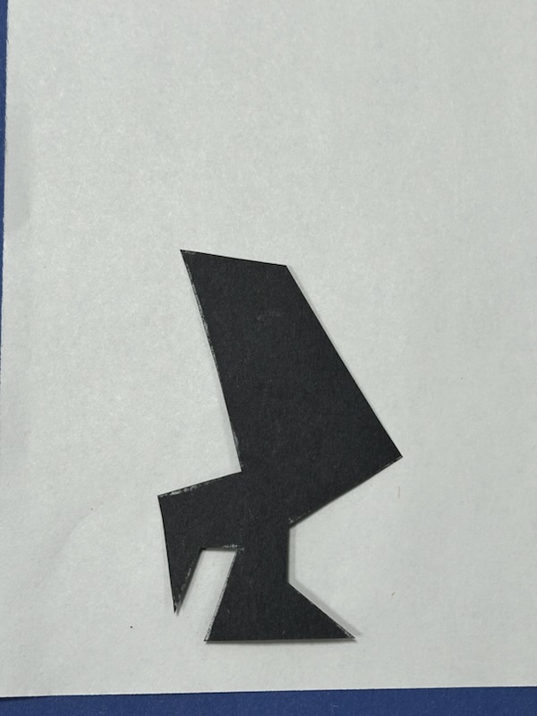
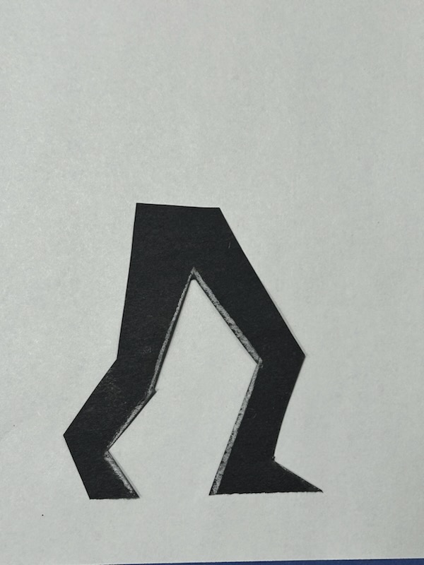
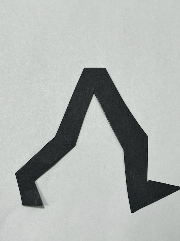
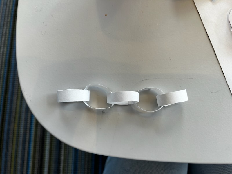
AP: This is totally a tangent, but are there any reasons the holes aren’t cut out in the numbers 6 and 9? Was this a design choice or limitation of materials? And are the chains made in “3D”?
IM: Haha, it was limitations in materials mostly, I knew it would be difficult to cut out holes. Also I wanted the numbers to also look like simple shapes to go with the more minimalist cut paper aesthetic. The chains are a picture of an actual paper chain that I made and took a picture of.
AP: Oh cool!