Love Swindler: Siyu Chen Interviewed by Jingjing Xu
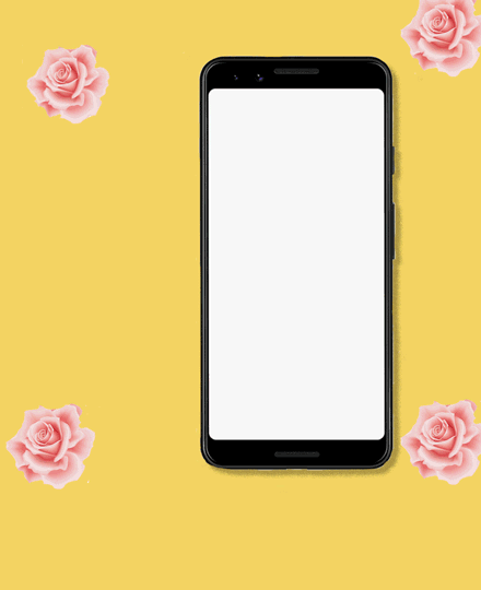
Siyu’s poster Love Swindler relates to her personal experience getting to know someone through online dating apps, i.e. the hurdle to convey true emotions and the fast development of fake sense of attachment via texting. The poster uses emojis and the user interface of mobile texting to represent the constraints and sometimes untrustworthy environment of online dating, with inspirations from the color themes of common dating apps to Japanese Manga. I witnessed some of the behind-the-scenes of Siyu executing her original hand-drawn idea and later sat down with her to understand the thought process behind her animated poster. – Jingjing Xu
Jingjing Xu I dig your Love Swindler poster so much! I remember seeing your Love Swindler’s hand-drawn draft and your original idea shown in that draft has been executed so beautifully! Could you talk about the background and context behind this poster?
Siyu Chen When creating the draft for this poster, I thought of my personal experience using online dating apps. I have used those apps since college, on and off. The process of getting to know someone through online dating apps is very different from getting to know someone in person – texting can feel forced, and at the end of the day you can’t really know the person that well. The same applies for others to get to know me as well. Overall, I think online dating apps can be a bad medium.
I also thought about the recent Netflix documentary The Tinder Swindler I watched: a dating app based swindler stole millions of dollars from a group of women. I think that person was jailed for only a short period of time, and now he is out again, being viewed as a celebrity almost, which is pretty unfair to others.
Dating apps can sometimes give you a fake sense of attachment over texting. You could develop feelings for the person on the other end quickly, and later on that (evil) person can take advantage of you or extract emotional values from you. So my message is be cautious about online dating!
JX That really helps me put your art into perspective. Could you talk about the design choices involved in making this poster? Such as the use of emojis, mobile user interface, and color choices, etc.
SC Sure. I wanted to find the representative element of online dating, from Tinder or other online dating apps I have used. For example, the texting boxes which are often seen in iMessage and other dating apps. In terms of color choices, I initially wanted to mimic the Coffee Meets Bagel app, and later I thought I don’t need to copy it exactly. Comparing mobile vs. web, I think emoji is the way to convey emotions via mobile, a very rough and naive way to depict an image of yourself. The use of emojis can be tricky sometimes. For the poster, I picked the ones that I would use, as I am a heavy emoji user. Emotions are very complicated, and using emojis to represent emotions is not very intricate, but overly simplified – I think the use of emojis meshes up well with the overall message I am trying to convey.
JX Great. Oh, I also love the spinning roses in the background! Any inspo for that?
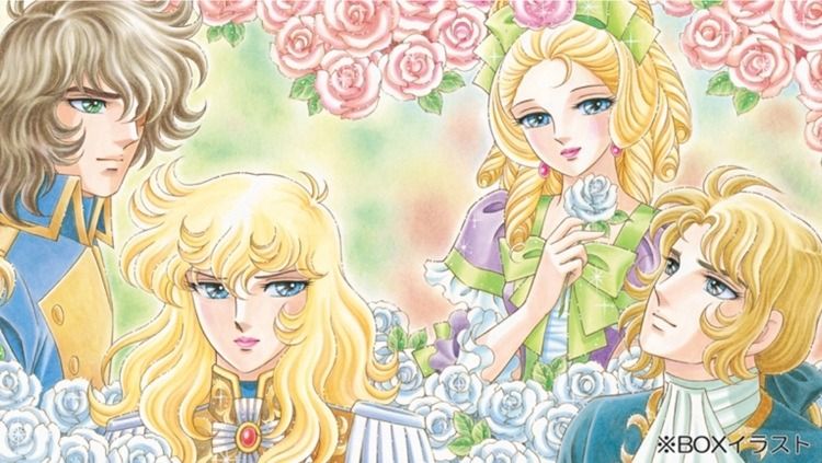
SC I watch a ton of Japanese Manga and I remember seeing in love fantasy scenes, they use spinning roses to represent someone is in love, to represent the romantic ambience and emotions. I recall one Manga/Anime I have seen which uses roses in the background a lot is called The Rose of Versailles.
JX Could you talk about the process of making this poster? Have there been any challenges? Any breakthrough moment for you?
SC Yea sure. I mostly used Photoshop and Illustrator. I first used Illustrator to make the shape of the texting boxes. To me, Blender is not very user friendly. Photoshop can be clunky in making animation, but it is more straightforward for me. I had a blueprint of how I wanted all the elements to move and then broke them down and bridged the gap in between, to make them not move abruptly. I turned on Onion Skin in the setting to see the path of movement and try to align the positions of different elements.
JX Cool. And what about making the spinning roses?
SC Haha I found a rose image from Walmart’s site and used masking to crop the rose out. I subsequently turned the layer into a smart object, and created two frames, each with a different position of the rose. Photoshop will automatically help you bridge the transition in the timeline view.
JX Is there anything you would like to add/modify if you have more time?
SC A few thoughts I have: I could display texting boxes with certain text, to show the conversations and emotions associated. I could also add another element to the heartbreak animation to play up that scene more. I could also make the roses float around or have them turned gray at the end, but I realize that is some additional work I have to do (laugh).
Recycle Your Batteries: Jingjing Xu interviewed by Siyu Chen
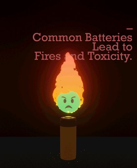
Jingjing’s poster Recycle Your Batteries is a loud and clear call-to-action to the general public to recycle used batteries properly. The poster uses color palettes centered around green and red to mimic the plus and minus sign of batteries and uses animation to represent the lifecycle of a battery. “Batteries are hazardous even after they use up all the energy”, Jingjing emphasized in the interview. We chatted in person, face-to-face, about her confusion and frustration with battery recycling in the US. – Siyu Chen
Siyu Chen I have mentioned it multiple times, but I really like your work and the clear message that it shows. I feel that there is so much more we should do as humans to protect the environment, and yet we are not taking any actions. Could you talk about why you choose to call out the issue of battery recycling in your poster?
Jingjing Xu I had this idea when I was throwing out trash in my apartment building’s trash room. Someone left a bag of batteries in the gray non-recyclable bin, which is a totally wrong thing to do. I remember that there was always a separate battery recycling bin in the building in Beijing; in contrast, I have not yet figured out how to recycle batteries in the US.
SC I very much relate to that. I don’t know how to recycle batteries at all.
JX Yeah, it is an unclear system for most people. Also, people aren’t aware of how toxic and hazardous batteries are if we do not throw them away properly. I have seen documentaries that talk about how used batteries can cause fires in waste management facilities.
SC Is that why you included the fire in the poster, to show that batteries are inflammable?
JX Yes and no. I think the fire is more abstract. I wanted to show the usage of a battery over its lifecycle, especially that it pretty much just becomes waste after it uses up all of its energy in the end. That’s why the fire disappears after burning for a couple seconds.
People need to understand that there are chemicals in batteries. In high school science class, I remember the teacher was talking about how batteries can eventually lead to more acid rain. When I was in New York, there was a trash bin that was solely designed for battery recycling but…
SC I didn’t know that New York was so on top of it!
JX It was an orange bin. I’m unsure if it is broadly available to most of the residential buildings in New York though. But again, people need to know that batteries can cause hazards.
SC Is that why the face turns into a hazard sign?
JX Yes! I googled a lot of signs and picked one that is most related to the radioactive nature of the hazardous materials.
SC Did you draw the sign?
JX No, I cropped it out from an image and wrapped the image around the sphere of the face (Avery helped me!!)
SC That’s awesome. I am also curious about how you created the fire…
JX I basically followed a step-by-step YouTube tutorial. It took quite a lot of work on the modeling panel to change the glow and the physical shape of the fire – like it is burning from the bottom to the top). I put some thought into both the fire physics and glow.
SC In Blender?
JX Yes. I also picked a specific material in Blender and messed around the speed of the fire rising up. I can include the link to the tutorial if you are interested.
SC Yes please! It is so interesting that now after knowing how you create the fire, I start to notice the movements of the fire. I mean, before this conversation I only noticed that the fire would disappear at the end of the animation, but now I can see the details in how the fire is burning itself, if that makes sense.
I am also curious why you picked green for the little face of the battery?
JX I picked green because I think the color is associated with toxicity and poison. The natural choice might be an orange, red-ish color to represent an angry face, but I didn’t want to show only anger. I think green is also used in chemistry/engineering to represent the positive/negative, or plus/minus sign. So a green face would have that association with batteries. That’s also why I picked red and green for the text colors to show the association with the plus/minus sign.
SC Wow, I can see your science background….
JX No, science is rusty nowadays 🙂
SC Is there anything you would like to add/modify if you have more time?
JX I would like to add a leakage effect from the battery to show the chemicals getting out, amplifying the hazard nature of batteries.
SC Like a leaking animation?
JX Yes, animation of liquid leaking out.