Parth Kashikar interviewed by Philip Raine
Philip Raine Hiya Parth! I like the minimalist background and the use of just three shades to give your figures character. Is this the style of art that you like creating the most?
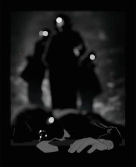
Parth Kashikar Thanks! I honestly only started getting into silhouettes after the first project in this class. Before, I would always sketch with contours and never really considered changing things up. However, I had a lot of fun coming up with little images and illustrations for all the emotions in project 1, and I found that I could actually say a lot with just flat shapes. Simplifying stuff in this way is new to me, and I struggled a lot with picking the right shapes to clearly represent certain forms. For example, in the person who is lying down, I’m still not confident that I’ve depicted the proper shapes to suggest the exact angle and lighting scenario that was in my head. Despite all that though, I do think this is a fun art style that I’ll probably try to do more with.
PR What was the issue that you were looking at for this poster, and was there a specific reason for picking it?
PK I was kind of looking to do a poster about labor and worker’s rights. Looking at old labor posters, I was drawn to how hypermasculine and overtly violent they could be. I thought that that was an interesting attitude to juxtapose with the idea of social justice and progressive change. I was also heavily inspired by this tweet about unions that I read a while back: “Someone should probably tell the rich that workers banding together to present formal address of grievances is the alternative we worked out a long time ago to breaking down the factory owner’s front door and beating him to death in front of his family? I feel like they forgot.” Both of those ideas explore progress through violence, and I wanted to create something that fit within that space.
PR How do you generally frame your art? Do you have a narrative or topic that you pick as a central point and expand around it? Or is your art more freeform?
PK I don’t know that I make enough art to be able to identify a strategy or a general process that I use. Typically I think I just get inspired by something random that I then want to duplicate or recontextualize. The inception for this assignment (other than the old labor posters) was actually a panel from a manga I read over the summer. It showed the main character in roughly the same pose as the front guy in my poster with a single glowing white eye. I thought that was a really neat look, and so I wanted to make an artwork that also had that element. The rest of the story around labor and progress through violence grew around the artwork as I started developing it more
PR Looking at your past works I see that when you have the choice, you generally select to do art with darker shades, and most of the time they have to do with depicting people or parts of people. Is there a reason for this focus?
PK That’s just what I’m in to right now. I’ve been wanting to pursue illustration more earnestly, and so I’ve been slowly teaching myself how to draw people. All that studying then flows over into my projects as well and influences the tone and subject matter that I want to work on.
Philip Raine interviewed by Parth Kashikar
Parth Kashikar Hi! First of all, what was the “protest” issue that you chose to do your poster about?
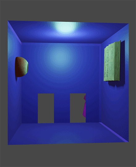
Philip Raine I never really settled on a concrete issue for my poster. Instead I tried to represent a never ceasing struggle between seeing something new or interesting and responsibilities. The person/figure being the interesting thing and the book symbolizing the responsibilities.
PK What about this issue attracted your interest?
PR I think it’s very applicable to most stages of life – though for me this experience reminds me the most of Penn which is why I tried to depict it.
PK Were there any other issues you were considering?
PR The only other topics I was considering were self trust or self care but I didn’t have as clear an ideas as to how to portray them.
PK Next, what is the concept for your poster?
PR The eye initially reading the textbook was symbolizing the responsibilities that everyone has, and at the very beginning of the animation it’s just the eye and the book. The eye’s gaze is representing what the person wants – or would like to interact with. Once the person/figure enters the room the eye’s gaze switches automatically, and the thought here was that the eye really wants to fulfill their responsibilities but what it wants even more is to interact with the person traveling through their space(the room). Though there’s never an interaction between the two and eventually the opportunity is gone.
PK Did you consider alternate conceptual ideas for the poster? What was the rationale for going with this particular execution?
PR I think eyes in general represent focus so that’s why I chose an eyeball. The textbook and the figure are both there because of my student frame of mind: Feels like I’m always choosing between doing well in academics or having fun talking to people, never both.
PK The book is cool. Did you model that or is it like a photoscan or download? Same question for the eye.
PR Both the eye and the book are downloaded from a third party.
PK Similarly, the crying animation is interesting. Was that done in Blender as well or in Photoshop?
PR Everything was done in blender as I just find it much easier to do things in blender as opposed to photoshop since I’ve got more experience with blender.
PK Having finished this assignment, do you think you’ll do something like this again?
PR Probably not? It really depends on the space I’m in though. It’s very rare for me to have really strong feelings for something which is why ‘protest’ is an extreme word to use to describe what I made. I much prefer making art that describes common experiences or fantasy art(though I’m not very good at doing it).