Katie Bogia interviewed by Elaine Fan
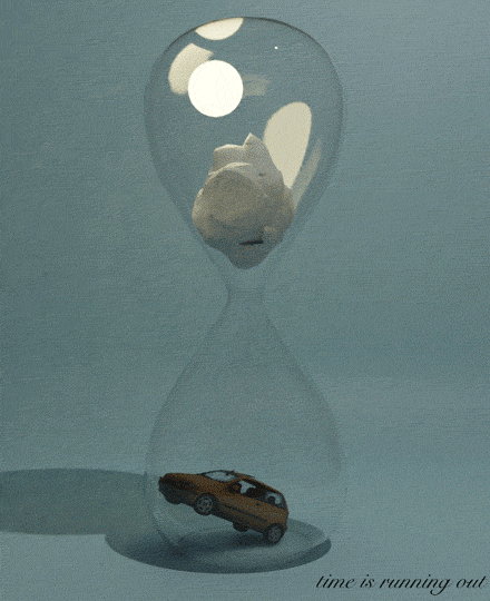
Katie’s poster “Time is Running Out,” whilst visually calm and beautiful, conveys a sense of urgency in our limited chances to repair the state of the planet. The piece is rife with symbolic objects, featuring a pristine hourglass against a solemn grey-green background. An iceberg in the top compartment gradually melts into the bottom half, drowning a shadowed yellow car in water. It is a striking and thoughtful reminder of climate change, of cause and effect, of limited time, and of each person’s role in preserving Earth’s future. Elaine Fan
Elaine Fan Hi Katie! I loved seeing your animated poster. It was so clean and striking that it immediately caught my eye. To start out, could you tell me a bit about the message you wanted to convey, and how you translated that into a moving image? What made you choose these shapes and symbols?
Katie Bogia Hi Elaine! Thank you so much! I knew pretty early on that I wanted to make my poster about climate change in particular, but I had a lot of different avenues between which I was deciding. After some very rough sketches, my mind kept coming back to the hourglass. Especially for our generation, I think climate change has become this issue where we feel like we only have a finite amount of time left to alter our own behavior before it becomes too late. I kept gravitating back to the hourglass because it brings with it such immediate associations of urgency, as well as the fact that there is a definitive end. The sand is going to run out at one point if we don’t step in to stop it.
EF definitely feel that sense of urgency too, especially when we see headlines discussing the point of no return. It’s very frightening that in less than 12 or so years we could be at a point where the damage on our planet is irreversible. I don’t always think about this in my day to day life, but the reminder is always quite alarming. It feels like we should be doing more to stop it, but most people — including myself — are often content to continue the same habits/lifestyle we’ve always had.
KB Exactly: I feel like climate change is this massive collective action problem that we all agree requires change, and yet no one actually wants to disrupt their own lives to accommodate this change. It leaves us with this problem that touches almost every part of our lives–from the clothing we wear to the food we eat to even just how we go from place to place–but with no incentives, no one has any motivation to significantly alter their own behavior.
EF was also intrigued by the color choice. The cool greys are so calming/somber to me, while also making the poster very pleasing to look at. What kind of feelings and reactions were you trying to invoke in the viewer?
KB Thanks! I think the colors are really natural. Perhaps excluding the background, nothing else is too vibrant and is relatively toned down in comparison to colors we are used to seeing. The colors here for me just emphasize this role of nature. Yes, we find nature super calming and tranquil, but still once again our actions don’t quite reflect our feelings on the matter. I think the poster just pushes these ideas back to the forefront of your mind.
EF That’s a really intriguing way to represent nature! I would probably default to something green or bright in reference to plants, etc, but I love how you focused on this “tranquil” quality of nature instead. It definitely stands out in comparison to other protest material we come across concerning climate change. In terms of composition, I thought the size differences were also quite striking: a huge hourglass and a tiny, almost toy-like yellow car. The car seemed so puny and powerless against the water pouring down from above. Was there an intention behind the
sizing choices as well?
KB Hmm… I think I pictured each end of the hourglass as its own mini scene, almost like a snowglobe, you know? But each one is connected: as glaciers and icebergs are melting, there are also rising sea levels in other areas of the world, leading to cars being underwater, for example. I feel like an aspect of powerlessness is our first reaction, but are we not causing the pouring water too?
EF Oh wow, I see. That sense of cause and effect is really cool to see in your poster!
KB Thanks so much!
EF I also went back to check out a few of your previous drafts. Could you touch on your previous ideas, and how you ended up choosing this concept to implement?
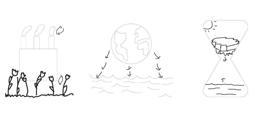
KB Sure! So yeah, as I mentioned before, climate change was my first instinct, so each poster was its own variation on the main theme. The first was somewhat of a cycle between flowers wilting while factories thrive, and then the second was kind of an idea of the Earth completely melting into water and taking over the poster. Looking at them now all together, I guess I was most interested in the cause and effect you mentioned earlier–from our actions to the natural world’s reactions. I think I kind of landed on the third idea because it seemed the most cohesive, or perhaps rather the most directly related.
EF Gotcha. I’m glad you did; it’s a relatively simple and cohesive visual that communicates so much. After seeing the final product, what would you say was your favorite part of the project? Is there anything you’d like to add or change if you could?
KB Oh wow! I think my favorite part might have to be the iceberg to water transition? I like how the iceberg progressively gets smaller and smaller and thus “melts” into the bottom half of the hourglass. As for your second question, I was initially considering the idea of adding a polar bear to the melting iceberg to really emphasize the repercussions on actual lives in nature. Given my somewhat limited skillset, I later decided against this, but I think perhaps with a bit more time I might have looked into that a little further…
EF The ice melting into water and the behavior of the water in the bottom half of the hourglass was definitely super impressive to me. I think a polar bear would’ve been a nice addition, but something about the nonliving objects in your current piece is also very striking as is. That’s actually all I have to ask you today — thank you so much for taking the time to talk to me about your piece!
KB Thank you so much for interviewing me, Elaine! I loved hearing your perspective on my poster!
EF Of course! Would love to see what you create in the future 🙂
Elaine Fan interviewed by Katie Bogia
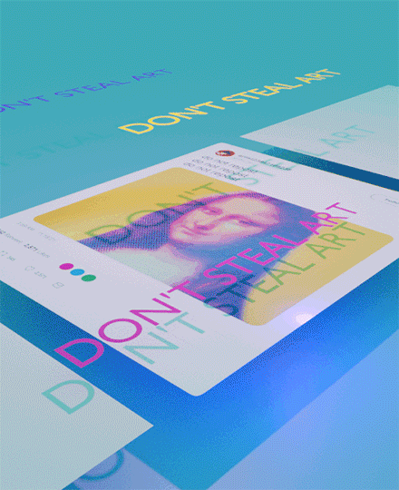
Elaine’s poster “Don’t Steal Art” navigates the sometimes murky world of art ownership. Inspired by her encounters online, Elaine highlighted the frustration that many digital artists face in a community where there are few consequences to art appropriation, especially on social media, where art is so accessible to the general public. With the Mona Lisa functioning as the stolen art in question, her poster points to the emerging frontiers for rules for digital artists. Katie Bogia
Katie Bogia Hi Elaine! I love your poster so much! It looks so sleek – I love how it loops and shows this perpetuating cycle of stealing art. Just as a brief background, could you tell me a little more about how this idea came to you? I feel like there isn’t a ton of movement in the public sphere around this issue in particular. Is there a reason it jumped out to you during your creative process?
Elaine Fan Hi Katie! Thank you so much — I’m super glad you liked it. When I initially brainstormed topics to protest, my mind quickly went to the Internet. I think I spend so much time on the web that online issues just feel closer to my heart. As a digital artist who has spent a fair amount of time following other artists and posting my own art on social media, I’ve definitely confronted this issue of art theft countless times. Sometimes it’s discourse on tracing, or clueless teenagers reposting art without permission, cropping out signatures, watermarks, etc. A reposted artwork could get thousands of likes and views, while the original post might have less than 100.
KB Yeah, that’s definitely super frustrating. I feel like we spend so much time learning that we cannot steal others’ words or how we can properly give credit, but I think the discourse around art and images is constantly left out of this conversation.
EF Exactly. It’s sad to see, but most people don’t think much of taking an image off the Internet and posting it elsewhere. Online, ownership just seems much more abstract.
KB For sure. Especially because plagiarism usually has these hard and fast rules with definitive consequences, but the Internet and images seem to operate on a completely different system.
EF Times are definitely changing! In school it’s often drilled into us that plagiarism and theft is bad, but I wonder if there should be more discussion amongst teachers and students about using resources and artworks on the Internet. I think there’s a difference between pirating an Avengers movie off the Internet versus erasing a small, independent artist’s signature and reposting it for your own clout.
KB Definitely! I feel like it’s such a small shift but if we can somehow incorporate this knowledge alongside the typical plagiarism conversation there would be so much more awareness. To go back to your poster for a minute, I was wondering if you had any motivation behind choosing the Mona Lisa in particular?
EF This was a pretty funny step of my process actually! I realized that I obviously couldn’t steal a piece of art off the internet for a poster that was protesting art theft, but I felt like the Mona Lisa was such a well-known, iconic painting that virtually every viewer would recognize the piece (with no confusion that I was claiming ownership of the artwork myself, other than some color editing + halftone effects done in Procreate). Plus, I wanted to draw a kind of comparison that art pieces posted online should be treated in the same way as physical paintings. You wouldn’t crop Leonardo da Vinci’s signature off his piece, so why crop out or cut off artists’ watermarks and repost art without credit?
KB That’s so interesting! I wouldn’t have thought about it in that way, but that makes total sense. We tend to think of paintings as these monolithic objects that are fixed but Internet art is so fluid there seems to be fewer conversations around outright appropriation.
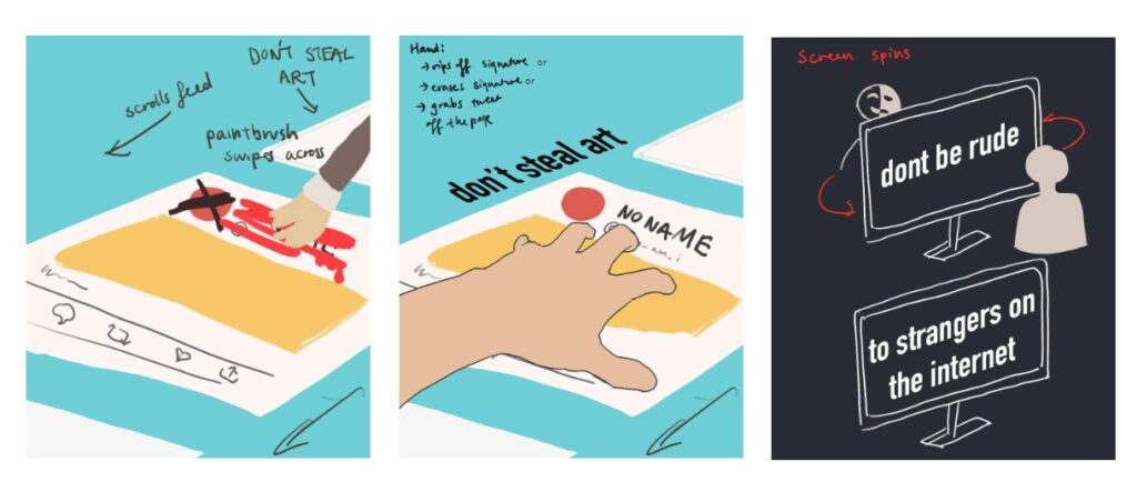
EF Yep! In some of my earlier drafts I was thinking about animating a hand painting a red stripe across the artist’s name, or even grabbing the piece off the page.
EF In the end it came to what I thought was feasible in Blender with the time and skills I had, so I ended up with the post crumpling instead. The idea was just to convey an action of disrespect to the art piece, and give a digital post a kind of physicality that people normally might not think about. The more I worked in Blender, the more I realized that I could play with this idea of a digital feed in real life. In the end, changing the camera perspective, lifting the posts off the page, and casting the shadow of the text over the feed helped contribute to this 3D feeling I wanted to create. Honestly the text shadow wasn’t even intentional at first; I just added text to the environment and really liked the shadow that immediately appeared underneath it. Since my experience with Blender is pretty limited, a lot of inspiration came from the “happy little accidents” that came with the process.
KB Oh my goodness wow! It all looks intentional though; that’s so impressive! I really like how your final product came out. The paintbrush and hand are really interesting to me. I know you said you had to consider the time and skills available to you, but do you see a difference in depicting a physical person in the act of theft versus an invisible actor stealing the art?
EF That’s an interesting point. Perhaps if I got a chance to incorporate the hand, it could’ve communicated more strongly the idea of theft. The viewer might have seen the hand as their own hand reaching out and wrongly taking something from its place. As the poster currently is, the crumpling seems to convey ruining the art or treating it as trash, and not really “stealing” it per
se.
KB Looking at your drafts now, your color scheme seems to have shifted a bit from your original ideas. I was wondering if you could talk about how you landed on these super saturated colors compared to more muted tones.
EF When I think of social media and digital art, I think of bright colors, and I wanted to incorporate the CMYK color palette in the poster. I was still trying to use the contrasting bright pinks, cyans, and yellows I had in my drafts, but they definitely came across a bit differently in Blender. Plus, I added some blue and pink lights, so this created some gradients too.
KB Oh I didn’t even think of it that way! I love how you included so many subtle allusions to other pieces of information outside your poster. Hearing your thoughts makes everything seem even more cohesive and fascinating! But thank you so much for answering my questions! I loved learning about both your thought process as well as your creative process behind this incredible poster!
EF I’m glad you enjoyed it — thank you so much for interviewing me! I loved hearing your thoughts on my poster, and you pointed out some ideas that didn’t even occur to me. ‘Til next time 🙂