Isabella Milanova interviewed by Logan Cho
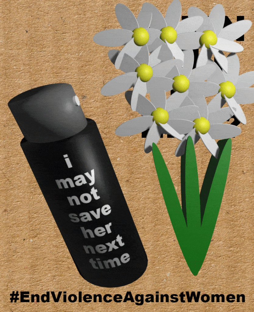
Created in the wake of the tragic abduction and death of Sarah Everard, Isabella’s animated poster “Where flowers bloom, so does hope” protests against the severely lacking safety and security measures in place for women. 3D models of a violent pepper spray and shattering flowers combine to convey how unsafe the world is for women even when they follow all commonly advised safety precautions. Isabella’s protest carries an underlying hope however, best relayed in the format of an unending animation that reflects how the fight for womens’ safety will go on until it is won. – Logan Cho
Logan Cho Something that stood out to me from your poster at first sight was the spraying effect you have from the pepper spray, with the orange beads – I’m interested in how you ended up animating that.
Isabella Milanovia I began the whole process with Photoshop but I used it only to make the background. I wanted to have something in the back to kind of resemble cardboard and the signs you see at protests so I used Photoshop to create a poster and then I imported it to blender, where I created all the other visuals: the pepper spray, the flowers, the particles that come out of the spray, and the animation itself.
LC So you created the backdrop in Photoshop- the cardboard.
IM Yeah, at the beginning I was wondering, Do I animate it in Photoshop too? I had the rough idea in my mind but I wasn’t sure how I wanted to approach it so I just started off with Photoshop. And I followed the flow from there.
LC Yeah, something that I was going to talk about later but a security guard up I’d love to talk about like, you know, the cardboard background right. So you mentioned protests, but I guess you’re going for, kind of, it’s almost like realism right. I feel like it’ll, since we’re doing animated. I know, like we’re doing animated posters, which feels you know more digital but I think your one with the cardboard it feels like something that you’d actually see at a protest. Is that like the effect you’re going for?
IM Yes, since the idea behind the poster was inspired by the protests that happened about a month ago, in March, surrounding the disappearance and murder of Sarah Everard in the UK by a male cop. I remember reading about the protests and all my friends who study in the UK were posting about it, and I thought, what is a better way to represent the issue than make a what seems like another poster that came out of the streets where people protest against the violence against women and yet nothing changes.
LC That’s a really just cause. And, the flowers also definitely stood out to me. Did you choose a specific type of flower?
IM That’s an interesting question, I didn’t think too much about the type of flower. For some reason I always associate these kinds of daisy-like white and yellow flowers with innocence and grace and I thought I wanted my flowers to represent women and their innocence that is being taken away because of violence. And, frankly, it was also the easiest flower to make in Blender for someone who was mostly experimenting with it. So it was a win-win.
LC I think the simplicity in colours and form really helps in conveying your message. Also, on the note of the flowers conveying that sense of innocence, I think the fact that you have them shatter so rapidly adds to that really well. When you started the poster, did you have this idea of having the flowers shatter and fall off screen like that, or is that something that you came up with during the process?
IM Yes, actually, when we did the brainstorm for what we wanted our posters to look like that was part of the idea. I was thinking, I want to create something to shed light on violence against women, and I wanted to somehow connect it to these protests that were going on recently. Then I remembered, apart from the posters, all the photos of people leaving flowers as a tribute to Sarah. So I thought this was what I wanted to go with because it connects to the current protests but also to the theme in general. Flowers are something that I always associate with femininity and I wanted to make the connection of how the flowers, kind of like the women being killed, they shatter.
LC Right. Yeah, I think I can see that especially in conjunction with the pepper spray it feels and carries a sense of violence.
IM Exactly. That’s what I was thinking, people wouldn’t expect to see the flowers just be destroyed like this but they are and so it’s like a moment meant to catch the attention.
LC Yes, and I think your poster is special because it contains a story. At least from when I was looking at it it went on like a loop. The way that the final message is revealed at the end I think is really effective.
IM Thank you, I kind of intended exactly that. While working on the animation I was asking myself, Is it too long, the whole spraying effect, and if I should have had the “When will it end?” be there from the beginning but then I realized I like the way it leaves the audience with this final rhetorical question: When will it then? Cause then it loops, as you said, and so it alludes to the point that maybe it will never end and that’s exactly why we should do something about it.
LC That’s a really great point. I think you made use of the repeating gif format really well to convey your message. And one more thing I noticed is, for the pepper spray and the text, which is really noticeable and well done, you used the word I, sort of anthropomorphizing the pepper spray. What were your intentions behind that, behind having the pepper spray say I may not save her next time?
IM So I spent a lot of time thinking, what should I add to this spray? At the beginning, I did not even think of adding anything. But then as I was making animation, it seemed blank and I thought, well, this could be used as another way to convey a message. And I was thinking, Do I just put a skull or pepper as a symbol to show this is pepper spray in case people don’t get it? But then I thought, no, I want to add another message. And I remember, if we connect it to the story of Sarah Everard’s murder, when she was killed she was not in a dark alley or taking a route that would be considered dangerous. She was walking under lights and she called her boyfriend too and, you see, she took these measures which supposedly would save you in a situation like that, and yet was still murdered. And so I thought, people always say “Buy pepper spray!”. My mom, too, when I came to college, she told me I should get one and I still haven’t and so I feel afraid sometimes and wanted to connect it to my own experience. Even if I buy pepper spray it might save me in a dangerous situation but what if it doesn’t? How many women who have been victims of violence on the streets had pepper spray that still wasn’t enough to save them? So I thought maybe I should show this and have people ask themselves, well, what if instead of providing women with a “weapon” to defend themselves with, how about we eliminate what causes the danger and help spread the idea that this violence shouldn’t be there in the first place.
LC Definitely. Sarah’s murder uncovers the tragic danger women face in the open even if they follow all the proper suggested safety procedures such as carrying pepper spray- and I think your poster’s doing a really good job at describing how even with these measures the threat is always there.
IM I agree.
LC The last comment I really had on your poster was regarding the typeface. It feels very reminiscent of the font you might see on protest posters, bold and straight to the point. I’d love to hear your thoughts around like what type of font you used.
IM I played around with fonts a lot because Photoshop has such a big variety of fonts and we looked at websites where we could find even more in class, and as I was searching I thought, okay, would give the best effect? And I tried and I tried but then I thought, you know, I’m going for a poster that goes in protest, and usually people they don’t really, well some put a lot of effort, but usually they just go for writing with a marker on cardboard. It’s more about the words and less about the aesthetic and so I thought I would go with whatever is the most simple and at the same time effective: more bold to capture the eye but still be straightforward. So that’s what I went for, I hope it achieves what I hoped for.
LC I think it definitely does. And I think with the pepper spray you did a really great job of like the white on the black is really easy to read, it’s clear. I also feel your use of black and white for the text maintains the gravity and serious tone well.
Logan Cho interviewed by Isabella Milanova
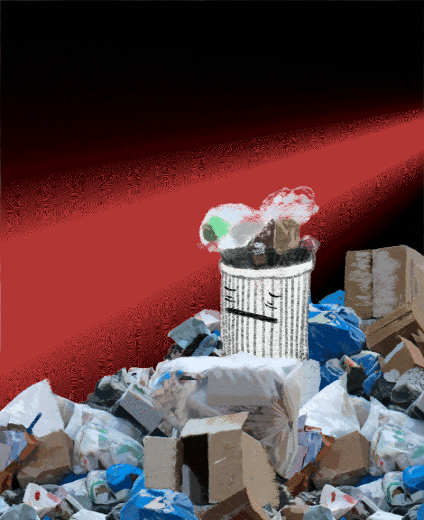
At a time when the world stayed indoors and thought less about what was going on outdoors, Logan Cho reminds us that among current challenges such as COVID-19, there’s one that has never stopped growing: pollution. He depicts the severity of the cause he’s been involved with since high school by anthropomorphizing his own images-turned-cartoons. An expression of Logan’s own exhaustion with the world’s inaction, the poster is an appeal to people to stop the endless piling of trash. – Isabella Milanova
Isabella Milanova The first thing that immediately catches my eye in the poster is the face on the trash. Obviously it’s a problem that we all face, and should realize we have to face, and you literally put a face on the trash, in a way making me immediately empathize with it. Is that something that you intended from the beginning?
Logan Cho Yeah, that’s actually exactly what I was trying to go for with putting the face onto the trash can, because, you know, at first, it might be like a little childish, or juvenile. Growing up, I’ve seen many photos of landfills and environmental disasters and such, and in person, a lot of rubbish on the streets, and something I’ve noticed is that I’ve kind of grown desensitized to such pollution, to the point where I even look at some parts of the cities and think, This is normal for there to be this much trash just laying around. But sometimes, though it feels a bit weird, we need to put ourselves in the shoes of something that has to collect this much trash and see its surroundings deteriorate by the day.
IM I get that. Personally when I see images of trash now, and they’re everywhere, I feel in a way, as you said, desensitized, I forget it’s not normal. But the face made me question it again. You said that it might look childish, but it’s actually such a good depiction: it looks tired, look at those eyebags, in a way almost as if it just wants it to be over. Is that the feeling you were going for when coming up with the expression?
LC Yeah, that’s actually a big change I made after my draft that I was hoping you would notice so I’m really happy. With my original draft I wasn’t making such a good use of animation so while I knew I wanted the trash can would have a face, I also thought it’s eyes would just be open the entire time without any added features but now, I feel with the eye bags and though it’s not too many frames, but having it close its eyes and then reopen makes it feel like it’s like really tired and drowsy almost. So that’s definitely what I was going for, like, making the trash can feel like it’s kind of just tired of seeing so much trash around it.
IM I think you did a great job! I see that you added a little face on the floating trash too, which I’m curious about by the way. It’s such a smooth motion how it’s flying in slowly. How did you achieve that animation?
LC Thank you! Honestly, 99% of the credit goes to Avery, since I asked him about how I’d model and animate this trash bag flying across a street. Avery helped me find an online model that we could use for a trash bag. And then basically the trash bag animation was already kind of done for us by the free model we found- though, in the default animation the trash bag was just in midair and it simply deformed to look like it was flowing in the wind but it didn’t actually move in any direction. So to film this poster we animated the red and black background which I did in Photoshop. And then I imported it to blender and basically animated the poster and the camera to move from right to left while keeping the trash bag in place. I also had it come closer to the camera to make it seem like the trash bag was getting a little bigger, as it got closer, like down the path. As for the face you mentioned, I think I just added that to really push the idea of all the trash being organic and alive and in pain.
IM I think this works perfectly with the whole idea of anthropomorphizing the trash and evoking empathy for these lifeless objects that you’re adding life to. It also seems like it’s going down an assembly line. Is that something you had in mind when choosing the motion? It almost looks like a laser too.
LC Yeah. I think that’s a really neat mention of an assembly line. Thinking back, that’s definitely an inspiration I had because in my original draft, instead of the black and red background I originally wanted to simply have an image of a street. It would simply be a trash can on the side of the road. But I realized part way through that I wanted to make it about trash everywhere, not just the streets. I wanted to make it a little more universal. Thus, I ended up with this straight beam of light which you know would usually be a pretty positive thing but I think by making it red it almost feels like, like you mentioned at first, a production line of garbage just coming in endlessly.
IM Wow. With red and black I usually get this feeling of doom, is this also why you picked these colors, to add symbolism, or was it more an aesthetic choice?
LC Red was already in my mind when I was trying to shift away from the idea of it being like a realistic street and then the black, I realized black and red are very contrasting but also, the black was really there more so so that I could focus the attention just on the trash bag flying from like the right to the left of the screen. I was hoping that the audience would only look at everything that’s properly colored, and ignore the black.
IM I saw it as this cool effect, I agree that it contrasts well. Wait, at first glance the trash looked like an image, as if you cropped it out of photos, but now I see that it’s more of a drawing. It’s like in between animation and realism. Did you draw it yourself, how did you make this happen?
LC The trash can I drew myself. But with the surrounding trash I actually used a bunch of photos I had on my phone of garbage and I made a collage of them. Afterwards, I drew over the collage of trash to blend them into one cohesive drawing. I think that gave it like this really weird surrealism almost because as you said, when I look at it from far away it seems very photorealistic but when I zoom in, I can see the individual brushstrokes.
IM That’s so cool. Speaking of the trash, I also noticed that all of it is stacked in one corner of the poster. Was that following one of the principles we discussed in class in a way to sort of capture the attention of the audience or was it, again, an aesthetic choice?
LC That’s a tough question actually. I think it only began as an aesthetic choice because it was meant to be this kind of street view, where I was imagining trash piling up on the side of the street. But as I worked on it more, I think that having all the trash pile up in the bottom really did help in terms of assuring that they are a negative disaster, because as I recall from design principle from class, being closer to the bottom gives both more weight but also a more sombre connotation at times. Having the trash build up on the bottom also works in tandem with the plastic bag I have falling downwards endlessly.
IM Now that you mentioned it, to me as part of the audience it kind of foreshadows that it’s just going to keep piling up and eventually fill up the poster with all this negative space. I get that feeling even more when I see the text popping up that says “Another…” toward the end of the loop. I was wondering, what was your thought process behind the caption?
LC For the caption I immediately wanted it to be something that the trash would say because I’ve been trying to go for this idea of the trash can being alive. But originally I think my initial message wasn’t actually as refined. I had the trash can saying something along the lines of “I hate this” where it was simply detesting the state of its surroundings. Whereas with “Another…” I think I managed to condense the message down into just one word. At first one might not understand but I think when you see the trash bags come again and again you come to realise. I hope the audience comes to understand that the trash can is talking about, as you mentioned, about the trash building up- that is, another piece of trash being added to the pile.
IM I think the message is definitely clear. What was your inspiration behind it, was it a specific event, something that you’re passionate about, etc., how did you come up with the concept in the first place?
LC I think, I tried just getting inspiration from my immediate surroundings and pollution has always been like a major concern I’ve had but recently, having visited Philly for the first time and going around the streets, I think it just sort of hit me that this issue of trash is in fact a global issue right – since I think somehow being back home and seeing garbage made me only really say such pollution as a local issue. But I think that through coming here and living and realizing it’s almost the same if not worse, just made me feel like it’s an issue that affects almost everywhere- and from that thought I wanted to make a poster about it all.
IM That’s an unfortunate reality that is indeed a global one, as you said, and I think that it’s great that you decided to highlight this in your poster and in such a powerful way too. I wonder, is there any title that you picked for this piece?
LC Yep, the title for this poster is, “… day waiting for change,” which I think might only really make sense after viewing the poster.