Kathy Fang interviewed by Hayley Hayden
Hayley Hayden Your poster is so interesting; there are so many moving parts and I love how you used the intricacy to express a social issue!
Kathy Fang Thank you!
HH My first question for you is, what made you want to pursue this topic in particular?
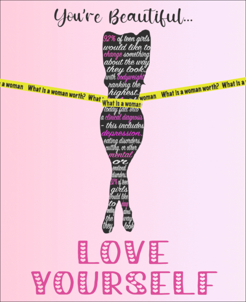
KF Yeah, it’s kind of funny because early on in my MBA career I had taken this communication course where we had to essentially give a five minute speech, trying to persuade the audience on any topic we wanted, and actually the topic I chose was trying to persuade women to go into weightlifting, which is like a very random specific topic, but it’s something that I felt like I was pretty passionate about. It was essentially a message that I wanted to convey to the public, I guess, and so I was trying to think like okay, I’ve done all this research from that speech that I previously gave, so like how could I tie that into this PSA poster? And so while it’s not quite 100% the exact same message that I was trying to get across is the idea of self love, particularly for women who are bombarded with posts on social media where things are clearly photoshopped in these ideals of beauty that are just completely unrealistic. And so that was kind of where the inspiration came from; starting off with the speech and then figuring out how I could translate it into a poster.
HH Okay, awesome! It’s so cool you picked an idea you’re so passionate about. I guess that brings me to my next question; so you had two other poster ideas, the ‘adopt don’t shop’ and ‘get vaccinated’ ones. How did you come up with those ideas, and how did they compare to the idea you went with?
KF Well to be perfectly honest I knew this was the one I wanted to do from the beginning,Rookie sign that requires that we put in three different ideas so I honestly was just like Googling around on the internet to see what kind of possible PSAs I could come up with, so it’s not very inspired, but literally that’s where the vaccination one in the adopt don’t shop one came from. It was more just like trying to complete the assignment versus actually thinking I might choose them.
HH That’s fair, I definitely get that! Speaking of your drafts, I noticed there are a lot of similarities between the initial draft of the body image poster and your finished product. It seems very well thought out, and I was wondering what the process of creating was like for you, and whether some aspects gave you trouble, or if there were just some you chose to change up?
KF Yeah, it’s kind of interesting that you say my draft was similar to my final because I feel like I made so many changes along the way, and in my head, I envisioned, you know just using the torso of a woman’s body versus the entire silhouette, but then when I actually went and tried to find those images online and put them on a poster, it just looked weird. It didn’t look right. So that’s why I made the decision to go from just the torso to the entire body, because I felt like, you know, when you saw it you could immediately tell that it was a woman. I also planned on doing something completely different with the measuring tape. So I have the measuring tape on either side of her head and I was envisioning that kind of holding the body so tight that the woman’s torso or break into many pieces, he totally honest I just couldn’t figure out how to do it. So, I was trying to simplify the poster, to make it a little bit easier for me to execute on. So after the animation of disintegration or shattering then I wanted the words to appear saying, “you’re beautiful, love yourself”, and so that’s what i envisioned in my head, and then when it actually came to executing it, I was already having a lot of issues dealing with the tape measurer pulling thing, and Avery helped me quite a bit with that. At that point I was like, yeah, I don’t want to make this too big of a project.
HH Okay! Design by the way, especially the tape measurer, I think it’s very well executed.
KF Thank you!
HH Yeah! And that brings me to my next question, in regards to the typefaces you used, was that a product of feeling it out as you created the poster, or do you have an idea of what you wanted to use or what you wanted that to look like going in?
KF Yeah, it’s an excellent question, and I think when I started working on the visual layout of the poster, it was literally right after the class where we spent a majority of the time talking about typefaces, and so, I guess for some reason I was just really inspired to go out there and look for different options. I guess, I started off with the typeface for the woman’s body silhouette, And I think I was looking for something, I guess, somewhat feminine looking, I know it’s kind of like cursive and it’s smushed into the silhouette, but I think I was really looking for something that I thought would convey the message I was trying to get across, about how women and teenagers currently don’t feel positively about the way they look, and it’s kind of hard to explain but that’s what I was thinking. And then, in terms of the typeface of the tape measurer itself, I think my biggest focus there was making sure it was readable. I knew I didn’t want it to be the same typeface as the text within the silhouette of the body, because I felt like it would kind of blend together and be hard to differentiate those two elements of the poster as completely different. And in terms of the copy at the top where it says “you’re beautiful” again, I wanted to keep it a little bit more feminine, light, and airy. And for the “love yourself” part of the text, I probably wouldn’t pick that typeface again because I think it’s a bit too much like Valentine’s Day versus the message I was trying to get across. But in essence, I was trying toemphasize that point by changing the color and making it bigger.That’s kind of what was going through my head as I was making all those decisions.
HH Okay! And I’d like to echo a question you asked me earlier because I just thought it was a really good question; So, in an ideal world where you had all the time and resources for this project, what would your poster have looked like?
KF Yeah, so in an Ideal World, love to be able to execute my head as I described earlier you know where like, instead of a 2D silhouette it would be a 3D silhouette were you able to also have a 360-degree view around the figure, and it would have been really cool to have a disintegration or shattering effect, but yeah, I had a few issues haha.
HH Totally get that, me too. It wasn’t that easy!
KF Yeah, for sure.
HH Yeah, and I guess my last question sort of ties to my first question, so you’re an MBA student, and you mentioned that you’re very passionate on this topic of body positivity, and I was wondering what you studied during your undergraduate days, and how have you explored this topic throughout your academic career?
KF So, I’m actually one of the rare double dippers, so I was in Wharton undergraduate and I studied marketing and operations management, and I should mention that the communication class I mentioned before wasn’t dedicated to this topic, it was just something I chose to pursue within the class. So, in that respect, I haven’t taken any courses on this or done any deep academic research, it was just something I struggled with back when I was a figure skater, and I kind of got into weightlifting and that boosted my confidence, so I’m a big proponent of it.
HH Okay! I think that’s all the questions I have for you, thank you!
KF Great! Thanks!
“Frankenstein” – Hayley Hayden interviewed by Kathy Fang
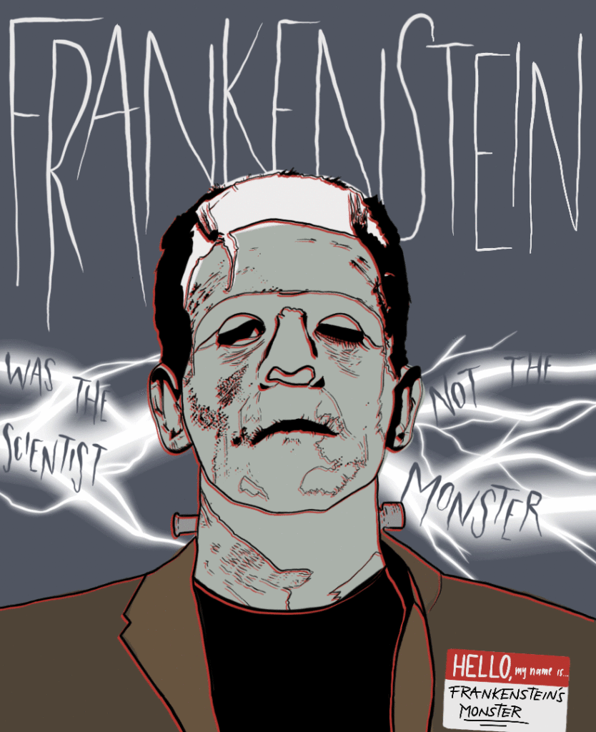
In Frankenstein by Hayley Hayden, she aims to displace the common perception of Frankenstein being the monster and inform the world that he is the scientist. Too often do people associate Frankenstein with Halloween and the idea that he is a bumbling fool that just groans and grunts, when according to the book written by Mary Shelley, he actually demonstrates a high level of vocabulary and diction. Ultimately, this concept resonated with her the most as it allowed her to have a bit more fun and to not take art so seriously. – Kathy Fang
Kathy Fang Tell me more about the inspiration behind choosing Frankenstein as the subject of your animated poster. I know you were also considering the topics of recycling as well as hostile architecture — what made you go down the path of Frankenstein?
Hayley Hayden I guess the inspiration for all of my pieces came from social media. I find myself scrolling through Instagram a lot and normally I archive posts of topics that I find really interesting and really funny, so that when I have projects like this I can go back and pull on those a little bit. The other two were topics that I was very passionate about but I guess when it came down to it, I liked the Frankenstein one better, because I liked the design of it a lot better and how that one turned out. I also liked that it was a little bit more playful and different than a regular PSA.
KF So for this Instagram post did it convey the idea of “Frankenstein isn’t the monster he’s the scientist” or was it a bit more generic about Frankenstein and then you came up with the tagline afterwards?
HH I think the post itself was a little bit more generic and I just played up on that idea. I just wanted to express that this is a point of discourse on the internet that I’ve seen throughout the years. There’s a misconception out there that a lot of people have that Frankenstein is the monster. I thought that for a very long time, but it’s not actually true.
KF So actually, can you tell me a little bit more about the backstory? So obviously I know the Frankenstein story at a super high level but I don’t really know kind of the nitty gritty details. Tell me a little bit more about why Frankenstein isn’t the monster and why he’s the scientist.
HH This is from the original Mary Shelley book and the original plot of the book became very subverted over the years. Pop culture distorted it into a different message and when you think of Halloween, for example, you think of Frankenstein. The popularized version of Frankenstein is characterized by grunting and groaning and he doesn’t speak in full sentences. But in the original book, he actually demonstrates a very high level of vocabulary and diction — a very academic way of speaking.
KF So now I want to shift over to the decisions you made behind animating your poster. I can see that Frankenstein has a drip effect and there’s also a lightning effect by the phrase “was the scientist, not the monster”.
HH In my original poster I had a neon sign pointing to the name tag on Frankenstein’s chest, but I changed it because it didn’t really fit the whole vibe that I was going for. Because I wanted to use the light effects of the flashing, we made it a lightning bolt instead. I integrated the words into the lightning bolt because I thought that it would give it an extra point of emphasis. And then from there, I think a lot of it was done on the fly. Like, “oh yeah, this would be cool”, and I had some conversations with Avery and how I could bring my ideas across a little bit better.
KF I really like the “Hello, my name is…” name tag in the bottom right hand corner. It’s so small but because it has such a different vibe than the rest of your poster, it really catches your eye. What was the rationale behind adding a name tag and putting the name tag there?
HH I chose to include the name tag and that style because I thought that it was a very straightforward way of being another point of emphasis. It’s sort of like blending an older work with a modern topic again, just to emphasize the point a bit more.
KF We obviously had a limited amount of time to create animated posters — if the sky was the limit, how ideally would you have liked to have seen this poster come to life?
HH I think that if I had an unlimited amount of time, I would like to probably do more with the lightning. Originally I wanted to have the Frankenstein word up top be a part of the lightning bolt in some way, but I figured that wouldn’t work because I didn’t want the word to disappear at any point. But if I had more time, I would have done a 3D rendering of this rather than a 2D rendering.
KF Any last parting thoughts for our reading audience?
HH I would say that from an artistic standpoint, don’t get too serious — don’t take things too seriously. That’s something I was struggling with and the two other designs actually came first and then I went to the Frankenstein one and I just had a lot more fun with that. So yeah, don’t take your artwork too seriously. And yeah, Frankenstein was the scientist and not the monster.