John Woodward interviewed by Regan Mizrahi
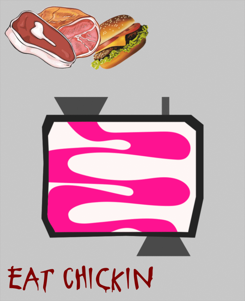
John’s poster is a reflection on the negative health and environmental consequences of beef consumption within the commercialized fast-food industry. By creating a “organ-like” machine that breaks down the food, John makes observers truly question what the impact of their food choices are while also exposing the irony of the “better options” that are often promoted by companies for their own financial gain. John’s message is clear and shines a light on the internal and external impact of what we consume beyond the immediate satisfaction one gets from a $5 sandwich. – Regan Mizrahi
Regan Mizrahi I really like your piece, I think it’s very creative, to say the least. My first thing I’d want to ask you about is what was your inspiration behind this PSA as a whole?
John Woodward Yeah, so my mom is actually vegan, and I went on this health kick over quarantine. I essentially didn’t eat meat and was trying to live a healthier lifestyle. And on top of all of that, I was reading about the environmental consequences of the consumption of beef. I wanted to communicate both the health consequences of eating beef AND the environmental consequences, and at the time I was in a math class, so I thought what better way to communicate the byproduct or output of beef consumption than a function machine.
RM No yeah, I love that context, especially because when I look at your PSA I can see that you have the sludge as that health consequence and the smoke for that environmental aspect. Now you mentioned that there’s also that sense of veganism, and I notice that there’s the “Eat Chickin” at the bottom. Is that something that you’ve adapted into your own lifestyle?
JW No, it kind of was like irony in a way, just because Chick-fil-A has this slogan of “Eat Chicken, Don’t Eat Beef,” and what I wanted to essentially say was that it’s become commercialized. They want you to eat their chicken, but it’s still fried and it’s still bad for you.
RM I was gonna say, I noticed that it’s a bloody font but it’s also immediately associated with the Chic-fil-A campaign that they have.
JW Yeah it’s like a slaughter. I think that their choice of font unintentionally communicates the slaughter of animals, which also has these unintended negative externalities both for the environment and for the individual.
RM Right, no I also really like how you point out, I guess I’d call it the “relativity”- where Chic-fil-A is saying “eat more chicken,” but it isn’t much healthier for you and probably still has an environmental impact.
JW And they don’t say that with the intention of beef being bad for the environment, they say that solely as a reason to get people to buy their product.
RM That definitely makes sense. I’m curious how you actually went about animating this, I assume you used Blender, right?
JW Yeah so at first I did a frame-by-frame animation in Photoshop, and so I pulled an Illustrator file where I created the actual function machine and then went into Photoshop and did frame by frame on the smoke and the positioning of the beef products and the wiggly lines. I think it makes it a little more rough around the edges, like it’s not a smooth animation. At first I didn’t really like that since I wanted it to be smooth, and so I was having trouble trying to figure that out, but in the end I kind of like it because it just gives it a more hand drawn or flipbook-like feel to it.
RM I agree, I also think it’s good because this food is highly processed and is often made in a very procedural step-by-step manner. So your animation being frame-by-frame and not as smooth can actually help with that association. Now, obviously we had limited time to do this, so I’d be curious if there’s anything you would change if you had more time?
JW If I had more time, I would really want to go inside the function machine and make it more resemblant of the organs. I think there are a lot of things you can do in blender to give those 2D paths a more three-dimensional quality and then make it translucent so you have like the wiggly lines essentially going through the translucent pipes that resemble organs. I think that would communicate more clearly the negative health consequences that right now I’m not exactly sure is getting across. I think on top of that, there’s some gaps here and there. For example, the smoke upon first glance doesn’t necessarily communicate like cattle and methane output.
RB I was going to say, I think maybe with more time you could have had the smoke spread. Right now I see the perfect circles, but since the food disappears as the frames go on, you could have possibly had it spread across the top of the screen. I love the shading though.
JW It’s a pretty nice contrast to have the smoke going across the top as the sludge goes across the bottom of the screen.
RM Right, I also love the shading and how it gradually gets darker the more processed it gets. One thing you could have done was add a human head at the top, but that would be quite tough to do.
JW When I was doing my rough drafts, I thought about possibly having a giant mouth that slowly expands and the food goes into it.
RM I kind of like it this way though. I think if you add too many elements it would become too overwhelming, so leaving that element out was a nice stylistic choice.
Regan Mizrahi interviewed by John Woodward
Regan communicates the insecurity felt by most Penn students at some point throughout their college experience. Personally, Regan’s piece challenges me to be better about shedding my own Penn face. I think to be true to oneself is made especially difficult by the added pressure of being at an Ivy League institution. By conforming to the Penn mold, many kids lose sight of what they’re actually passionate about, and some never rediscover it. I met Regan this semester and, apart from working together on our group writing project, haven’t had the opportunity to get to know him on a deeper level. Yet, in our brief interactions and in our interview, I can tell Regan is a passionate learner and a dedicated friend. As demonstrated by his piece, Regan is artistically talented and, more importantly, has something to say to his peers. Going through Penn is made infinitely easier by not doing it alone — by being vulnerable. Regan understands this better than most. When things return to normal in the fall, I look forward to getting to know him better and adding yet another cog in a network of supportive friends, without whom I’d be lost. – John Woodward

John Woodward Hi Regan, so I really like your piece. I think it’s interesting and especially relevant to our lives here at Penn. I want to unpack here some of your stylistic choices. To start, what went into your color choices and how does it reflect your message?
Regan Mizrahi Sure, so I started by hand drawing the piece. I tried to make it look somewhat like myself, with blue eyes, brown hair, etc. The blue I felt would contrast well with the other colors I chose. In terms of stylistic choices more generally, I’d say a stylistic choice I did make was with the font for “Penn Face.” It’s fairly similar to the font for the actual Penn logo, so that was definitely a deliberate choice on my end.
JW I didn’t realize that at first but now totally see it. So, “Show me yours and I’ll show you mine…”, that has some sexual connotations, no?
RM Honestly, I threw it in there for a little bit of comedy. But also, in terms of, you said my piece is very relevant for Penn, I think it’s often tough, especially with Penn face, when people first come into college, it can be easy to put on that face, as if to say “yeah everything’s fine,” so I felt like, as the face is melting down, a way to break down that barrier is to say “if you show me what’s underneath, I’ll show you mine.” This makes it easier to be vulnerable because it’s so easy to get swept up in keeping the mask on if no one’s there to talk to. That’s why the mask is falling off in the animation.
JW Those relationships are rare at Penn.
RM Yes, it’s tough coming in, but as you settle in as an upper classman, you can eventually take that mask off and care less about what everyone else is doing. It’s easy to get swept up in all of that.
JW Moving on, can you walk me through your process for animating this.
RM So, I started by hand-drawing the actual face itself. And from there I, instead of importing it, uploaded it to my computer and then traced it in Illustrator. So, I added the various layers, the base layer of the sad face and then an extra layer of just the happy face itself so I could convert that into a smart object and do this manipulation later on. One thing I learned, Avery found a great video about puppet warping. So, it allows the face, a specific object, to deform and melt as you want. So I added different layers sequentially of the face falling off and then edited that as frame animations in Photoshop.
JW Do you think if you were given the opportunity to do this again or spend more time, what might you change?
RM I would have loved if I could have made it longer than a five second animation. I had to cut it down a little bit. There were about 60 frames. But I think one thing I would do in particular is change the mask. I think it gets the point across, but I would have wanted more of a melt effect, which was my idea at first. But, I focused on getting the job done.
JW What do you think the melting would have communicated that this doesn’t?
RM I wanted to go for that painted effect. You know how they say, “paint on a face.” Having it more directly connected to the bottom layer rather than a separate entity would have really shown, I guess, the difficulty or the gradual process of showing what’s really underneath.
JW I get that, though I kind of like the mask effect here. The crumpling, almost like it’s some fragile façade that’s shaving off like a snake shedding its skin.
RM Yea sort of. I had originally modeled, if know how in performance there are those stereotypical opera masks, think black and white happy sad ones, so I had originally shaped the face to be modeled off of that.
JW I see that now. From your personal experience at Penn, have you in particular had instances where you’re putting on a Penn face. Is this especially relevant to you? Or, do you think, this is something that’s true of Penn students more generally?
RM That’s a good question. I’ve definitely had my struggles with it. I mean freshman year everyone’s swept up in what everybody else is doing. For me specifically, I had to take some time to sit down and realize what’s important to me and understand that it’s ok to not always be at your best. And it’s tough for every Penn student, when they come in, to realize that because you just see everyone’s successes, but you don’t realize everyone has those failures along the way. So, for me this was personally relevant. But I think if you were to show this to any freshman now, I definitely think they would be able to relate to it.
JW I mean I can relate to it. So I know for you this is about Penn, but if you were to change say “Penn Face” to something more general, do you think this poster would be applicable to people in general?
RM Yea, I definitely think it could be. If I was making this more general, rather than having the Penn application, I think I would try and play with the shadows or shading of some sort, where light is where the happy face is and you would have a dark shadow behind. I think that would make it more general. I don’t know if you could throw another school in there, but there’s probably some more general term as to that “hiding what’s underneath.”
JW I’m still interested in the “Show me yours, I’ll show you mine…”, especially the ellipses at the end. It almost suggests whoever’s saying this isn’t sure they’re ready to shed that mask. Can you unpack that?
RM I originally had the text as “Penn face, you don’t need it,” but then I realized, as it’s shedding, there is that uncertainty about being vulnerable and whether people will reciprocate. And it might not even have to be a reciprocal process. But in term of “show me your and I’ll show you mine,” you never know when you take off Penn face what’s actually there. It can be struggles of any different type. The Penn face text itself only appears after the mask has fallen off the screen. It leaves that uncertainty.
JW For me, it’s a certain timidity.
RM I wanted to make it general, to communicate everyone’s different experiences, leave something different underneath.
JW If you were to have left the text so that it’s there the entire time, how would that have changed the message?
RM I think it would have had a more immediate connotation. But I did like the uncertainty of the delay. Leaving it up to the viewer so that they have a few seconds to interpret the piece allows them to digest.