Stay on the Trail: Noelani O’Hare interviewed by Maura Pinder
Inspired by her mother’s favorite pastime and warning catchphrase — Stay On the Trail — Noelani urges viewers to remain mindful and make safe, smart decisions when hiking or exploring the outdoors, especially when alone. Through the use of bright, bold colors, she grabs your attention while a hand-drawn animation of an alarming scorpion scuttles across the screen. We discuss her poster in more in our discussion about artistic inspirations and techniques. – Maura Pinder
Maura Pinder: Okay so I’ll start, I have a few questions…
Noelani O’Hare: Ok, wait. Before we start let me just give you an overview. This poster doesn’t have somuch meaning, I really just kind of came up with it based on what I was interested in drawing (at the moment scorpions) and then I thought about what my mom says alot because she likes to hike.
MP: And that would be the phrase “Stay on the Trail?”
NO’H: Yup
MP: Okay, that makes sense. It sort of reminds me of being in the woods, like camping, and avoiding dangerous animals like scorpions.
NO’H: Oh my god yeah. My first time camping ever, we were all climbing up these rocks somewhere in southern California, and I found this perfect little stepping stone to launch myself up the boulder. And totally blindly, I just jumped up onto this rock before another parent immediately pulled me off and pointed out the rattlesnake sleeping right next to it.
MP: No way!
NO’H: Yeah and in that same day, I remember I reached down to touch this soft and hairy, sort of skunk looking bug and immediately got stung so horribly. I learned then that it was important to pay attention to my surroundings and be mindful of the choices I make while outdoors.
MP: I’m really curious about the color scheme as well… tell me more.
NO’H: I just love red and I love yellow because it contrasts with red really prettily and I love blue because it is a pretty contrast to both of them. Also just elicits sort of warning vibes and like danger. Also you can’t really miss it, its super bright and kind of bold.
MP: Okay yeah I totally get that, the red really jumped out at me. It looks like you used sort of a stop motion technique to animate the scorpion, how did you animate it?
NO’H: Yeah, I just drew the scorpion 60 times on procreate and brought it into photoshop.
MP: Wow that’s really impressive, it really looks like that little guy is scuttling, I don’t think that could have been achieved with another technique… what made you decide to make the entire poster two dimensional?
NO’H: I’m gonna ask you a question, do you mean 2D in that it isn’t like a 3D rendering in blender or because the scorpion is just like a silhouette?
MP: Just that the scorpion is a silhouette and the text is also flat, I think it provides for a great contrast between the two.
NO’H: I tend towards 2D normally and I’m not really sure why, but I think in this case, if i were to have made it 3D, I think it would’ve made it too busy and just sort of distracting. I think especially because the scorpion is moving so quickly, I think the viewer would just have had a hard time focusing.
MP: I agree! I think that since the colors are so bright and the font is complex, it would’ve been hard to make sense of if the scorpion were to be three dimensional or had detail aside from the silhouette. It’s really cool how the final line of text is outlined in blue, like it emphasizes it.
NO’H: Thanks! Yeah, when I was creating the poster, I debated alot about whether or not to just outline all the words in blue, but I realized that the blue sort of changed the like under tonal qualities of the yellow and made it a lot colder, when I really appreciated the sort of orange-ness of the yellow and how that played with the orange-ness of the red. I also just think that it added the sort of impact the text needed to actually be seen and like read.
MP: Totally, my focus was on the scorpion until the last line! I know you said you drew inspiration from your mom for the phrase, are there any artists you draw inspiration from in terms of style?
NO’H: I really really love Russian Constructivism-
MP: Wait, I need to look that up.
NO’H: It’s super bold bold and has just really cool colors and super clean lines that I’m really drawn to.
MP: Right, right, I’ve been to the common press a few times. The times I’ve done printing or like linocut, its been so time consuming just to get each aspect right. It’s a form of art where you really have to be deliberate with each step of the process, and there isn’t a lot of forgiveness if you mess up. I can totally see how that has influenced your poster.
NO’H: I also love this Philly based screen printer called Lowlvl. He does something that he calls ‘manual’ screen printing—I’m not really sure what that means but I just assume it is like without the use of a computer for his designs. It’s super cool, kind of inspired by like the 80s punk rock scene. I think I got my start in graphic design at the same time I started screen printing and printmaking in high scool and I think because of that everything I make is sort of a print, or like could theoretically be made into a linocut or whatever. I like that sort of simplicity and the 2Dness of printmaking.
MP: Well, thank you for giving me some insight into your artistic process, and introducing me to Low Lvl. I really like your piece. Have a good one!
NO’H: Thanks! Bye.
Smoking Kills: Maura Pinder interviewed by Noelani O’Hare
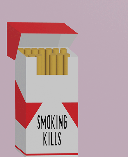
Maura’s poster SMOKING KILLS is a digital piece commenting on the resurgence of smoking cigarettes and the negative impact that smoking has on one’s health. Through three dimensional rendering she has depicted a cigarette shriveling as it puffs out smoke, she uses this as a metaphor for the human body, as it too withers away. Maura and I chatted about why our generation glamorizes smoking and how she created her piece in a way that captures the Gen Z aesthetic and a longing for commodities past. – Noelani O’Hare
Noelani O’Hare: Ok hii.
Maura Pinder: Hey again!
NO’H: I really loved your piece, I thought it was super cool and like really complicated to be honest, could you tell me more about the process of making it? Like did you make it all in blender?
MP: For sure, so basically I started in Illustrator. I made the cigarette box with 2D shapes there. I knew I didn’t want anything to be 3d besides the cigarettes. I also knew that I wanted to go for a sort of vintage cigarette box, very sharp lines, sort of like the old Marlboro boxes. Then I bought the Illustrator file into Blender as a plane, and created the cigarette itself and the smoke. Ta-da!
N’OH: How did you make the smoke?
MP: I had to watch like 10 youtube videos to learn how to do it. Thankfully, Blender has a pretty good default smoke option, so I just messed around with that a bit.
NO’H: It looks beautiful! Super super realistic, I just also wanted to ask about this font you used. Did you make it yourself? Or find one online?
MP:I just used a classic font that looked similar to ones on cigarette boxes, I knew I didn’t want text anywhere other than the box, so I figured I would just put my message there.
N’OH: Also the background! What was your process in choosing the pink? I think its a sort of unexpected choice but works beautifully with your poster. I think also the sort of pinky-grey hue is kinda reminiscent of lungs and the greyness sort of adds like that character of smoke.
MP: Originally I had like a blue background, but it didn’t look great with the red and white of the box. I was trying different colors and found the grayish pink which I immediately associated with smokers lungs.
N’OH: And can I ask what prompted you to choose smoking as your topic?
MP: I thought it would be funny honestly. Our generation has more accessible knowledge about our health than any other, yet we are the generation that is bringing back smoking. So many people at Penn smoke cigs and there is a whole internet subgenre about how “drunk cigs don’t count.” This references how smoking when inebriated doesn’t make you a smoker, which isn’t true.
NO’H: Yeah I’ve honestly seen the resurgence of cigarettes kind of everywhere, like in my own life and with my own friends and on Tik Tok and social media. I think they did such a good job at like eradicating cigarettes for like the 15 or so years when we were growing up, but now its kind of over and I’ve always been curious as to why.
MP: I think its because it feels vintage to us. I also think at schools like Penn, where everyone is obviously very smart, things like smoking almost have this aesthetic tie to them, like dark academia or whatever. It feels like something semi-safe that you can do to break the rules. It’s a fashion statement, it’s a callback, it’s something that you crave doing once you’ve done it once.
NO’H: Yeah I definitely agree with the aestheticism. I think smoking in some ways is also sort of tied to a kind of like maturity and what feels like intellectualism now.
MP: Totally, yeah. It’s all very analog isn’t it. Like the desire to do something from a time period before we knew it was bad. I feel like part of it is people pushing back against the digital age and longing for something that feels familiar almost.
NO’H: I think that’s also mirrored with like the resurgence of digital cameras and film photography, even like record players and CD players are coming back. We’re slowly moving away from the digital and into the analog, which is strange to me because I feel like the 2000s was a time where we funneled so much effort into switching to the digital and like defining ourselves as the new sort of future.
MP: Yeah like it’s all ironic right? Like you’re using your digital camera to take photos that you will post on Instagram. Instagram is owned and operated by Meta, one of the biggest tech giants, constantly pushing us closer to new technologies, but it’s like “so retro” at the same time to do this. I really like irony, like I said, it is sort of what inspired my poster.
NO’H: Yeah. I really wonder what it is that makes us so attracted to the old. I’ve also seen like tons of videos recently about ditching the smartphone in favor for a flip phone and that one kinda seems to me like we’re taking the gimmick a little too far. Like I am all for a CD or a record, but phones are sort of functional now in more ways than just calling or texting.
MP: Like the whole thing is sort of stupid, we are all just looking for something that reminds us of something else I guess. I do it too, just the other day I was at the thrift store, prowling for vintage pieces, all the while I had a podcast about the Balenciaga PR crisis playing in my airpods.
Times are weird, right? It’s like we pick and choose what we want to be analog vs. digital. I love it.
NO’H: Honestly..yeah.
MP: I have a question for you… have you ever smoked a cigarette?
NO’H: Yes but only once! Have you?
MP: NO! Never! winks