Sydney Kahn interviewed by Hannah Shedlo
Hannah Shedlo: Sydney! Your poster looks amazing! How did you come to the decision to make yours about safe sex?
Sydney Kahn: Everyone has their issues that they won’t shut up about, and sex education is definitely one of mine. With the abortion debate where it is right now, clear and comprehensive sex education is more important than ever, and yet so few young people are actually learning what they need to know. Most sex ed programs across the country preach abstinence, and those that go so far as to explain birth control options, often don’t do so accurately, in-depth, or in conjunction with important topics like consent, female pleasure, and how to stay safe during non-penetrative sex. I am all for breaking down the taboo-ness of talking about sex in our society, as a lot of social and relationship issues can be traced back to a lack of sexual communication. I hope that this poster can be a bare-minimum info-flash for young people who have not been exposed to contraceptive options and their value, so they can go on to practice safer sex.
HS: I love that. Sex ed programs are definitely known to be lacking across the country so I definitely see that the need is there is talk about this more. Is this something you experienced? How did this end up becoming your issue you don’t shut up about?
SZ: I received an “okay” sex ed program in public school. Nothing about it really stuck with me. I was lucky to have a mother who was ready to answer all of my questions, and she had us go through one of those puberty/sex ed books together, so we could talk about anything we came across. Most of what I was talking about earlier, though–like contraceptive options, female pleasure, etc.–I learned about through a program at my Unitarian Universalist group called Our Whole Lives. It’s a multi-session program and covers everything from basic anatomy (plus the clitoris and prostate) to contraception to pleasure to what makes a healthy relationship to how to talk about consent. It’s what I wish more young people had access to and what I think that public school sex ed programs should aspire to be. The main obstacle to this, I think, is that O.W.L. instructors are volunteers and go through a multi-day training program to become certified instructors comfortable talking about sexual topics with kids in an educational way. Few public schools have a dedicated sex ed teacher or the resources to acquire one. And the type of person who would want that position I also feel is hard to come by in a lot of areas. It can be a risky position, but not every kid has a parent willing to fill the role my mother did either. So where are kids supposed to reliably get a quality sex education if not at home or at school? It’s a difficult issue, but one that can only be solved with advocacy and creating access.
HS: Absolutely agree. Sort of shifting gears I’m curious about some of your design choices for your poster. Were the growing / shrinking condoms part of your original vision? Is there meaning behind their direction and placement within the poster?
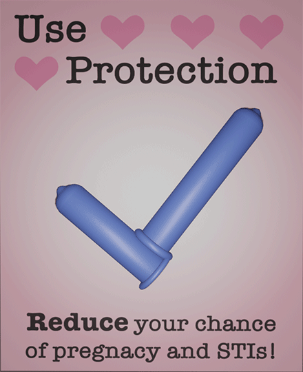
SK: Yes, they were part of my original idea. I wanted to show how a condom is used without including images that might be considered pornographic. As the two condoms “roll on”, they form a checkmark–indicating that a) you’ve used them the right way and b) you are now protected, as the bottom statement assures.
HS: Nice. And was there specific intention behind the color choices and positioning of the text?
SK: Well, condoms are generally blue, so I went with familiarity there. The pink background I felt complemented the blue and evoked some feelings of love. As for the text, I followed a common poster format with the main imperative at the top as simply as possible, then some specificity at the bottom, with key words emphasized to make for a faster read.
Hannah Shedlo interviewed by Sydney Kahn
Sydney Kahn: Hey Hannah, love your poster. What was the inspiration for your lefties concept?
Hannah Shedlo:I love ‘silly’ art if that makes sense. I think generally art can be really serious. I also do think this is really important and it helps send important messages, but I think people forget that art can also be fun and utterly ridiculous. There are so many different ways to feel when it comes to art and I want my poster to be a reminder of that. I love to make people laugh so I thought I’d take a non-issue and blow it out of proportion just to have a little fun. I’m a lefty and I’m in a group chat of people who are lefties and we all take it super seriously in a completely ridiculous way. This is the exact energy I wanted to bring to my poster and what inspired me.
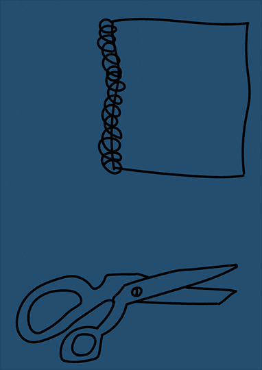
SK:That’s awesome! Definitely helps it stand out. Why did you decide to have the flash back and forth between the two images?
HS: I decided to start with the righty notebook and scissors and then have the image quickly flash to the lefty version. I wanted to begin with our societal convention, our norm that we take for granted- the righty notebook and scissors. Then I wanted to flip this norm on its head by showing the lefty version in the exact place as the righty versions once were. The lefty items flash in because they exist, but they’re not given the spotlight and people often forget about them. As quickly as they come, they are gone. If you’re not looking for them or if you choose to blink at the wrong moment you might miss them. I also wanted this to contrast with the end of the poster where the image of the lefty notebook and scissors remain on the screen. Here is where the main message is being given. The lefty items are being given center stage as it reads that they will not be forgotten. This is the progression of the poster in the same way that this is the future.
SK:I totally see that. Continuing on with the style of your poster, why did you decide on this hand drawn animation style?
HS:I really felt that it went along well with my overall concept. I wanted to present lefties as this group of rebels or this rising contingent. I thought that having everything hand drawn
tapped into this well. It’s scrappier and to me it evokes perseverance and struggle. I really think it made the whole poster seem more dramatic and thus more ridiculous.
SK: Awesome. To finish up, is there any intention behind the color scheme used?
HS:I really appreciate the question and I really wish there was. I wanted to go for contrast to emphasize the difference between the lefty and righty sides of things. I specifically chose the
dark blue and the cream / yellow because these are both colors that I really love. These are also colors that I have used in many exercises and projects throughout this semester so thinking of my work from this semester as a collection, I thought it made it more cohesive.