Isabella Pargiolas interviewed by Mikey Marcus
Mikey Marcus: Okay, so I just want to start by going way back to before you began this specific piece. Have you had a lot of experience with graphic design prior to taking this class?
Isabella Pargiolas: No, my only experience with anything artistic was in glassblowing. So I had very little experience in digital design. So I wanted to take this class as a way to get out of my comfort zone and do something a little bit more creative. That’s different from my day to day classes that I take.
MM: Awesome and then based on what you thought of your prior work in the class and feedback you’d gotten from your peers and from Avery, what was kind of your goal or what were things that you want to work on with this specific project.
IP: So I think in a lot of my previous projects, I kind of learned how to use the tools as I was doing the project, which made them look less professional and I kind of didn’t have a vision of what I wanted to do until I was doing it. So for this one, I planned it out a little bit more and tried to learn some skills before doing it.
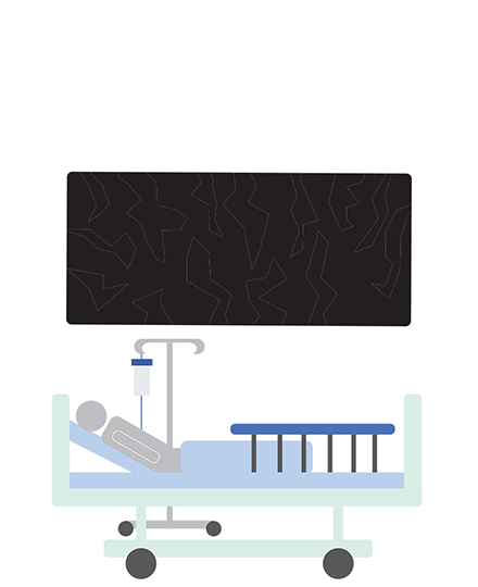
MM: So I guess that’s a great segue. Going on to your planning for this project, I noticed that in your initial brainstorming for this project, you had three different ideas, all kind of focusing on the monetization of patients in the healthcare system. They all touched upon how people are just treated based on the amount of money that they can pay and that inequality in the system. So how’d you end up choosing this specific piece with the patient lying in the hospital bed, as opposed to your design of people with the money symbols and the pills and your design with the actual image of someone’s body that goes through more of the biological side of this issue?
IP: Yeah, so I was kind of just sitting during health care management looking at this week’s assignment sheet of what lectures we’re going to be about, and there were some like, kind of related protests on the syllabus, so I thought that this ties in really well for the design class. So I ran with a healthcare idea and the monetization of patients. And as far as the three studies, I just kind of drafted those up but I really liked the one I chose because it had a little bit more symbolism and was more easily interpreted by people who didn’t necessarily understand the healthcare system or how health insurance works, or anything like that. So I think it’s a little bit more accessible to everyone. And then I kind of came up with the idea of it being a little bit more robotic because it’s a system. It’s not a person that you’re dealing with, hence the very like computerized font. And so once I got those ideas going, I just really liked the one I chose.
MM: Great. So, looking at the computerized font and the words specifically on your final product, you explained why you chose that specifically computerized font to represent the systemic nature of this issue. But what made you choose the font for AMA afterwards?
IP: I think I just chose blue just because that’s kind of a very governmental logo color. And I didn’t want to take their exact logo or anything like that, but the font I thought was just bold and a little bit more friendly. It’s not as systematic as the computerized font but not necessarily personable either.
MM: I get that a lot because I feel like the Affordable Care Act is progress but not enough progress. And then in terms of the actual patient in the bed itself, I’m curious as to how you chose the level of detail that you want to put into the patient. Obviously, it’s not a rectangle to represent the body; it has an arm and a head to indicate that it is human, but it doesn’t have any facial features. The face is just a circle. So how did you come to that decision?
IP: Yeah, so I think I wanted to stick with a little bit more of a simplistic look. In class, we discussed the simplicity of the symbolism in bathroom signs and we talked about the use of icons more broadly. It’s really just a head with a blob because that alone is enough to symbolize a human, and we learned about that in class. We’re all able to interpret that as the same thing. So I think different people can associate and relate to it without that person looking a certain way or being, you know, a certain age. Like everyone can kind of relate to that.
MM: I really appreciate that choice just because the issue of expensive medical care is one faced by such a wide variety of people in this country. When I saw it first, the lack of individual features reminded me of how, because of how money is prioritized in the healthcare system, patients aren’t treated as individuals. So you’re taking away that individuality from the patient both in real life and in your poster. I’m not sure if that was your intention—
IP: It totally correlates. I think that’s a great point.
MM: Well, I guess those are the things that I wanted to cover. I think you did a great job with this and covered the issue super well. With that, do you have anything else you would like to comment on with this piece specifically?
IP: Not really. I think we covered everything.
MM: Awesome. Thank you so much.
Mikey Marcus interviewed by Isabelle Pargiolas
Isa Pargiolas: Going back to the beginning of the class, why did you decide to take it and what got you interested in design?
Mikey Marcus: I took a couple marketing classes at Penn and possibly doing a consumer psychology minor. I’m very interested in marketing and have always appreciated the use of graphics in, not only advertisements, but also anything persuasive. I have always been super terrible at visual art and I thought that I would have more control over digital art because it involves making shapes for example. It is significantly easier and you don’t have to have a super steady hand. I thought that this class seemed like a really great opportunity to learn to be better at visual art and be able to get out my ideas so I could bring things to life that were just in my head which I would never be able to do with just pen and paper.
IP: That’s awesome. Do you think that after taking this class, it has the applications that you thought it was gonna have
MM: 100% Especially with this piece, specifically. Things like this are kind of why I wanted to take this class. I used images and digital time to send some sort of message so this final project felt very fitting for me to sort of utilize all the skills that I had learned. It’s one piece that I’m most proud of, maybe as a result; but also maybe it’s because it’s the thing I spent the most time on and had the most knowledge prior to. I would definitely say that I think you can see it in my design, but I definitely relied heavily on super basic shapes because, as I said, I’m not super good at drawing it out. Any super intricate designs were just not going to be something that I thought I could execute well, and so I definitely tried to stick to simpler shapes and rely pretty heavily on doing basic, but lots of animations. These symbolic shapes are what get the message across.
IP: Leading into this project, what made you choose your topic?
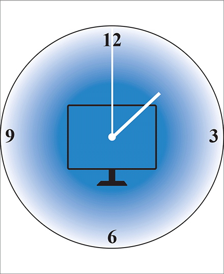
MM: Honestly, I chose the topic as a result of having an idea first. This isn’t an issue that I’m crazy passionate about, to be honest. I think it’s an important issue, but I am very passionate about a lot of other issues that I think would have worked super well for protests but I thought one this would be a more unique subject. I didn’t think any of my classmates would do it. Whereas other things that I’m passionate about, like climate change, my classmates chose as their topic. I had the idea of a footprint in a computer for some reason, when I was thinking about things to do. I just kind of ran with it from there and developed other ideas relating to digital footprints. The initial idea I had was the shoe in the computer screen and the seasons changing behind it, which is not what I ended up choosing to do, but I still incorporated the foot encased the screen. I was kind of trying to go for more basic shapes that were super symbolic and that I could animate well. I kind of chose the topic as a result of that.
IP: Yeah, I’m a really big fan of how literal, yet symbolic the figures you used are. Like you said, the footprint on a screen with a ticking clock. It kind of spells out the words that you’re seeing on the screen. You could probably make those words on your own without even reading them just by looking at it. I thought that was really cool. And I noticed in your studies you had “your digital footprint”, and then you changed it to “digital footprints”. Did you mean to get rid of addressing the viewer? Why did you decide to make that change in the words?
MM: Initially, I had “your digital footprint”, because in my marketing class, we learned about this thing called elaboration in terms of getting things from people’s short term memory to people’s long term memory. Involving the viewer is a great way to do that. That was my intent initially and why I included “your”, but as I was making the design, I was really just focusing heavily on simplicity. I was trying to cut back on as much as possible to result in a very clean and simple image.By getting rid of the word “your” I was able to achieve a cleaner look. Also just the issue of one’s individual digital footprint isn’t a personal issue. The issue is that one’s data being online harms other people. I cut it down to make the message make more sense.
IP: Yeah, that makes a lot of sense. It’s really cool that you were again able to apply content you learned in other classes to your design. It looks great. Wrapping up, what was your favorite part about working on this project and do you have anything else you want to say about it?
MM: I think that I was finally able to feel like I had adequate skill that could actually be used to deliver something that looks good and that I’m proud of. I think with animation specifically, I learned a lot on Photoshop that I did not learn in class and so I was super proud of myself for learning how to use this software, kind of on my own. I also liked the creativity I had. Even though it looks very simple, getting the minute hand on the clock to rotate took a lot of brainstorming. The rotation tool makes an object rotate on its own center axis, instead of an axis on the end. Avery helped me fix it, but then I messed it up, so I had to find a different way. I used the skills that I already had in order to do it and did something that maybe was a little bit more clunky in terms of the behind the scenes stuff to produce a very clean image later on. And so
being able to do that made me feel super prepared to continue to do digital design beyond this class because even if I’m not learning concrete skills on a weekly basis, I know that I can use the knowledge I do have and expand on that and get creative in terms of my application of it.
IP: That’s awesome. Yeah, great job.