Norman Chen interviewed by Monika Lee
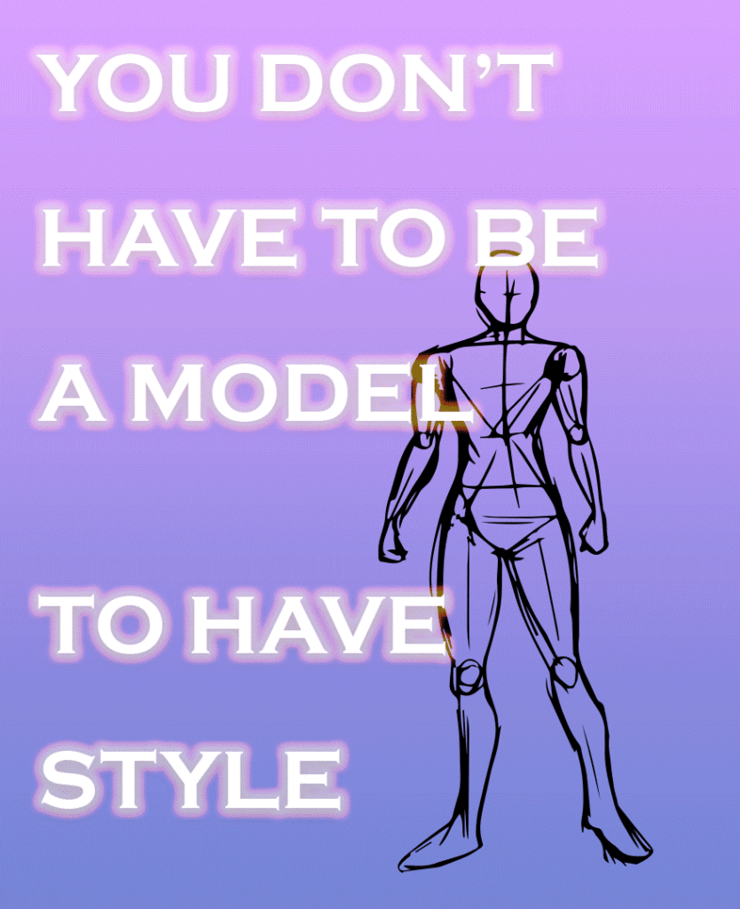
Norman Chen’s, “You Don’t Have to be a Model to Have Style,” depicts how “style” should be fluid and aims to tell its audience that they do not need to have a certain body type to be stylish. By using a generic figure with no face and an average build, he shows how clothes are what make a person stylish, not their physical build. The pace at which the frames of outfits transition between indicate how he is not trying to sell the outfits he put together, but rather, show how there is not one way to be stylish. This piece hopes to inspire viewers to go outside of their comfort zone and experiment with articles of clothing that are not considered to be “safe” and commonly worn by the public. Chen is a sophomore at the University of Pennsylvania studying Cognitive Science. In high school, he was a part of a fine arts program, where he mostly worked with still life and realistic figures. He is interested in the entertainment and art industry, and moving forward, he would like to work more fashion and design. – Monika Lee
Monika Lee What was your inspiration behind this piece?
Norman Chen I guess I’ve always been interested in fashion as well as just the day to day industry of entertainment and art. I originally was thinking about making something about body proportion and how you should accept your own body – how tall you are, how short you are – and be proud of who you are. But I think I wanted to be more artsy, to show how it doesn’t matter what you look like, you don’t need to be super good looking to have really nice style and stand out from other people. So I used a very generic figure with no face, doesn’t have super good proportions, and is just very, very average. I just wanted to put a lot of different, fashionable clothes on there and rotate between different outfits to show my audience that if a random figure with no face could look cool, so can you.
ML I think you did a really good job of executing your idea! So what is your definition of “style?”
NC Good question. I think style should be a sense of clothing you put on that makes you feel like yourself. It should define you and not anyone else. I think it is very important to find yourself through your own clothes, rather than just think about what everyone else is wearing, and what is a “safe” thing to wear in public. It’s very important to find what looks good for you, find something that makes you feel the most comfortable, and just rock it.
ML How did you arrange the outfits? Did you organize the top/bottom and each component separately and then put them together?
NC For some outfits it’s just a dress or a long trench coat where it’s just one article of clothing. I didn’t really refer to any specific magazines, I just picked them out on my own. A lot of the frames I did I just searched up tops, like oversized tops or pastel tops, and then I would try to fit them with pants, maybe like a lighter shade or black and then I tried to see what shoes would fit. A lot of it was just me trying to test out different styles and see what would look cool and to show that there are so many possibilities than just one style of clothing or two styles of clothing.
ML That’s very impressive! Upon first glance, I didn’t know that you organized each component of the outfit separately because they look so well put together. Do you remember how many outfits you made?
NC I think it was between 12-17 outfits. A big motivation behind how I choose clothes is that I’m pretty interested in styling myself. I really like picking out clothes and thinking about color composition. I think about complimentary colors and colors that fit your body shape and skin tone. When I was doing this project, if there were like purples or blacks, I would see what colors would go well with it. The general rule is that you should stay within three colors for your outfit. You don’t want to be too colorful. Sometimes it’s nice to have a gradient and sometimes it’s nice to have some sort of contrast to balance out your proportions.
ML Is there like a reason why some of your outfits have shoes and then some of them don’t have shoes?
NC A lot of the times the shoes came with the clothes and I feel like for me, some of the outfits that I’ve put together, I didn’t feel like shoes were even necessary in some cases. I wanted to show that you don’t need shoes to look super stylish. You know, some people would think like, oh, I can wear whatever I want, as long as I have really hype Adidas yeezys or Nike Jordans, I’ll look super cool, but you don’t always need shoes. They don’t define how cool you look or what style is. I want to show how some outfits will obviously have shoes and they look great with shoes and some don’t have shoes and look equally as nice. I just didn’t want to put the center of attention on nice shoes.
ML Going into the physical design of your poster, why did you choose to have a gradient background?
NC I played around with different colors, but I chose a vibrant blue-purple color to have a futuristic feel to it. It was just a very comfortable color combination that wasn’t boring or had a business-y feel to it. I wanted it to have its own quirkiness and style, and it reinforces my whole concept of how you get to choose your own style and you don’t have to just choose what other people are doing.
ML So what was your thought process behind the serif font and is there a reason why you
chose to have a glow behind the letters?
NC The idea behind the glow is that it’s kind of “glowing up.” I was trying different things. and I wanted to have a little bit of drop shadow with a white glow effect. This combination stood out the most, and it felt the most like bright. It reminds me like you’re just walking into a restaurant or a bar or like some really fancy place that has a really good design. I just like the vibe and the contrast. There isn’t a super deep motivation behind it–I was just turning it around and I thought this would fit the concept.
ML Do you have a lot of experience with design or like graphic design, like outside class and what software did you use to make your poster?
NC I don’t really have a lot of digital design experience. I did a lot of fine arts in high school. I was part of a fine arts program, so I drew a lot of figures. I drew a lot of still life things, painting all that. This class was definitely the first time I did graphic design. I think I used Adobe Illustrator to get the figure drawing more black and white. I used Photoshop to put everything together. I did the time frame feature to put different clothes on different frames. I would just add a new layer each time and erase the old frame to create this transition of clothes.
ML My last question is about the speed at which your outfits moved. Is it intentionally fast? I noticed it kind of draws attention to the figure, but doesn’t necessarily let the viewers dwell too long on each outfit.
NC My main motivations behind this is not saying, oh, here are some great clothes where you choose from. Here’s some like examples you can just buy from this. Right? This isn’t a poster to say, here are some clothes that look cool, go ahead and buy these. I’m not selling these clothes. The main message is to look at this figure. It’s literally just a plain figure that has nothing–it’s not particularly attractive. I’m trying to say that there are just so many ways you can style a person to make them look cool, and you don’t have to perfectly follow any one of these outfits to look really cool. I want this to be more of a message saying, there are so many ways you can style yourself, just explore and go out of your comfort zone. In a way, go find what makes sense to you. It’s less emphasizing, you know, khakis and oversized dress shirts with black and pink colors, if that makes sense.
Monika Lee interviewed by Norman Chen
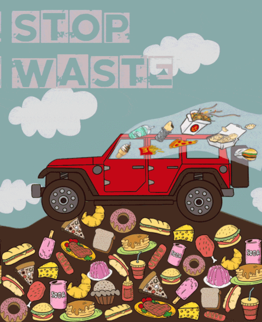
As a member of Penn Appetit, Monika Lee is passionate about food and the social issues behind the food industry. Food waste is currently one of the biggest and often overlooked issues faced by Americans. Monika’s animated poster “Stop Waste“ aims to stop food waste using a cartoonish yet powerful style to delineate the severity and inefficiency of wasting food. – Norman Chen
Norman Chen So, first thing. Tell me a little bit about the motivations behind your piece and how your background may have contributed to what you made, and what you experienced.
Monika LeeI knew I wanted to focus on something involving food waste or climate change, just because like in high school, I was very involved in environmental stuff. So, I kind of wanted to, do a different take on, stopping food waste, not just the stereotypical melting icecaps or composting. I think I went through a lot of drafts of this poster before I came to my final conclusion. An inspiration behind it is that I made a spread for Penn Appetit using a similar model, like the photos I worked with was like a red Jeep but it was actually like a physical jeep. And my goal was to flip that spread and draw food flying out of the car. I kind of just like, took that image but revamped the idea in a way to make this to stop food waste.
NC Right. First of all, did you draw all of these foods or where did you find all of these images of food, or fast food in this case?
ML Yeah so I drew the Jeep, the food, the background on procreate.
NC I see I see. Oh wow, that’s super impressive, and, I guess, what is the main message behind this as like putting all the food behind the soil, what is the kind of main message you want to get across, I guess, and also does this red Jeep symbolize anything?
ML Um, I think my goal was to make the food like appear visually appetizing just to show how people are wasting a lot of like good tasting food I guess. I originally didn’t have a soil, like in my first draft was I needed like something behind it to show kind of like it’s being wasted. It’s not just like a Jeep bouncing on top of like piles of food. And then like the flying food out of the car was just kind of like people throwing away food was like my concept. I felt like the red jeep was just kind of like, I think Jeeps show more stereotypically wealthier people.
NC Yeah, interesting! What would you say is your intended audience, and what do you hope to achieve out of this poster?
ML Um, that’s a really good question. I think my goal is just to remind people that, just kind of like stop wasting so much food, just because food waste in the US is a huge problem, and a large amount of food is being wasted. Obviously, I can’t like enforce anything like the message my poster is just like more so kind of just like a comedic or like ironic way of illustrating food waste, because it’s like a car bouncing on like a lot of cartoon images like it’s like a very like, okay, casual, childish, it’s not like a serious like animation, you know.
NC yeah, I like the juxtaposition of like having really good tasting food and putting it in like place where like it’s gone and basically trash at this point, yeah I really like the contrast. And, yeah, I guess, is there anything you can say about the floating words in the sky? I see there’s like a little bit of, you know, blue into like the, white background of the word, if that makes sense. You want to talk about that?
ML Yeah. Um, so, like the concept behind the font is like kind of reminds me of like, I wanted to like notice like lettering, like lettering on like pavement. Yeah, I was like kind of my concept to kind of like tied to the car, just so it’s not just like a random car and the poster. So, I wanted to like make it like I like tried to make it a loop, just because it shows kind of like a never-ending cycle of like food waste and like the extremity of like topic, I guess.
NC Is there a specific reason why you wanted to have that concrete design, I guess, as like the background?
ML Yeah, I think I just like kind of wanted an element to kind of like tie everything together, it’s like very, in terms of like tying like the car with the pavement and like what the background together, I was like, I was like, juggling other fonts, of like, if I wanted something that kind of like mash the clouds better or like match like the sky better, but I think like I needed something that draw attention to the model in a way but I wanted to, like, I guess like flow a little bit that’s why I like move slowly with the background. I just thought it was like a nice type of thing.
NC And was it intentional that you kind of made “stop” and “waste”, how they have like different speeds in the loop. It’s almost like waste kind of stops and then stop catches up, or I don’t know how exactly you made it, but um, is this a reason that you kind of made it move in different speeds and start and stop in different times?
ML Yeah, I want to stop to go first, just because like I feel like because stop moves towards it draws more attention to like the stop part, and then like always kind of is like being dragged a little bit by the stop.
NC Yeah, so um, I know you talked about how you drew everything in procreate, how did you end up like doing this, putting everything together, what software did you use?
ML So I made everything on Photoshop so we like the video timeline, I essentially drew the back on to procreate, and then I like extended it into long landscape ones like on Photoshop, I would just like drag the big image across the screen, and then I made different layers for like all the food and the car, like the clouds and stuff to add like more movement.
NC Interesting, okay. Yeah, I think that’s everything I have. Thanks Monika!