“Under the Faucet” – Marisa Senkfor interviewed by Madison Reynertson
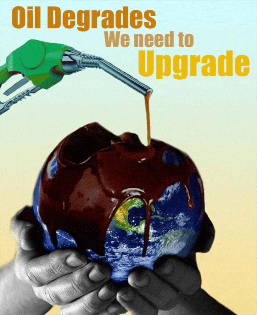
Marisa’s poster Under the Faucet is an elegant critique of society’s environmental ignorance. Created after a full year of living under COVID-19 regulations, Marisa warns society about the consequences associated with revamping travel and the effects that consuming mass amounts of oil have on our ecosystem. Her message is blunt: we are holding our Earth under an oil faucet, and we are the only ones that can move away from it. – Madison Reynertson
Madison Reynertson I’m curious does this have any special significance to you or like where did you come up with this idea
Marisa Senkfor Yeah, so I really wanted to do something involving the environment and because you know we’re not headed in a great direction when it comes to taking care of this world and so I really wanted to do a public service poster targeting that. I think for me why I chose specifically oil was kind of inspired by the fact that during quarantine where no one was really driving and you know you heard about dolphins in the Venice canals. You would hear how oil consumption really just decreased and how much it impacted the environment. And so I kind of was inspired by this fact. But now with things opening up again, I think we should try to keep oil consumption down and people should be conscious of oil’s impact and that we should be finding better solutions
MR Yeah, That makes sense. That makes a lot of sense especially since right now everything is opening back up again. Initially, I didn’t think about that but that makes it seem like a super timely piece or timely poster. So what made you decide to have the whole globe in someone’s hands, and I guess, make it like a worldwide issue instead of maybe picking a poster that was showing the more direct effects than just on the entire world in general
MS Yeah, so I guess my answer is two parts. One is with the reason behind the hands. The reason why I chose hands holding up the world is that it is kind of saying, you know, we kind of have control over the direction we want to take this world and that the Earth is in our hands. But, right now we’re putting it under the oil faucet. Except, the hands also show we have the power to move it. So that was kind of the intention behind the hands and show we must take care of Earth. And the reason why I just have the Earth is funny because I was sleeping one night and I just had this image of a chocolate ball melting and thought it would be neat if the earth was the chocolate and the oil was the “syrup” melting it. I just thought it would a really cool demonstration of just how oil kind of affects the Earth. Obviously, the Earth is not like caving in and breaking apart but I mean the wildlife is so negatively impacted and eventually you ‘re kind of not treating this Earth kindly. I thought to myself is there a better depiction of treating something not well then showing we’re choosing to “break” it.
MR Yeah, that makes a lot of sense. I didn’t pick up on the fact that you’re showing that we’re kind of in charge of the direction that the world goes in and that out of anywhere we’re directly putting it under the oil faucet. I really liked the way that you did that. Why did you choose to have the hands in black and why?
MS Yeah, I think that whenever something’s in black and white, you always think something sad or somethings wrong. You know those infomercials when things are going wrong it’s always in black and white but when they get the product their life is “better” so it is in color. So I think that for me the black and white hands were kind of saying, you know we’re not doing something right. But, I didn’t want everything in black and white because I think the poster is more powerful with color but I wanted the hands to at least be in black and white
MR Yeah that makes sense. How did you come up with the tagline or slogan?
MS So actually initially I had a different tagline. So I met with Avery and he was saying that the sketch kind of reminded him of the Sherwin WIlliams logo that has a painted Earth. Their tagline says “cover the Earth” and I thought it would be really cool if I said something like, “uncover the earth” and kind of play off this motif. But, I don’t think it was very clear what the message was trying to say. And so then I was thinking about another tagline, and I thought you know the oil is kind of degrading the Earth and what are we going to do? We need to do better. So I thought “upgrade” was perfect since it rhymed with “degrade”.
MR Where did the inspiration for the colors of the words come from? Because to me it kind of feels like they’re Earth tones but als oil tones.
MS Yeah, so I wanted the “oil degrades” to be kind of an oily color and I wanted the words to be a sort of gradient to represent a transition. So I wanted something that looks like a natural gradient from this oily color. But I also wanted it to stand out more and to also be complementary to the yellow in the background. I don’t know if I executed that exactly but that was the intention behind it
MR Yeah that makes a lot of sense. I like it. It doesn’t seem out of place at all when you’re looking at it because the yellow, I think, does go really well with the yellow in the background. And that the upgrade is yellow too and it’s closest to the yellow piece of the background versus like having done the other way. I think it makes it look really cohesive
MS Thank you
“STEMinist Attraction” -Madison Reynertson interviewed by Marisa Senkfor
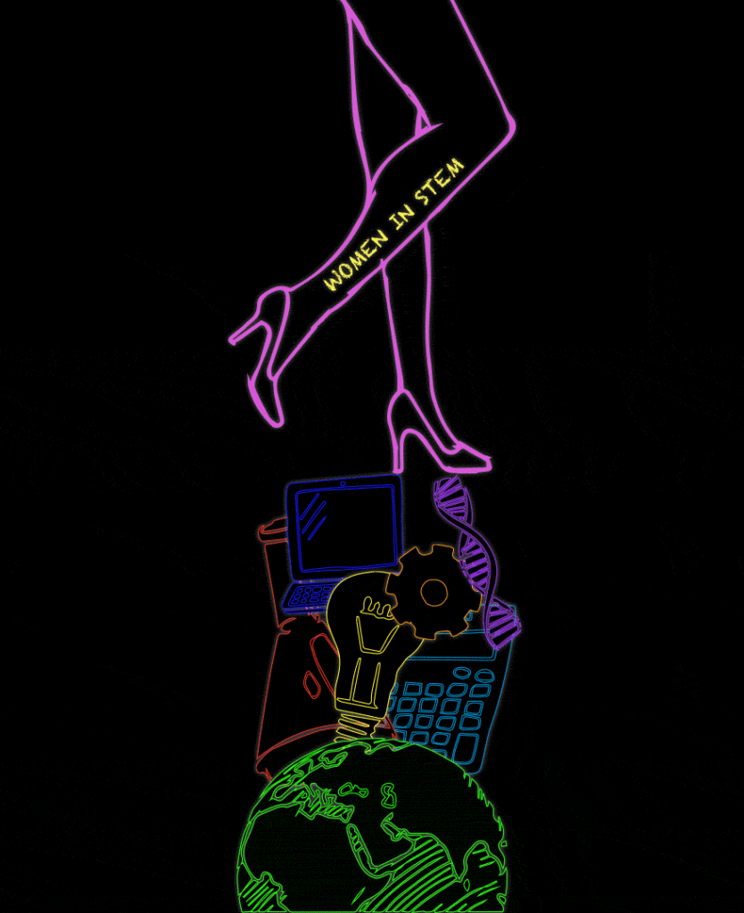
Inspired by her own experience as a woman engineering student, Madison in her “The STEMinist Attraction” poster captures the fine balance of being a woman in STEM. The poster’s tasteful neon lines allude to the signs commonly used to advertise strip clubs. This insinuation addresses how being a woman in STEM means fighting many stereotypes. A classic stereotype of women is that they’re just for show and sex, which is often represented by the strip club industry. As such, Madison turns this stereotype on its head. She uses the symbolism of the neon sign and pink legs to not advertise strippers but rather to advertise the amazing women in STEM. – Marisa Senkfor
Marisa Senkfor I really like your poster and that you’re doing women in Stem. One thing that I really found interesting was that you changed the shoes every time she kicked up, and I was wondering, what was the inspiration behind that intention?
Madison Reynertson Yeah, so I wanted to start with heels because I thought it was a really in your face example of women. I wanted the underlying message to be that women could do both. Like they can be in heels and we can see them in that light, but we can also see them as workers in the STEM field. So, I wanted to be able to show that transition from the stereotypical woman in heels to a woman wearing sneakers, because I thought it was a symbol of seeing women as more than just the stereotype. More like men, more like people who are working in STEM.
MS What’s the inspiration behind the choice of colors and having a black background?
MR This is something that I kind of went back and forth with a little bit. I decided to go with the neon theme, because I I felt like it would show another part of the stereotype as women being sex symbols working in strip clubs. When I think of the neon signs that’s where my mind goes to first. So again, I was trying to show that women could do both.
MS Oh, I didn’t know. Now that you mention that, that’s actually really powerful. I really like the intention behind that. Is that why you also choose neon pink for the legs?
MR Yeah, that was the idea. And then I tried to make them look like they were glowing to go along with that neon theme as well. If you look closely you can see that especially the stem icons look like they’re flashing.
MS Yeah, I definitely see that. How did you animate this?
MR I drew the legs on my friend’s iPad. I don’t actually know what that program is called! And then, I think I did four iterations of the image. Then I used the same image tracing technique that we did for the first Photoshop exercise to trace the legs and the icons. Then I animated it by doing a frame animation in Photoshop, each with a different leg drawing so that it looked like they were moving. To do the glowing, I just turned the glow feature on and off in successive frames.
MS Ah, that’s really neat. I really appreciate the simplicity. It really reminds me now that you mentioned it of those strip club signs that say ‘Girls, Girls, Girls’.
MR The one thing I was struggling with in this project was how to find a balance between telling the story I wanted without oversexualizing the poster. Maybe it gives off a different vibe for different viewers. Personally, I thought the final outcome made me, as a woman, feel powerful. But maybe others would feel it was degrading. I’m not sure.
MS Yeah, I guess that kind of leads into my next question. Was there any point that you thought about writing something different than women in STEM? Did you ever want to put a tagline or anything?
MR Honestly, I never really thought about it. This topic is personal to me in the sense that I’m in the engineering school at Penn and I frequently get questions about what I’m studying or how I’m performing. So when we had this assignment to make a public service announcement poster that was the first thing I thought of and I was determined to make that my main point.
MS Did you ever play around with the placement of the women in stem writing? Was that intentional?
MR My initial idea was that I wanted it to almost look like a tattoo. I wanted it to feel ingrained in the leg, to further that idea that the ability to perform in STEM fields is ingrained in women just as it is in men.
MS That’s a really cool idea. Well, I really appreciate the simplicity of the whole poster and I found it really interesting.