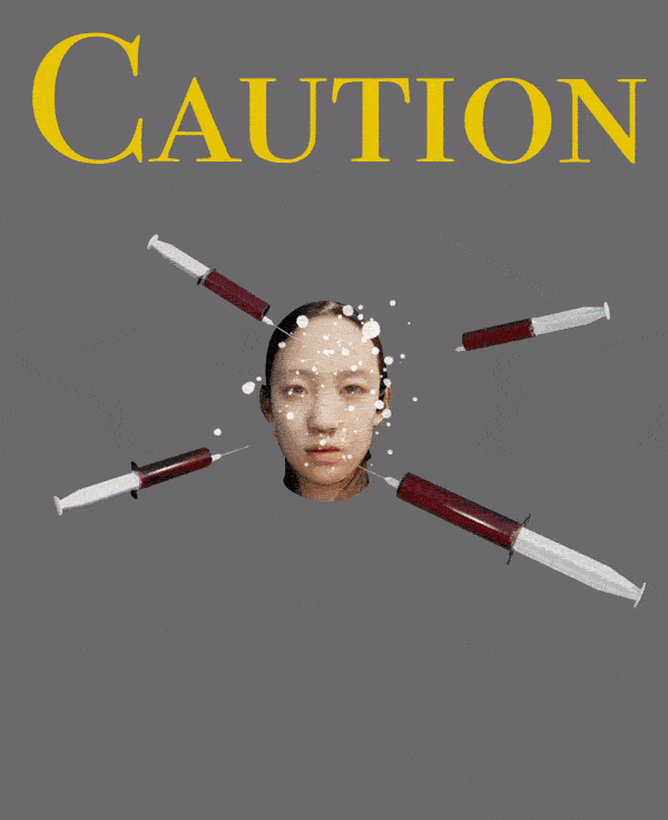
“Caution Plastic Disasters” – Jiatong “Jessi” Han interviewed by Dina Leyzarovich
With celebrities and influencers and the like always in the news for new cosmetic surgery procedures, Jiatong Han’s poster reminds and warns us of the potential risk of getting cosmetic surgery. She was inspired by her research into why these sorts of procedures are not included under insurance coverage in mainland China. Using carefully selected colors and expertly crafted faces with surgeries gone wrong, her message is clear. It makes us think -is cosmetic surgery really work the risk? – Dina Leyzarovich
Dina Leyzarovich What motivated you to make this poster?
Jiatong “Jessi” Han I am interested in healthcare since many years ago. But when I worked for a reinsurance broker, I found cosmetic surgery and plastic surgery are not included in the Critical illness insurance plan (In China mainland, HK…). I asked my mentor about this. She told me cosmetic plastic surgery need extra plans for each individual, so I started to research potential risks of doing cosmetic plastic surgery. Recently, I feel people surrounding me and those celebrities have different levels of addiction to plastic surgery. And this trend seems to be more popular among younger people. Also COVID is a perfect timing for those who want to have plastic surgeries as they are working virtually.
DL Is the goal of your poster to stray people away from getting plastic surgery since there are risks associated with it?
JH Yep. I think it is not good for people’s health both short term/ long term and mental/ physical health. Or at least reminder people about potential risks of plastic surgery before they make the decision.
DL Interesting. How did you settle on this poster design? What were your drafts like and why did you pick this one?
JH I first used an add-in called Facebuilder in the blender to sculpt my face on the “head”. Professor Avery helped me with the design of syringes. I also used “cloth” effect or changed the pressure on the right upper and left lower faces. These will give us an impression of melting skin. My friend told me these faces looked creepy loll.
DL Wow! That’s really cool. Do you agree that they look creepy or how would you describe them?
JH Sure they overall look too strange to be recognized as a face. But it is true that some failed plastic surgeries have similar effects. When I finished the head on left upper corner, I felt disgusted.
DL That’s definitely getting your point across then! How did you decide on the colors?
JH My way to choose color is quite simple. I just changed color and see if they can had a warning purpose. At first, I used a violet background and white caption–violet is often used as something attractive and dangerous; white caption will not draw too much attention from those five heads. However, when I shifted to dark gray, the poster seemed to be more serious which fit the vibe of PSA. Also, Yellow, as a frequently used in warning sign, is distinguished from a gray background.
DL I really like the thought process behind that! If you had all the tools and skills you’ve ever wanted at your disposal, how would you change this poster?
JH I will definitely add more details (e.g. hair) on those head to make them more realistic. My initial idea is using stiff facial expressions to highlight the risks associated with plastic surgeries, but it’s not easy to display with in 5 secs. Maybe adding some necessary facilities like scalpel in the background.
DL I see. Those are great ideas. To wrap up, what do you hope people take away from looking at your poster and who specifically do you hope to reach?
JH Beauty is making yourselves comfortable and fit. It is not necessary to have a 18-year-old face. I think the target audience would be women at any age.
DL Is there anything else you want to touch on about the poster that I didn’t ask?
JH Nope. You covered all key points! Thank you Dina! Nice chat with you!
DL You too!!
“Take Care of Yourself” – Dina Leyzarovich interviewed by Jiatong Han
Dina’s poster is a reflection of many students’ life during virtual learning. Finding time to focus on self-care can be difficult, especially with the demands of school, jobs and family life. Someone regards taking time for yourself as being selfish or unproductive. However, in Take Care of Yourself, Dina encourages viewers to create their own space and listen to their innermost feelings. Using a pastel tone in the background, Dina elucidates her way to stay chill and calm. It is not hard to take care of yourself; put on your headphone and breaks for a while. – Jiatong Han

Jiatong Han Let’s start! How did you conceive the idea of this poster? Is there anything inspiring in your life that motivates you to create this poster?
Dina Leyzarovich Yes definitely. When I was brainstorming ideas for my poster, I was like – What PSA could help me right now? And looking around my messy room and my cluttered calendar, I realized that I really hadn’t taken any time to myself in a few weeks, so that’s why I wanted to make a “Take Care of Yourself” themed poster.
JH Pretty close to our daily life! I also feel overwhelmed by deadlines and homework this semester, but we will adapt this soon. I noticed the colour scheme in your poster. Why did you choose the purple background and green eyes of the girl? Does this girl represent a general student or a specific person?
DL I’ve always been drawn to pastel tones, and the light purple felt really neutral and calm. I was considering a light blue too, but I sometimes don’t like the contrast between pink and blue. As for the eyes, mine are green too. I have curly hair though, so the girl in the image doesn’t look exactly like me.
JH Amazing! A more specific question about the background: I saw “homework” and “social” shifting alternatively while the girl is listening to music. Just to check my understanding is correct or not. Do you want to tell the audience that you are not interested in both (clubs and school) during the post-covid?
DL So not exactly, the background just has handwritten words of activities that take up my time – not necessarily in a negative way – but they still do and prevent me from taking breaks when I probably should. I love my clubs and my jobs and my friends and sometimes my classes, so none of it is anything I’ll drop post-Covid. This poster is more of a reminder to myself to work on balancing everything better and being able to say no. I need to take care of myself today.
JH Right, all these you mentioned are valuable in our life. I am curious about who is your target audience?
DL I think my target audience would be other students our age! Everyone is juggling so many things day to day and feeling so much pressure to always be doing something. But all you need to do is just put on your headphones and tune everything out for a little. I used to not really believe self-care (which comes in many forms) was crucial, and I think many Penn students might’ve had similar thoughts. This poster is a reminder that it is!
JH That’s interesting! We need to balance our work and life! If Penn allows students to paste their posters in the school, where is your favourite place to do that?
DL Hmm, that’s a good question. I think spreading it on social media would be most effective, but also on poster boards in buildings like DRL and Huntsman
JH If you don’t have deadline pressure on this assignment, what else would you like to add to the poster? I found your previous draft was composed of four scenarios in one poster. They seem to be different ways to get relaxed. Would you like to continue a series of posters?
DL I would’ve liked to make it more realistic and less cartoony by adding more details to her face and hair. I also really wished I had an iPad during the assignment because I had pictured the words being in my handwriting. I really love writing by hand, and the text definitely would’ve looked better if I wasn’t writing with my laptop trackpad.
And, yes! I think it could be cool to make it into a series about the same girl in different settings taking care of herself in various ways as you see in the drafts.
JH Love that! I also need more technical skills to help with my poster! Is there anything that I haven’t covered in the previous question but you want to tell your audience?
DL Hmm, I don’t think so! I think the main idea is that there are lots of things always swirling around, but it is still important to take time for yourself in whatever way is best for you!